
Ness Grixti
·
·
8 min read
Stand out, show your best work and get that damn job.
Product Design
In a world where competition is becoming increasingly high thanks to that slowly deflating tech bubble, getting first impressions right is important.
I recently was asked to review over 300+ portfolios quickly to hire one role. No, I’m not joking; competition is fierce right now. And, while I have reviewed my fair share of portfolios over the years, this time, given the short timeframe and my even shorter attention span, I saw many avoidable faux pas, which ultimately made it harder for me to judge their work.
So, without further ado, here are some of my presentation and setup tips to land that first interview and get that damn job.
Just like judging a book by its cover. Yes, your thumbnails are being judged. Be sure to put as much care and effort into presenting these as you would the work itself.
How you sound is just as important as the work. While having a fun and jovial tone of voice is fine, it must be done correctly. You often won’t be taken seriously if you start to sound too unprofessional.
Think of your portfolio through the lens of those reviewing hundreds of them. This differs from a design assignment at uni, which requires intricate detail; trust me, you’ll do plenty of that on the job. More often than not, your portfolio copy is being scanned or ignored, so keep your copy brief and highlight what you want people to read.
And don’t worry; once you’re in an interview, you can wow the hiring manager with the details.
Academic programs will give you a wide array of work to share, from service mapping to high-fidelity mobile UI designs. Use that to your advantage and highlight things that fit the role you’re going for.
For example, if you’re applying for a role in Design Systems, highlight some work that shows you understand Design Systems because your service map will mean little to us.
Every time I see designs which use a noticeable inaccessible colour or font size, all I see is a red flag. Not only does it suggest there was no consideration of accessibility, but there is likely a deeper lack of UX consideration behind the design.
While basic standards of accessibility can sometimes feel like they hinder creative design, they’re more important than ever in today’s tech landscape.
Showing you understand and care about how to design for a wide range of different audiences and needs adds depth to your work and challenges your design thinking.
Basic AA accessibility standards are slowly becoming the norm and law in some industries/countries, making them highly desirable skills to add to your arsenal.
So, consider the basics of accessibility in your designs and how you present your folio. Sure, some colours look cool together, but they’d look much cooler if you prove they work for everyone. You’d be surprised how thinking about accessibility can yield even more creative design work.
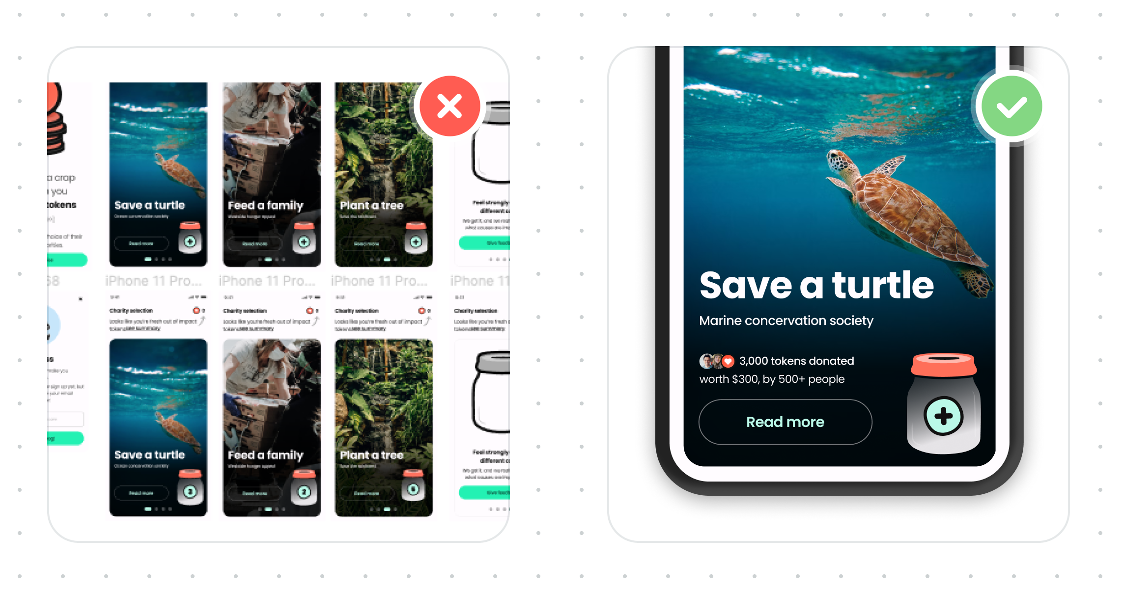
While angled mockups can add depth to your portfolio and showcase platform design at a top level, it is often hard to see your work. They’ve also been known to mask poor design. You’re a good designer; you don’t need to do this!
Instead, use flat mockups that don’t detract from your work. It’ll showcase the platform and highlight the amazing work you’ve done.
That’s not to say don’t use them at all; think of them like salt; a little goes a long way.
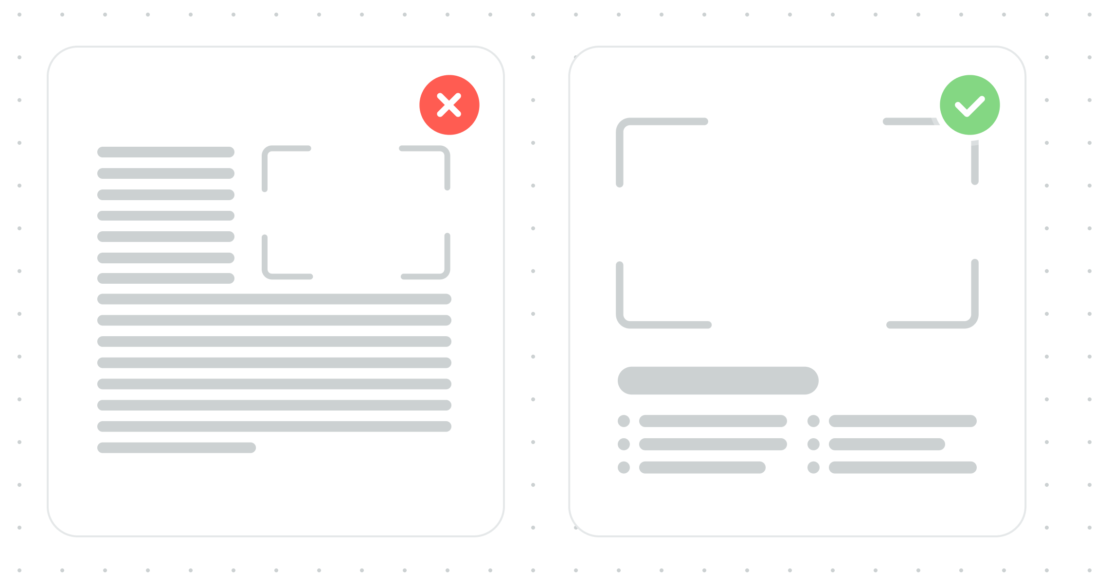
It can be easy to get a little bit lazy when referencing more significant pieces, like the existing experience, a post-it session, or even a journey map to ‘fill in’ the gaps in your process story. What I mean by lazy is adding a massive, detailed image that can’t be zoomed in on. While it might look impressive, it doesn’t tell anyone anything, especially if they can’t zoom in.
Taking the time to give a brief run-through of the critical opportunities/problems and showcasing some of the details will make your process feel all that more impressive; it also shows you’ve considered the UX of your portfolio and not just the work itself.
This one should be pretty self-evident: if you want a job in design, people need to see your design process and not just finished designs. Sure, if you have UI design challenges with fewer processes, that’s fine, but it should be the icing on the cake, not the entire thing.
Let us know exactly what you did if it’s a team project. It is essential to feel confident in what you’re discussing in the interview and that you’re being hired for the right skills.
Sometimes, we want everyone to think we’re excellent at everything and can do everything. Good hiring managers will value candidates who can work well with others, learn from them, and also be learned from in return.
You don’t always need a dedicated website; many other options exist to create a portfolio. Some examples include a Figma presentation, a public-facing Notion page, and a PDF.
Unless it’s a link to something visual, I recommend you don’t ask someone to fork your repo as a designer, unless it’s for a development role.
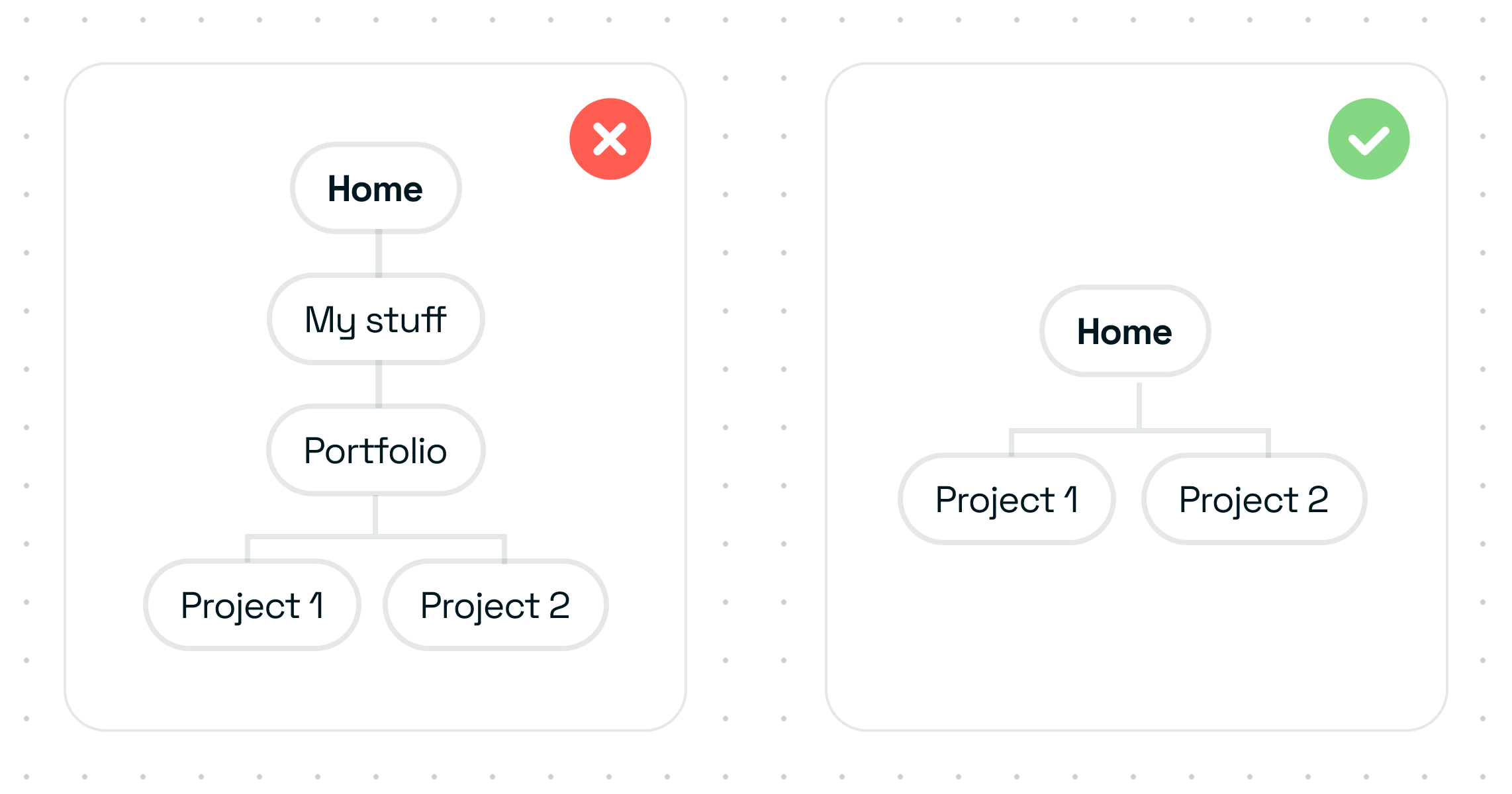
The IA/structure of your portfolio is just as important as the work itself. The last thing you want is for the hiring manager to completely miss your best work because it was behind a hidden link.
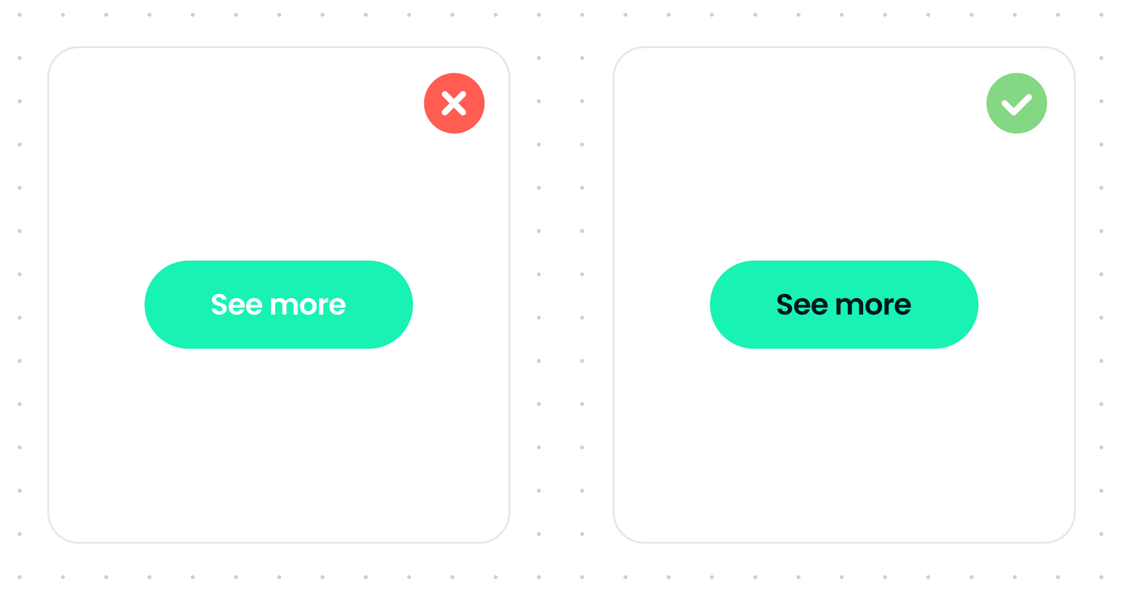
Some portfolio templates make it easy to add fancy hover animations/curser changes on links but can make it confusing to know what to click. While it’s tempting to use these features, sometimes they can take away from the work itself; decide what is the higher priority.
Remember to consider the naming of your projects and their placement as well. Is it obvious they are portfolio pieces to anyone but you? An easy way to test this is to ask a few people to find your portfolio work. Be sure not to use leading questions or guide them. It’s a humbling experience.
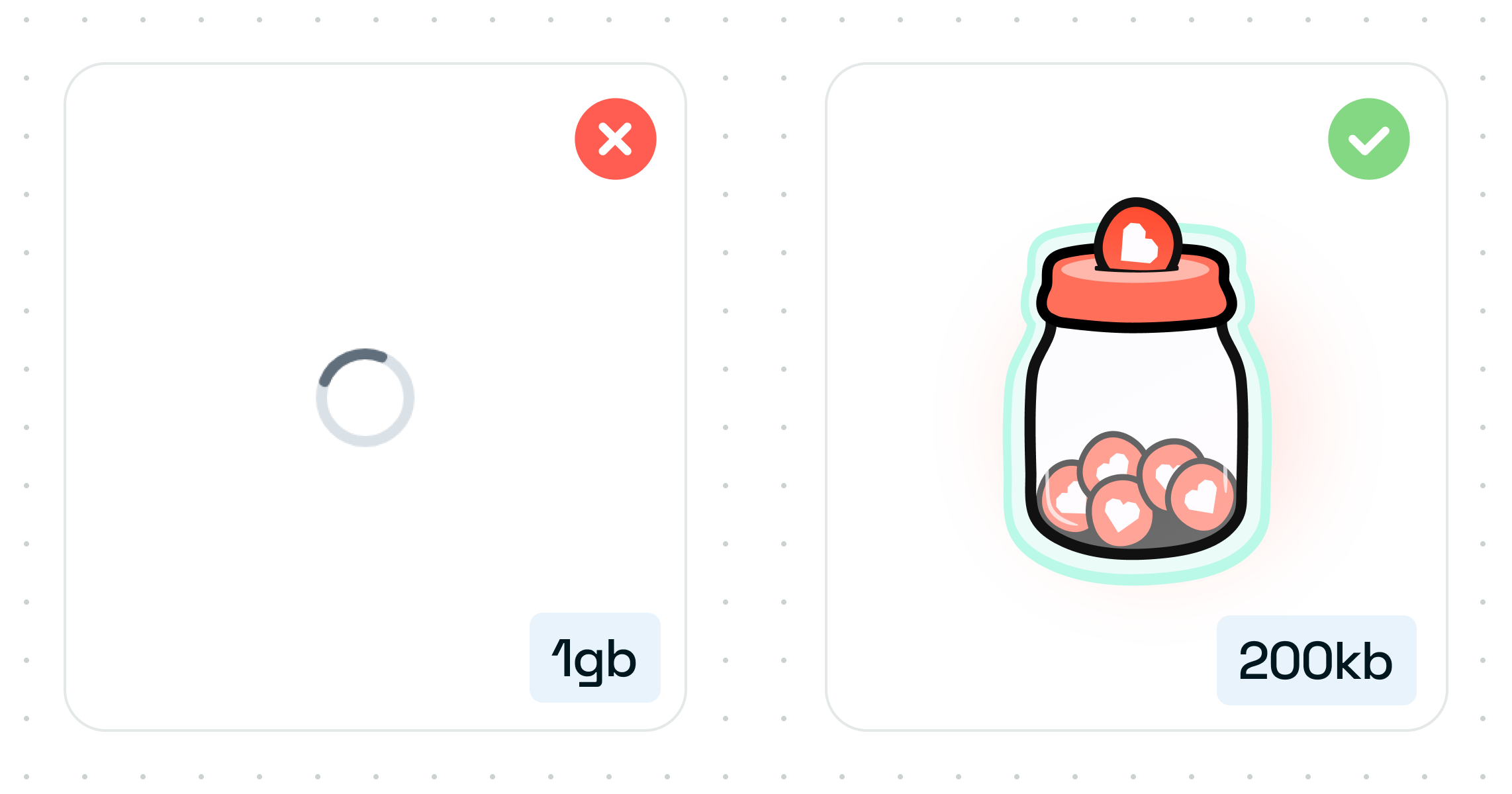
Large image sizes will slow down how long it takes someone to see your work. We don’t all have super fast machines/internet speeds, and your files don’t need to be that big.
Depending on how much time your audience has, this could lead to them missing crucial pieces of your work.
Using modals and carousels with just images and no context doesn’t tell a story or sell your work. If you use these, be sure to have supporting text, and no, not in the image itself. It’s terrible for accessibility.
The only use case for modals is to allow us to see those super-detailed images up close.
If you share a Figma file as your portfolio, share a properly designed presentation, not a Figma project file, unless it’s been specifically requested.
And, if you are sharing a working Figma file, for one, make sure to include a page for context and two, please, please, please make sure your layers panel is squeaky clean. It’s being looked at as well 👀.
It’s not easy for everyone to use sideways scrolling, nor is it always obvious that’s what the UI is doing. You don’t need to rely on fancy UI to get attention. Let your work do the talking.
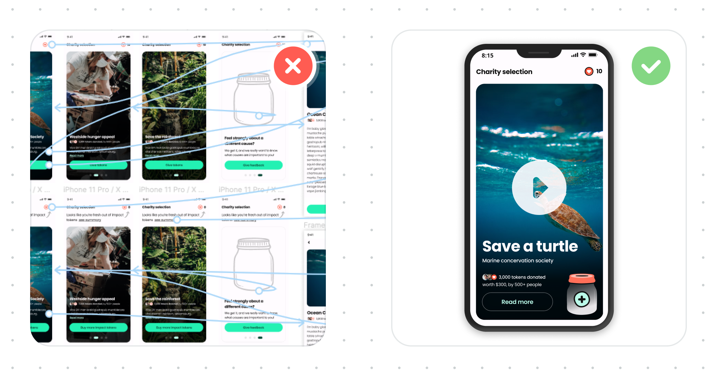
I said it once, and I’ll say it again, but this goes for all of your images; tiny images make it hard to see what you’ve done. Show off your work correctly, or use a lightbox/modal.
Prototypes are a fantastic way of showcasing the whole experience in all its glory and highlighting your excellent work.
When adding prototypes to your portfolio, consider a few things.
For one, when adding a live prototype, it’s only sometimes going to be evident to the viewer what flow you want us to take without directly guiding us. You’ll end up with people mindlessly clicking around and likely missing things.
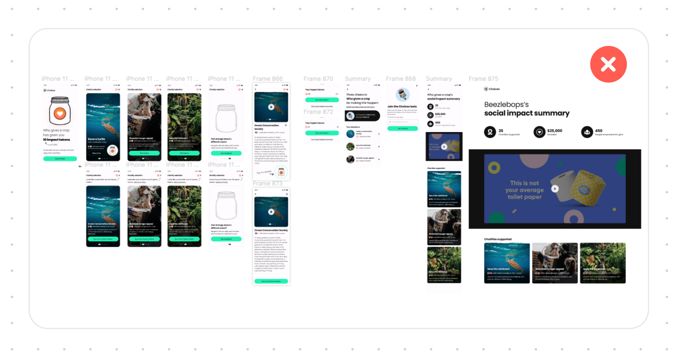
And two, images of your prototype, including a massive screenshot of your project file with the prototype panel turned on, with all of the interconnecting lines shown might look impressive, but all it says is that you figured out how to use the prototype tool 👏🏼, nothing else.
The best way to showcase your prototypes is by including a video. This allows you to control the narrative and not miss a thing.
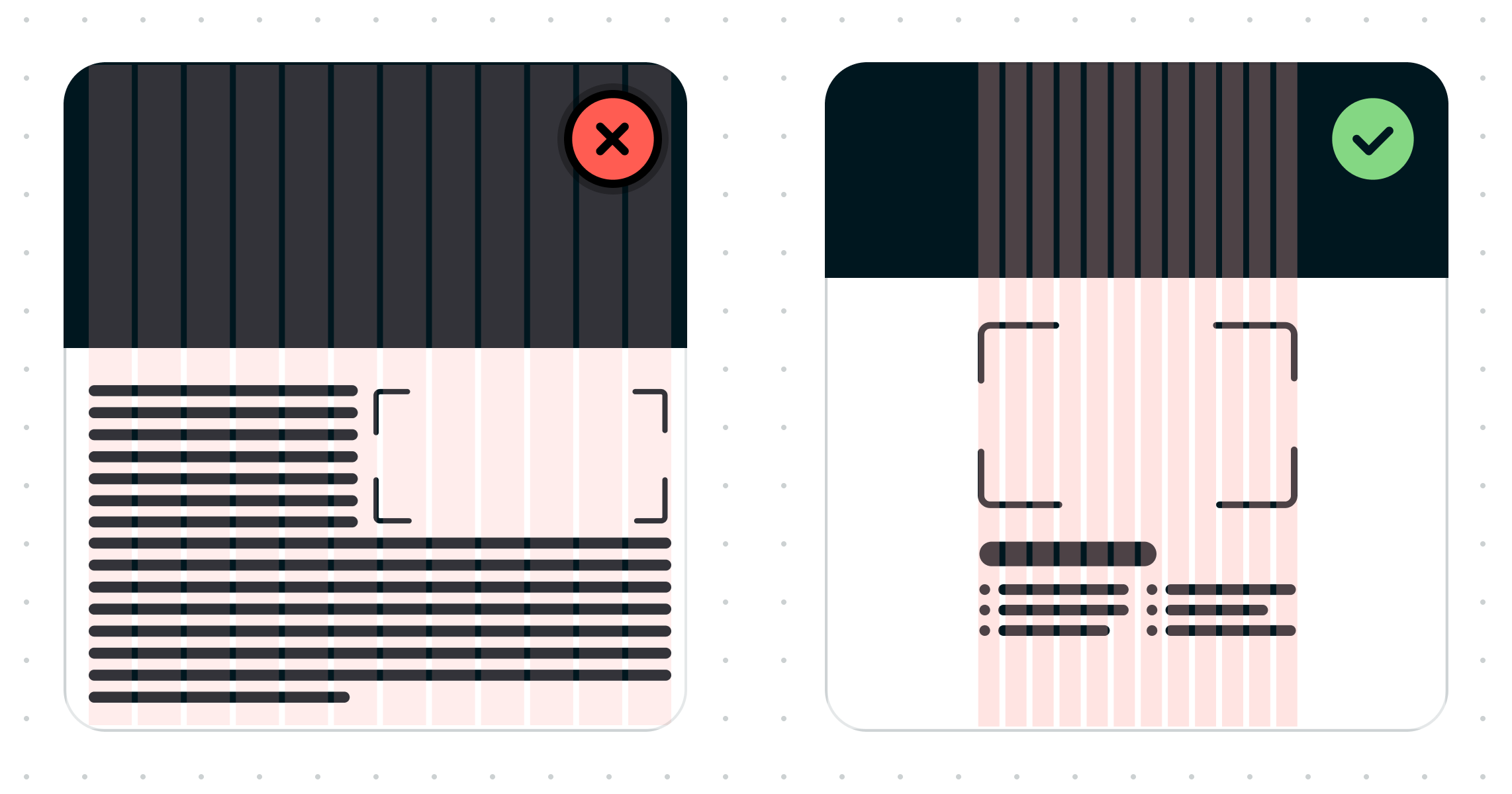
And lastly, consider your screen layout and content hierarchy carefully. Using 100% of the screen width can be good in some instances; it can create walls of text and make it hard to know what to look at.
Your portfolio will be viewed on wide-screen monitors down to small phones, so make it work for everyone. A nicely considered grid goes a long way, and sometimes, keeping it simple and adding some limitations is suitable for everyone.
It’s your work people are here to see, so put it front and centre and let it do the talking.
You’re an amazing designer, and you got this ❤