Boost redesign
Boost Power Redesign
Boost power was an energy company under OVO group specialising in digital PAYG electricity and gas.
With the review of Boost Power’s core brand values I redesigned the product to reflect the update.
The project took all 2018, and included testing the new visual identity with our customer base to make sure the new designs resonated with them.
Updated values
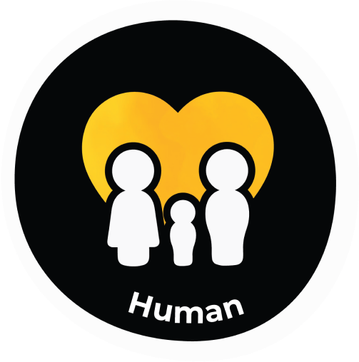
Human
The target market for Boost was stretched and struggling families.
As a result the brand was redesigned to be on the same level as the customer, we’re in it with them.

Helpful
The product had a strategic edge to help the customer help themselves, as in the case of the winter wallet campaign, where we would encourage customers to save each top up to a winter fund.
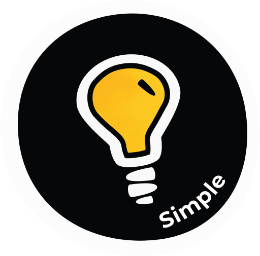
Simple
This was a no fuss, uncomplicated brand with no hidden strings attached.
Keeping simple in our values also ensured we made the experience as uncomplicated as possible.
Foundational updates

Colour
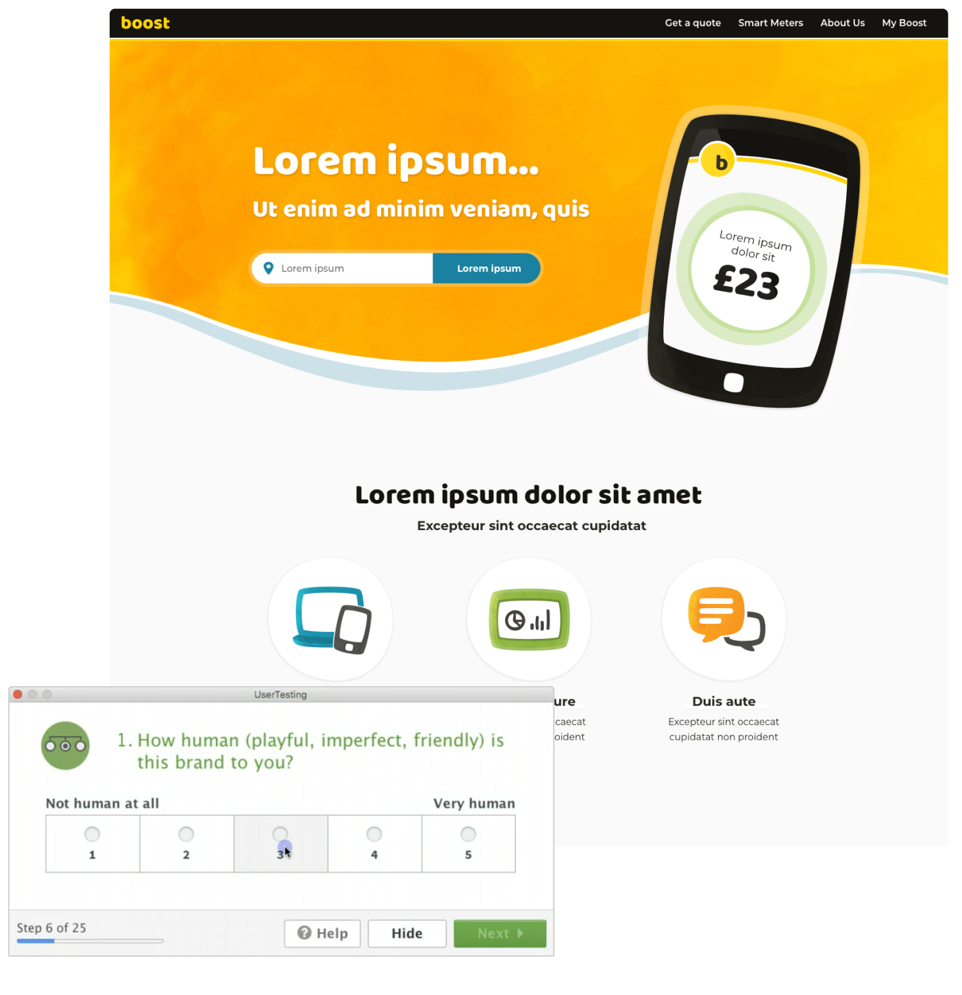
The existing brand used 100% yellow and 100% black, which is predomedantly used for print.
We shifted the yellow to a slightly warmer shade, and softened the black, this resulted in a more engaging and less alarming palette, whilst still leveraging the existing brand.
Iconography
Our illustration style moved to reflect what the brand was trying to achieve, being human.
Instead of robotic, perfect vectors the style was moved to be more hand drawn and playful.

Typography
The exiting brand font wasn’t versatile, using only a heavy and a light version of a serif font, as a result the website was filled with other fonts.
We landed on Montserrat as a body font for versatility and Baloo as a headline font to build depth and create character within the brand.

Photography
The existing brand was filled with stock photography of people holding phones!
We set a rule to only use photography that was of real people natural in their environments, and not staring at devices as a means to communicate managing their energy.
Testing the rebrand
The test
We used a stripped iteration and plotted it against our competitors, using our current website as a control. We asked customers how they felt on a scale of 1 - 5 on questions that best reflected the new values.
Findings
We found that photography resongated more with users on appearing more human and helpful.
We had also overdone the curviness of the visuals, making it appear too playful and not secure enough for an energy company, so we reduced the beziers opting for slightly more uniform illustrations.
Brand book
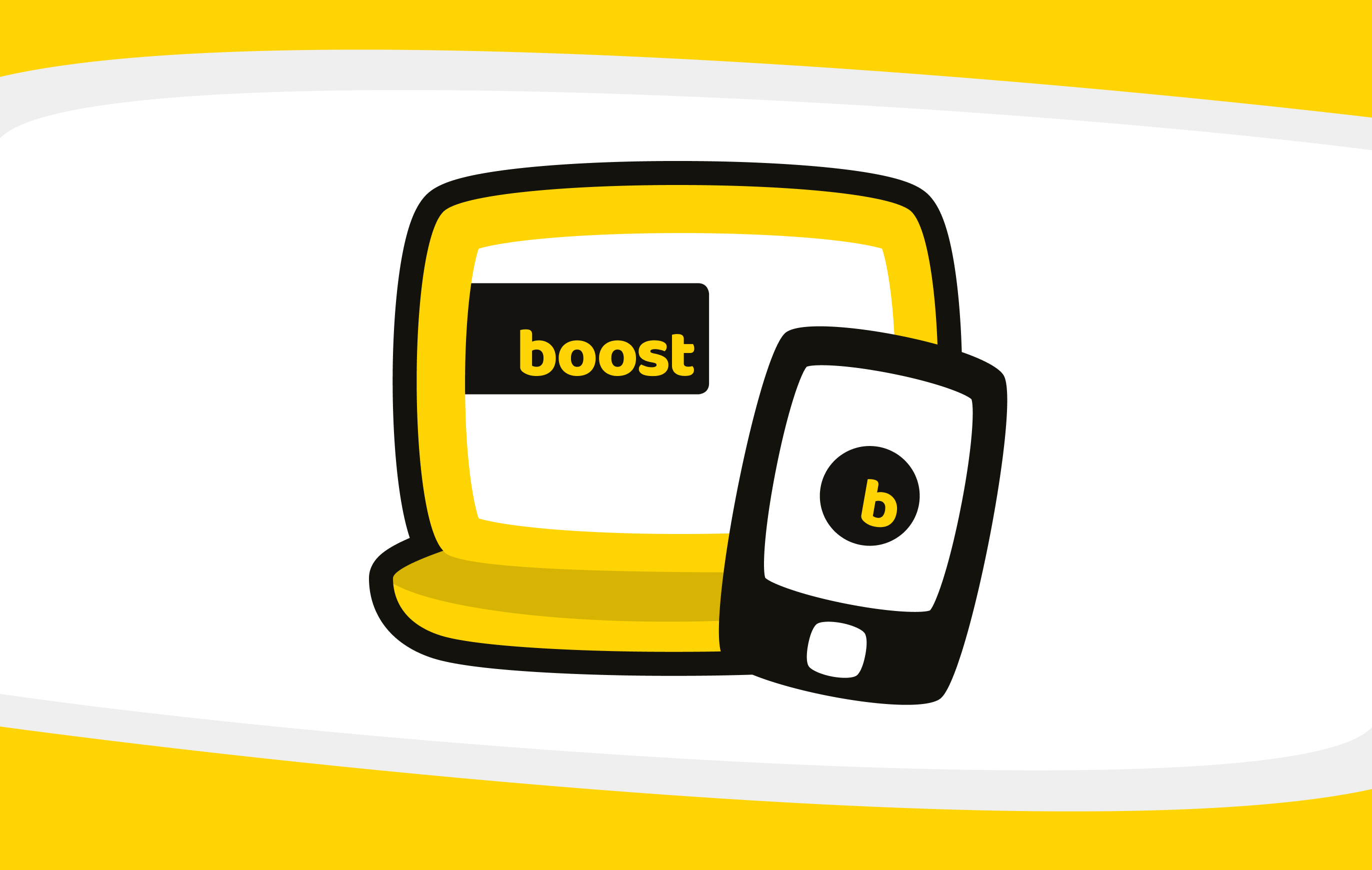
Marketing site
Mobile app
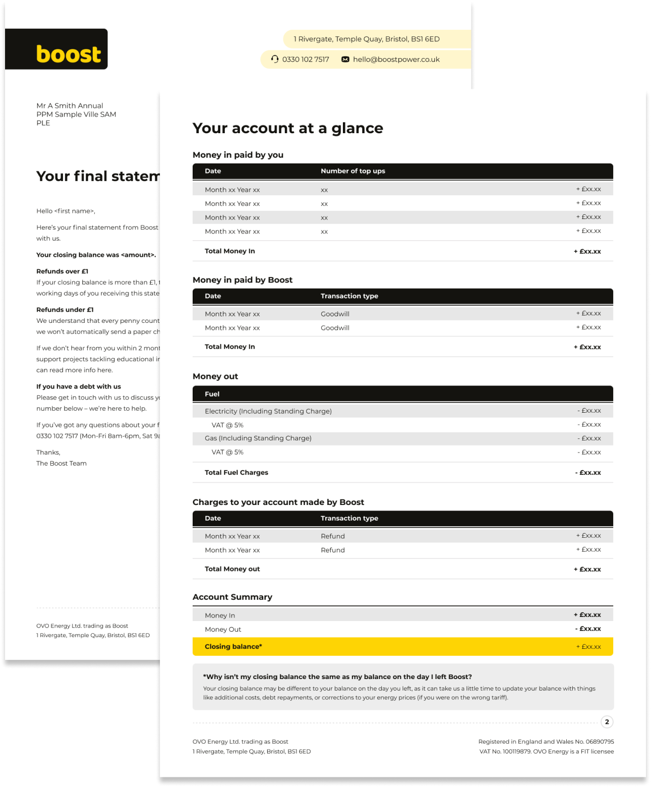
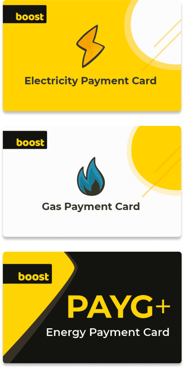
Print materials
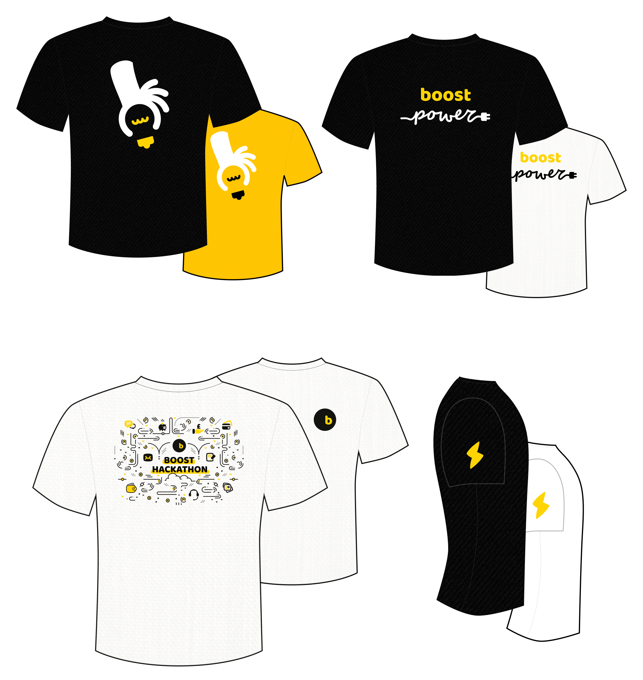
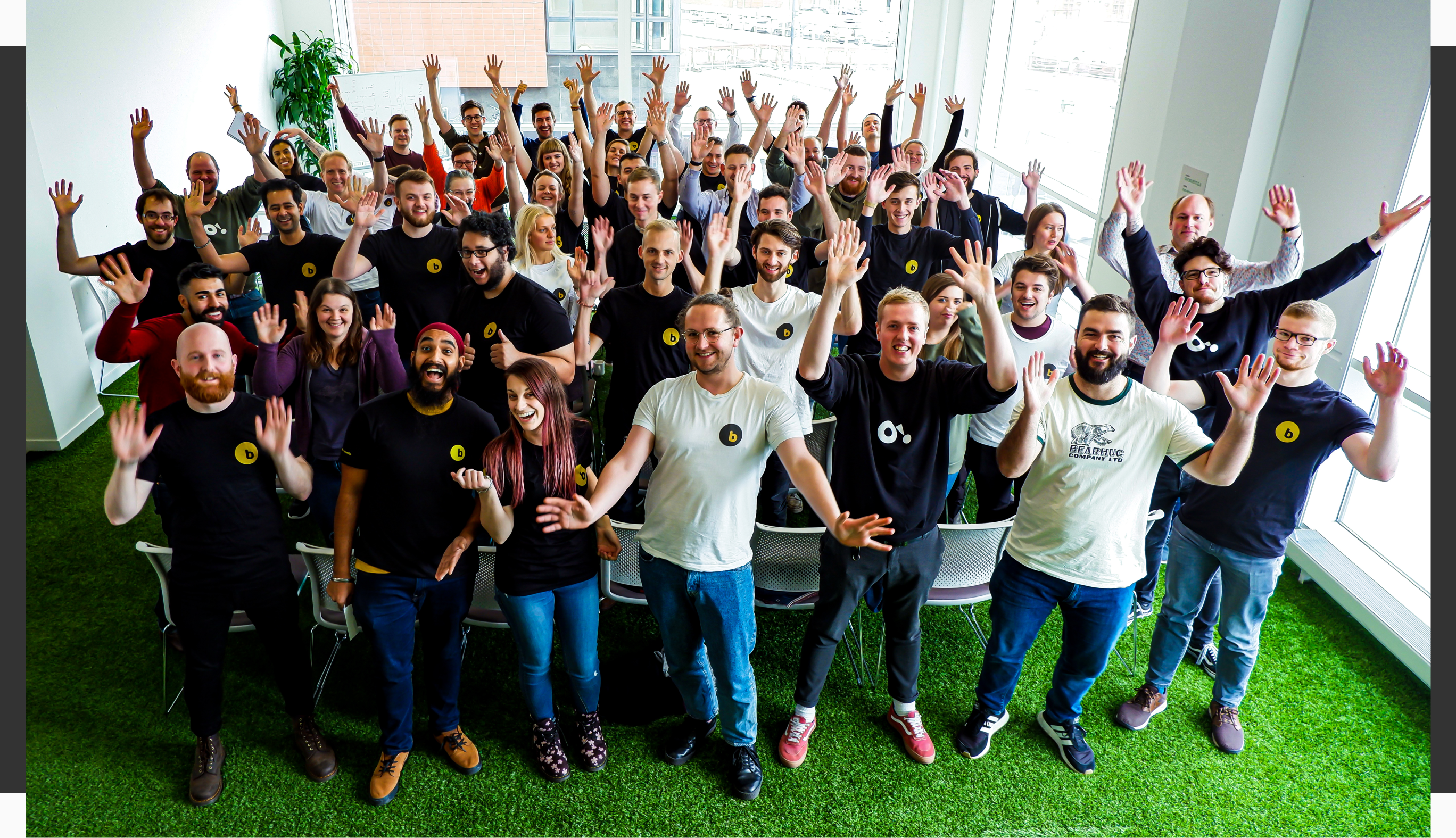
Staff swag
I also designed and co-ordinated a line of tshirts for 200 staff members, as well as photographed them in it for the ‘about us’ page on the website.