OVO Group design system
Orion nebula is a platform design system project I started with one of the lead developers in the business.
The system started as OVO_byus, a branded system for OVO energy but then evolved into a theme-able white-label platform as the business grew.
The Team
Designers

Ness Grixti
Product

Chris Lynch

Engineers

Fred Parke


Getting buy in
Selling a design system to the business
Setup & tooling

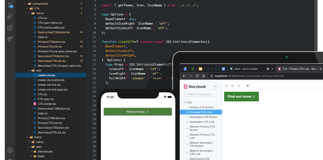
The tools we decided to utilise were Figma, React & React native.
The design team were using Sketch without any version control, after researching and testing a few options I opted for Figma as the tool of choice for the design system and shifted the design stack for OVO onto Figma, given I had implemented this change, I also needed to ensure I had buy in and trained the design community.
The process
01 Audit
We check existing instances across our applications to make sure we are aware of current use cases and designs. May also involve study of existing research in the case of forms and so on.
02 Kickoff
We filter the audit list down to the most used cases - we only build what is essential for immediate delivery.
We also research best practice for accessibility to funnel the design process.
03 Design
It is then designed and tested in situ, then reviewed by the team.
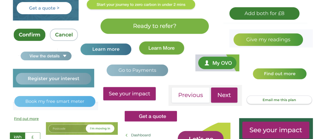
Once we’re all happy the designs are turned into reusable components which may have many states and variants.
04 Guidelines
Establish guidelines for the component, inc general usage as well as best practice. Can bring to light considerations that affects design and build. Once written, they go through copy review and are moved to the docs site.
05 Dev kickoff & dev build
The engineers agree on the technical approach for building the component. This ensures consistency and easier review.
We build the component starting from core on React and React Native. We often find new considerations here. Once the foundations are solid we create the ovo energy versions.
06 Review, release & rollout
The engineers agree on the technical approach for building the component. This ensures consistency and easier review.
We build the component starting from core on React and React Native. We often find new considerations here. Once the foundations are solid we create the ovo energy versions.
07 Iterate
After releasing a component we take on feedback from teams and if required we add variations or make improvements to existing components.

System personas
Before we created the docs site we wanted to understand the customers of the design system. I ran a workshop with our delivery manager within the design system to put together the following personas.
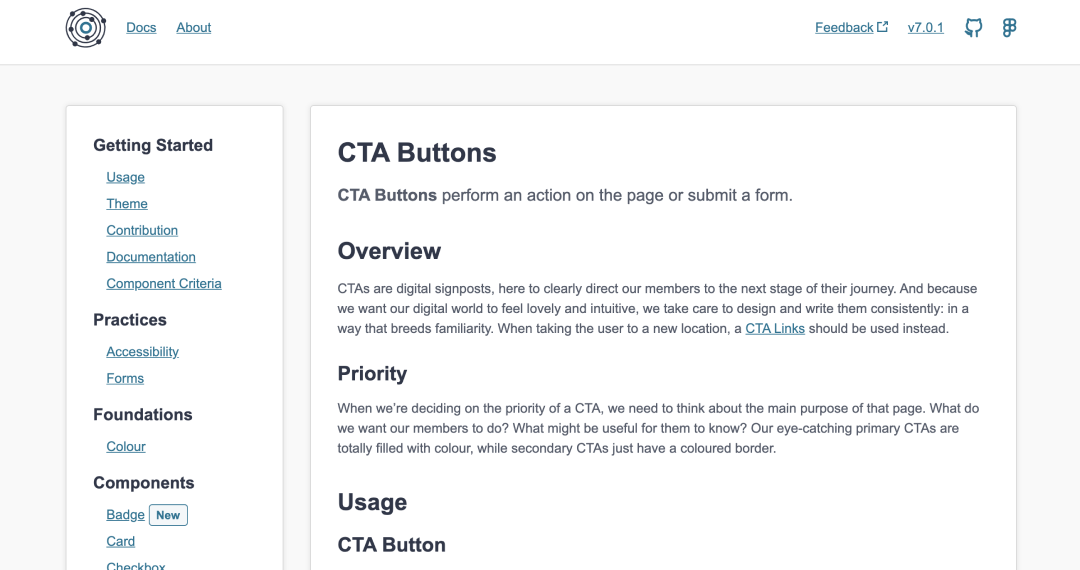
The docs site
Used as our primary tool for sharing design system information. It contains tutorials and content on setup, theming and usage.
Figma setup
A white-label platform
When setting up byus we had thought about multi-brand, but were strongly focused on one brand.
With the shift to white labelling, I re-architected the Figma library to support ‘theming’. All branded systems have system components linked from the Nebula library, with their brand overrides living within their own brand file they could share out as a branded system. I created the Nebula template file so brands could quickly spin up new libraries.

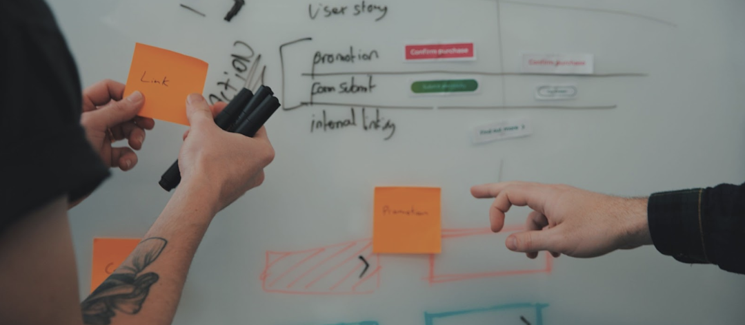
Contribution
We had decided we would move toward a more federated model when we first started the design system team.
Once we had established a solid foundation and process we opened up the contribution process. The graph below illustrates the process flow in interacting and creating components for Nebula.
The results
What Nebula achieved in 9 months
Release of a documentation site
3 platforms
2 brand libraries
60 components released
42,752 component insertions in our design tooling
163 unique component “adoptions”
948 component imports in dev projects
