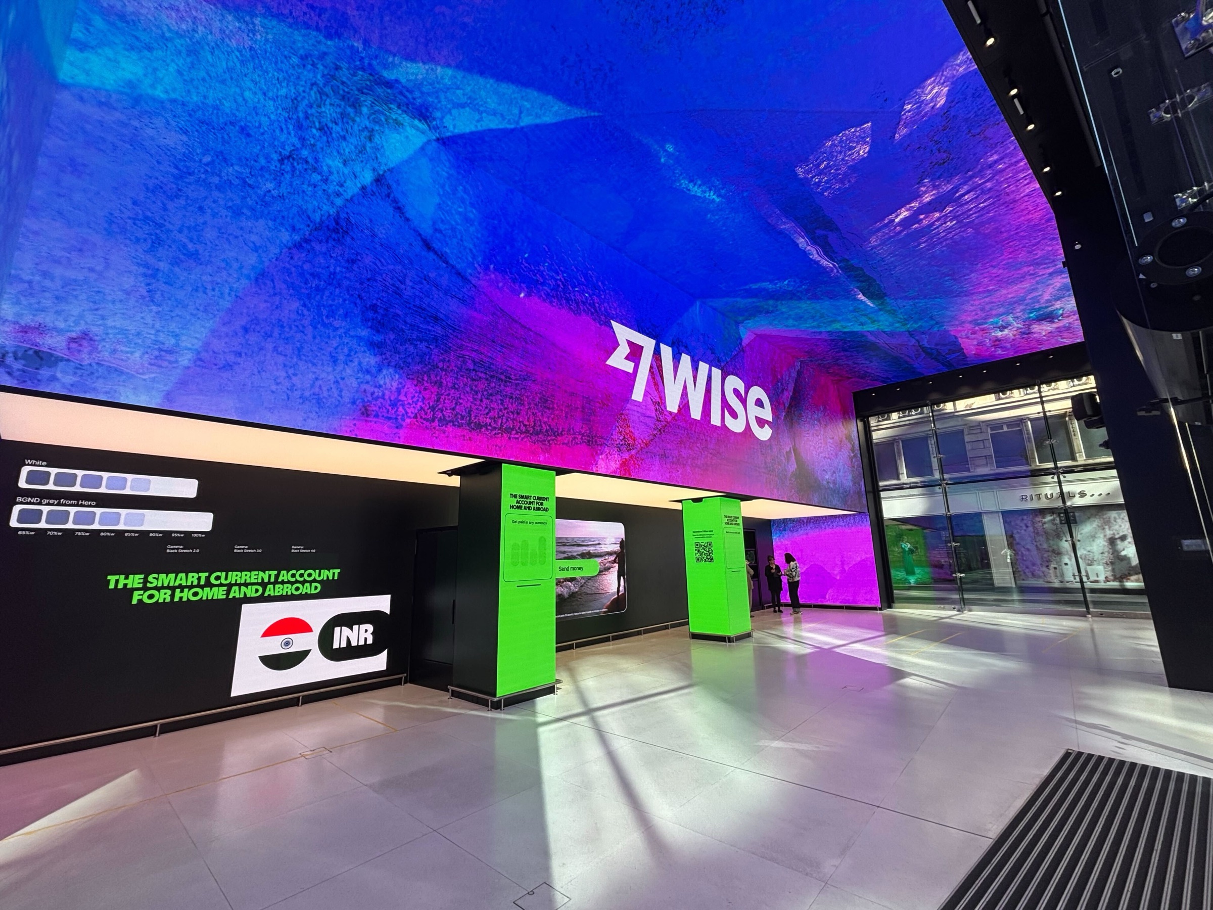
Wise Branch Demo
To mark the launch of Wise's UK Current Account, we took over Future Stores on Oxford Street for two weeks. The brand systems team handled creative direction, design and animation, while I focused on the interaction design and owned the build of the demo at the centre of it, running on tablets throughout the space for people to pick up and explore on their own terms. Using AI as the primary build tool, I took it from flows and interactions through to a live API integration pulling real exchange rates and fees, without handing anything off to engineering.


The challenge
Building something people could actually experience
The space was open to everyone, from existing Wise customers to people who'd never heard of us. The goal wasn't to replicate the app, since people can already do that on their phone. It was to create something tangible and engaging that existed beyond the product itself.
Something you'd pick up, figure out on your own, and want to keep exploring, with no instructions or guided tour, just an experience that felt worth your time whether you were already a customer or had never opened the app.
Before we built anything
Getting aligned before building
The first thing we made wasn't a demo, it was a wireframe prototype. We needed stakeholder sign-off on scope before anything went near a build tool, covering what features were in, what was out, where content was missing, and what compliance needed to review, all of which involved a fair amount of back and forth before anything was locked.
That process wasn't glamorous but it meant by the time we started building, the big decisions were already made. Worth saying that doing this work upfront in standard Figma isn't slowing down. It's what stops you spending credits rebuilding things that weren't right in the first place.
Choosing the right tool
 Claude Opus 4.6 × Figma MCP Console
 Figma Make × Claude Sonnet 4.6
We tried a few things first
We explored building directly in Claude using the Figma MCP console. It didn't prioritise design quality the way we needed, so we moved to Figma Make.
We started with one flow to test whether the approach worked at all, so we started with the send flow. Reasonably contained, well defined, a decent way to find out what Make could and couldn't handle, and when it did we kept going.
The approach
Pairing on design and build
The brand systems team and I worked closely on the design side, going back and forth on content, motion and visual decisions alongside stakeholder and compliance reviews. Once the flows were at roughly 80%, I took over execution, building in Make, refining details, and focusing on getting the whole thing to work as one cohesive experience. When bigger changes were needed mid-build, we went back to design first, without exception.
That last 20% was left deliberately open for animation, interaction details, and whatever came out of actually building the thing. Some of the best stuff came from that space. The UI animation was built in Make using existing Wise motion work from the motion designers as reference. Videos were made by the video animation team and embedded via a Figma Sites workaround, since Make doesn't accept video files directly.
Live rates
Connected to the live Wise API
We wanted the demo to feel like the real product, not a simulation of it. Customers picking up the tablet were seeing the actual exchange rate and fees they'd get on a real transfer, because we were pulling live data from the Wise API to power it.
I got the details from engineering, used Claude to handle the integration logic, and set up a Supabase instance to store and serve the rates and fees in real time. If the whole point is showing customers what Wise can do, showing them a made-up number rather than the real one misses the point of the whole thing.
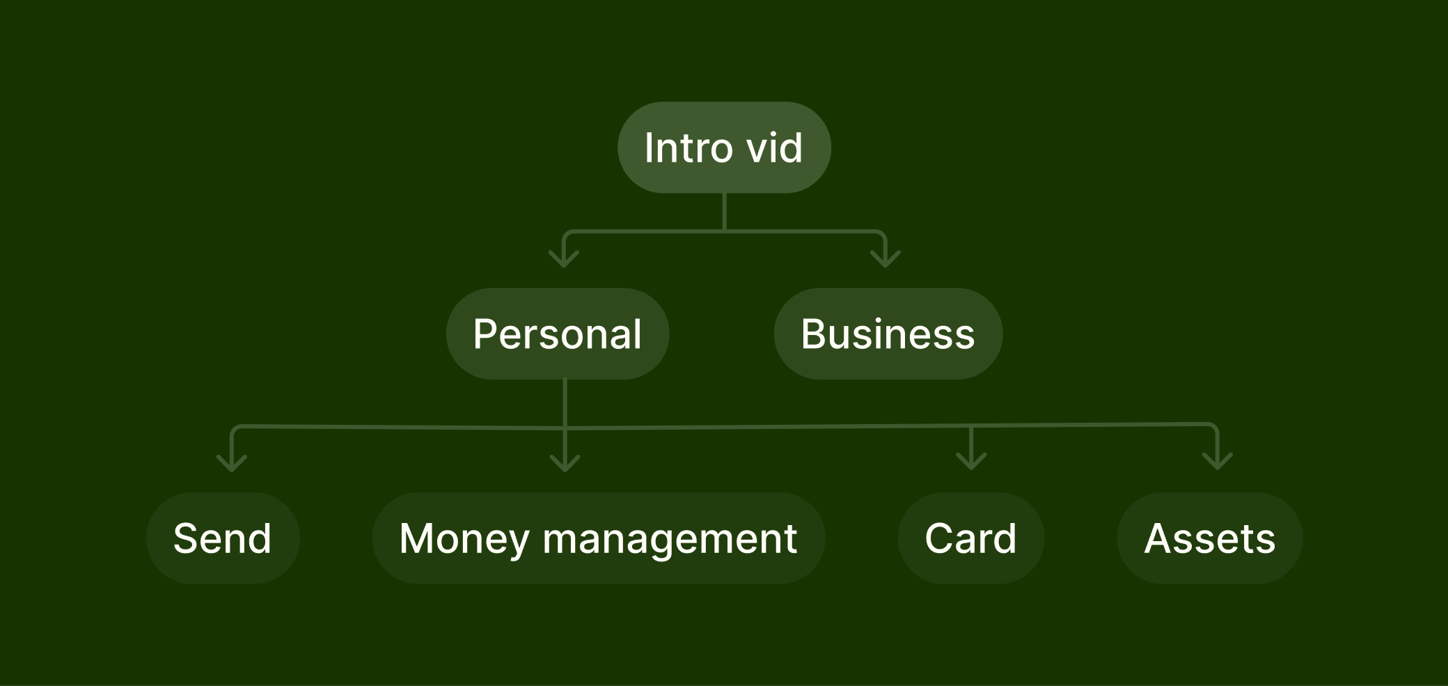
The demo
Opening with context
The demo opened with a short video prompting people to swipe and explore. Simple. It gave people enough context to start without over-explaining what they were about to see.
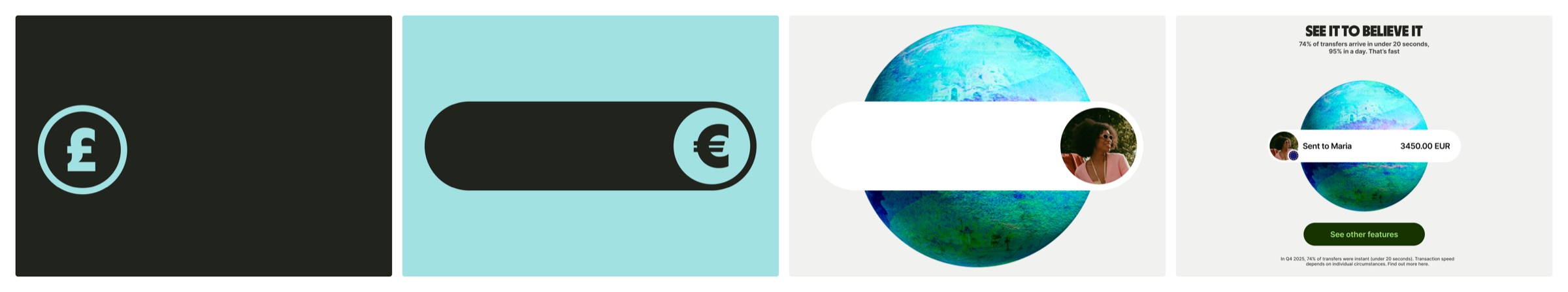
Send
The core Wise proposition, with live exchange rates pulled directly from the Wise API.
Cards
Card management, digital card creation and spending controls.
Travel hub
An extension of the cards flow but visually distinct. Live exchange rates, ATM locations, travel tips and support, all brought together in one place.
Money management
Joint accounts, Young Explorers (the under-18s card), and currency conversion.
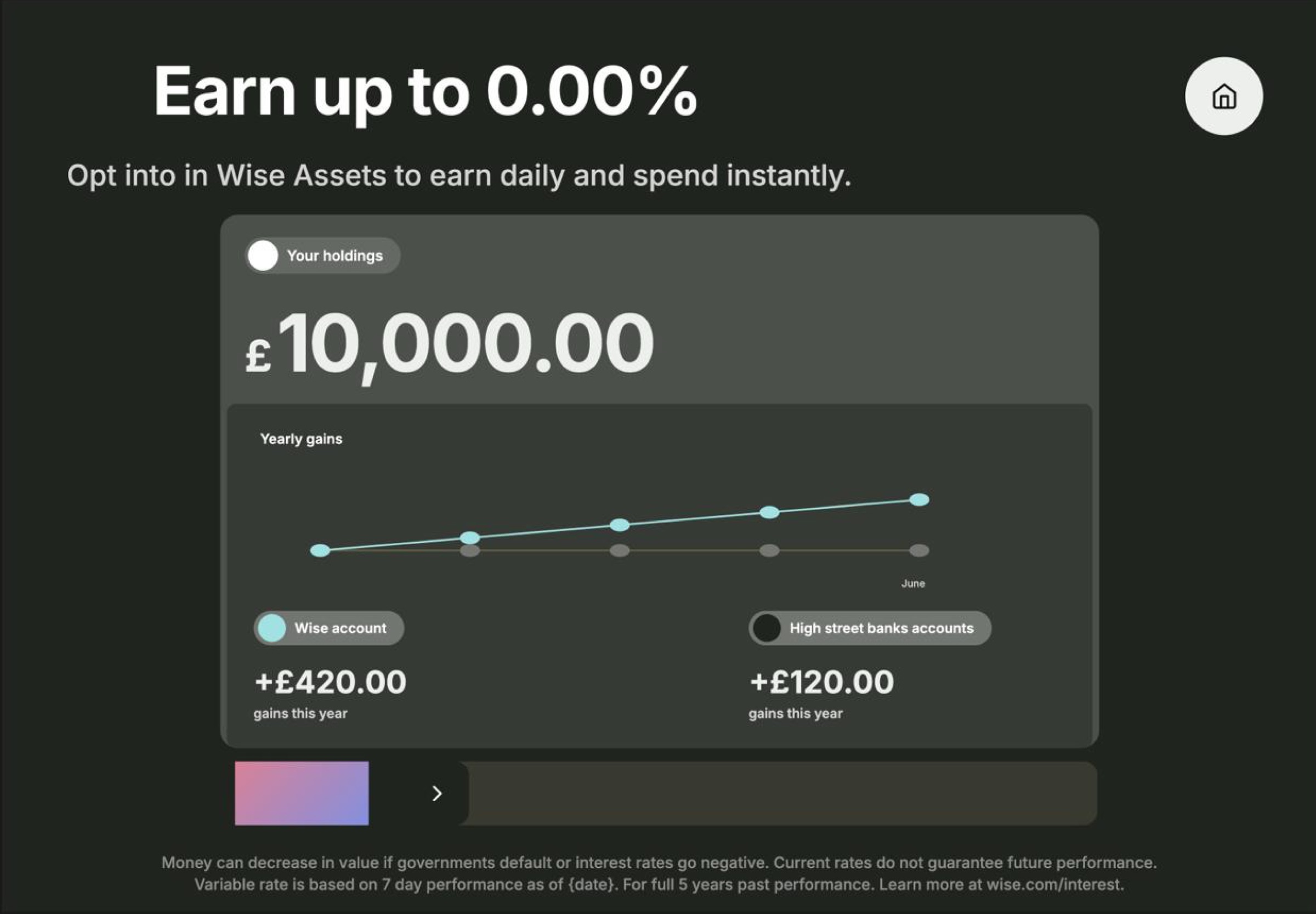
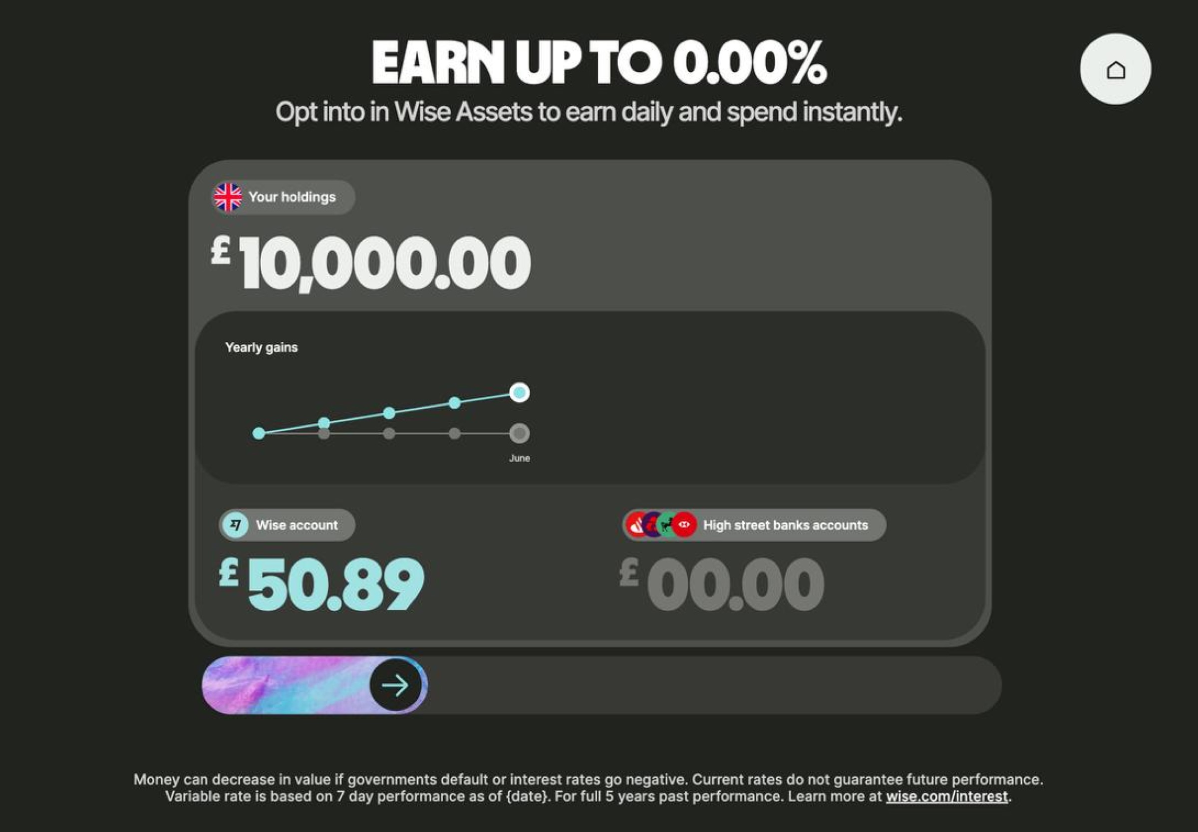
Assets
Interest across multiple currencies, with a visual showing how that builds over a year.
Business
Kept as a video rather than an interactive flow. Right call for the complexity involved.
Try the demo
The demo ran on tablets in the space, explore it yourself.
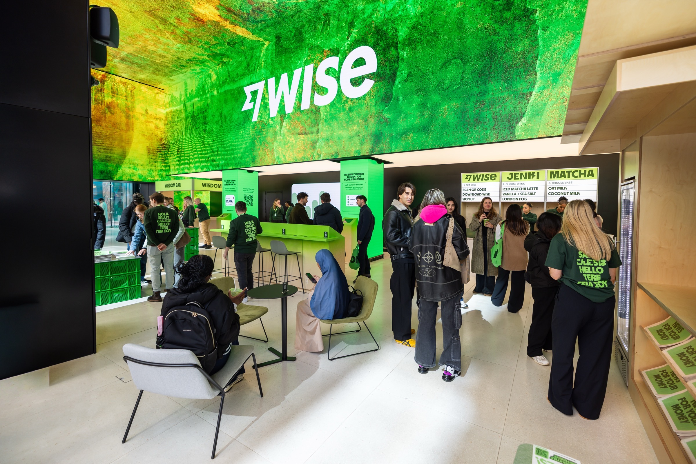
In the space
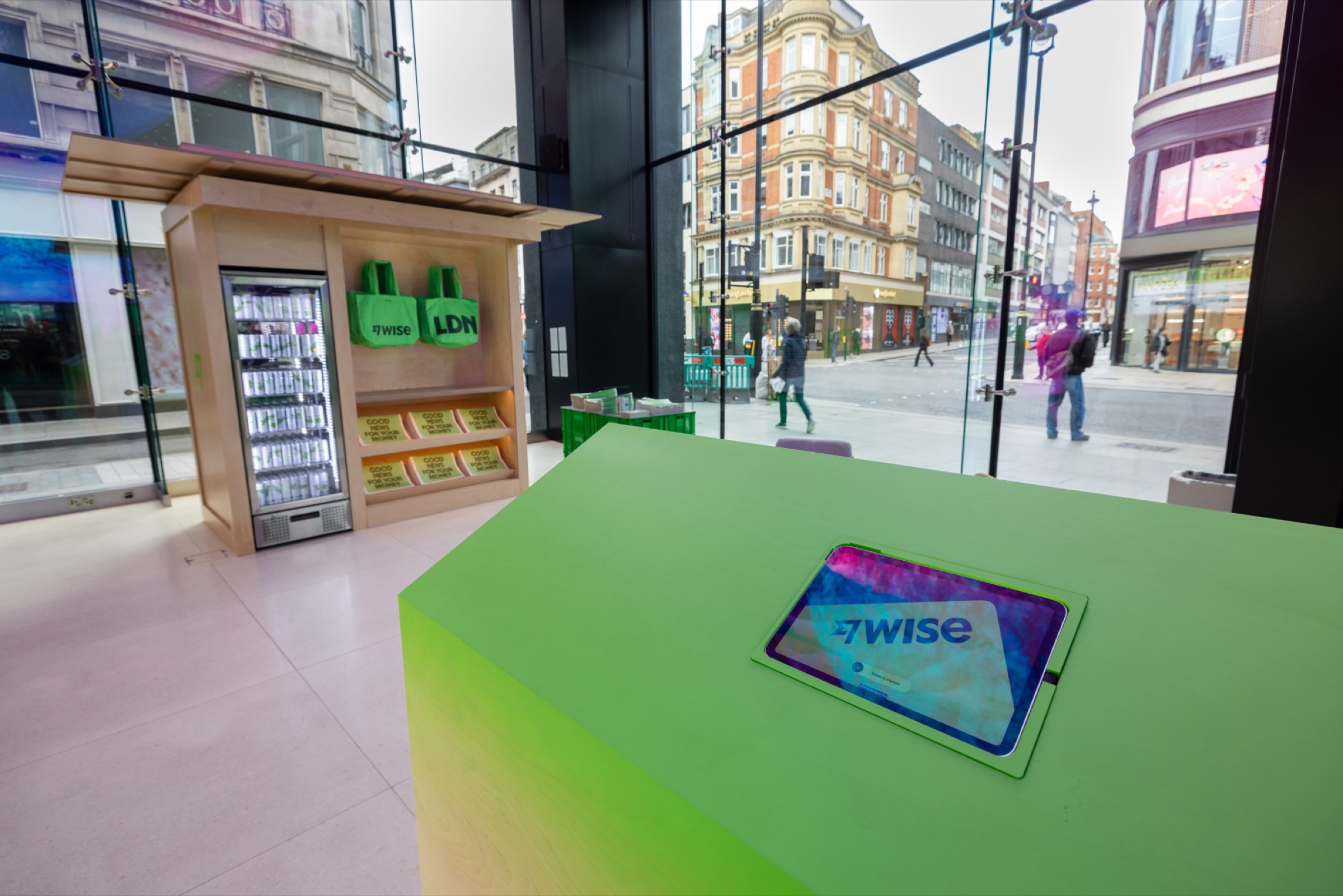
Demo ready to go
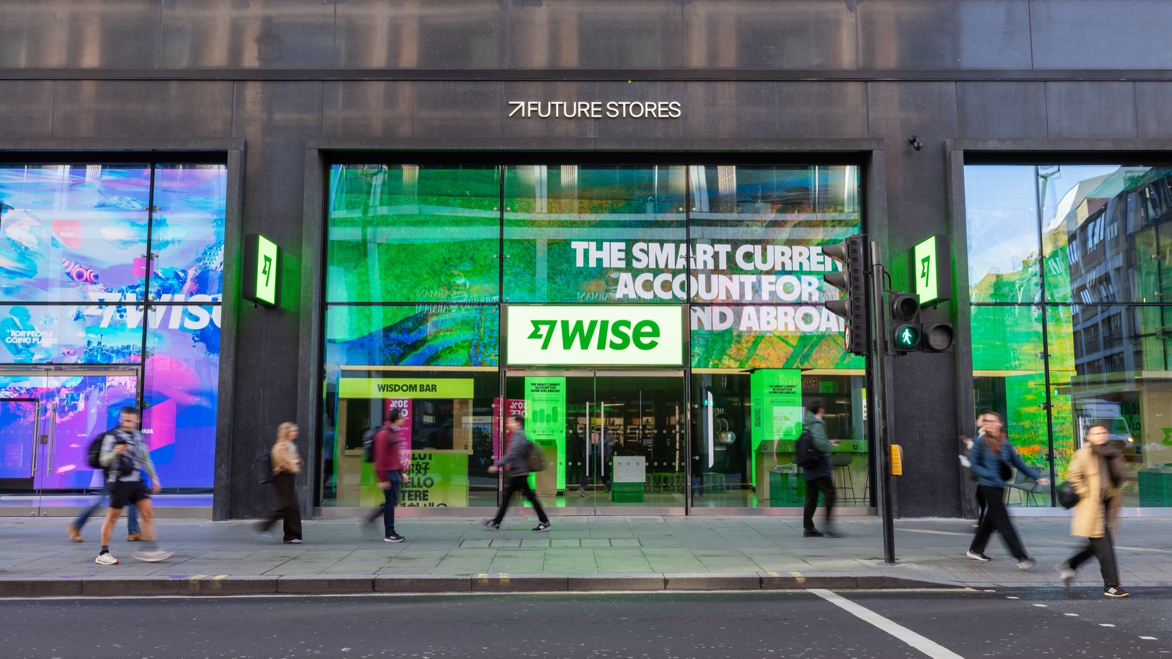
Future Stores, 95 Oxford Street
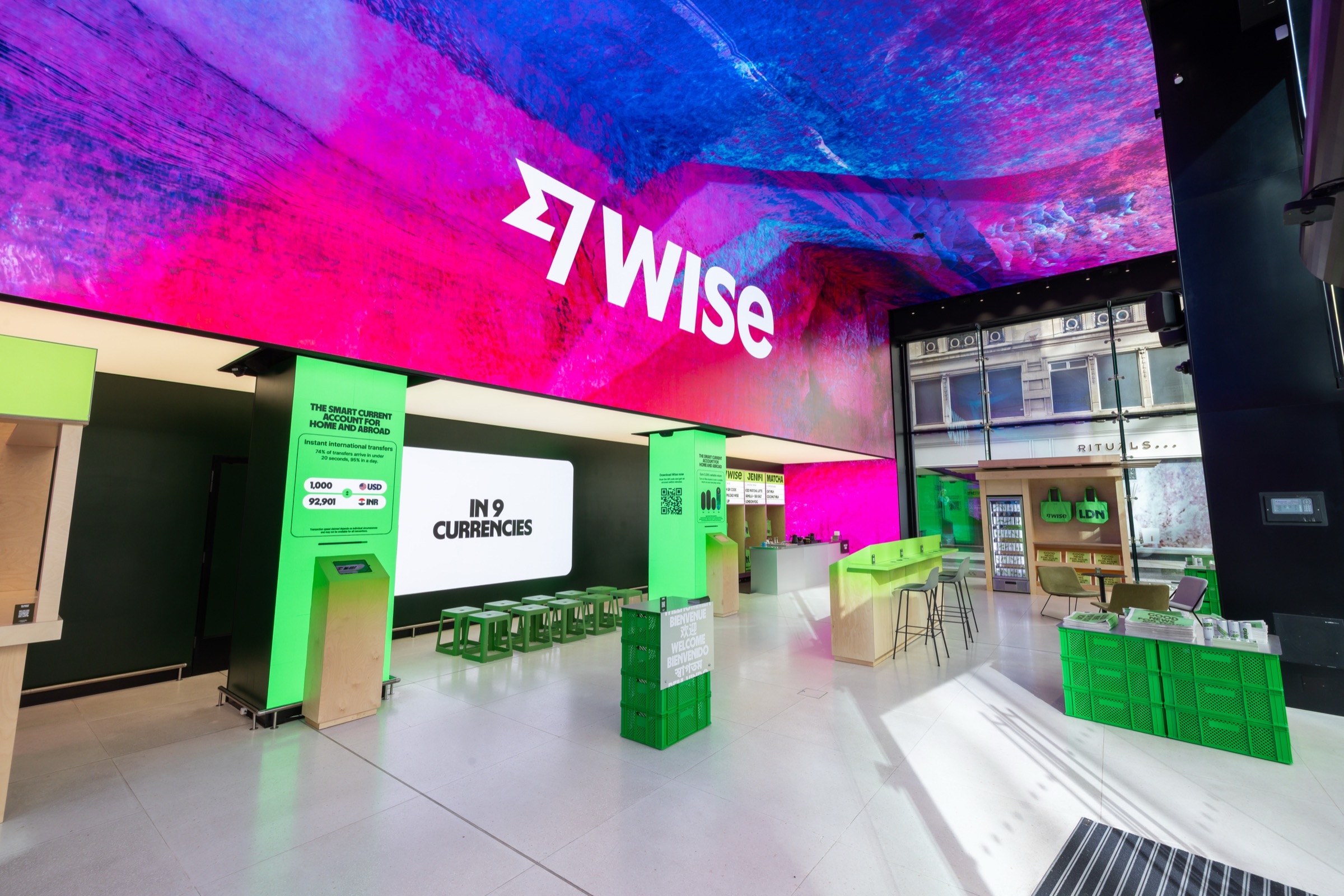
Venue interior
Future Stores, 95 Oxford Street
Future Stores is an interactive retail space on Oxford Street. Two weeks, March 30 to April 13, open daily. The demo ran on tablets throughout as a self-service experience.
Staff were on hand for anyone who wanted to go deeper, with free matcha and tote bags for anyone who signed up in store.
The results
 Day one
1,900
visitors on opening day, against a projection of 689. Future Stores' biggest Monday on record.
 QR codes scanned
8.6K
scans across the two-week run
 App installs
3K
tracked across the two-week run
 Sign-ups
2.6K
new accounts opened via QR code
What I learned
A few hundred prompts later
This didn't take an afternoon. It took hundreds of prompts, a lot of QA, plenty of time in VS Code and Chrome Inspector tracking down styles Make couldn't surface, and constant back and forth with the team. AI made it possible for a designer to build something at this level of complexity. It didn't make it easy.
What it does do is reward what you already know. Recognising when output has gone wrong, knowing what good looks like, understanding the front-end well enough to fix things manually when prompting is slower. That stuff comes from experience, not from the tool.
Do your thinking in Figma first
Credits go fast. Design mode is free. Work things out before you start spending them.
One prompt, one change
Bundling is how you break something that was working. Small focused prompts are recoverable.
Keep your files clean
Make prioritises structure. Messy layers carry across. Frames and Auto Layout over Groups.
Use version control
Save a named version before any big change. Always have somewhere to roll back to.
VS Code and Chrome Inspect are your actual best friends
Make can't search across a whole project. Download the code, open it in VS Code, find the thing in seconds. A bit of front-end knowledge goes a long way.