Wise calculator redesign
As part of our collaboration with the Send team, we redesigned the money movement calculator, one of Wise’s most critical and high-traffic flows. This work surfaced key limitations in our system and led to foundational improvements across core components, helping us scale consistency across product, not just improve one experience.


The challenge
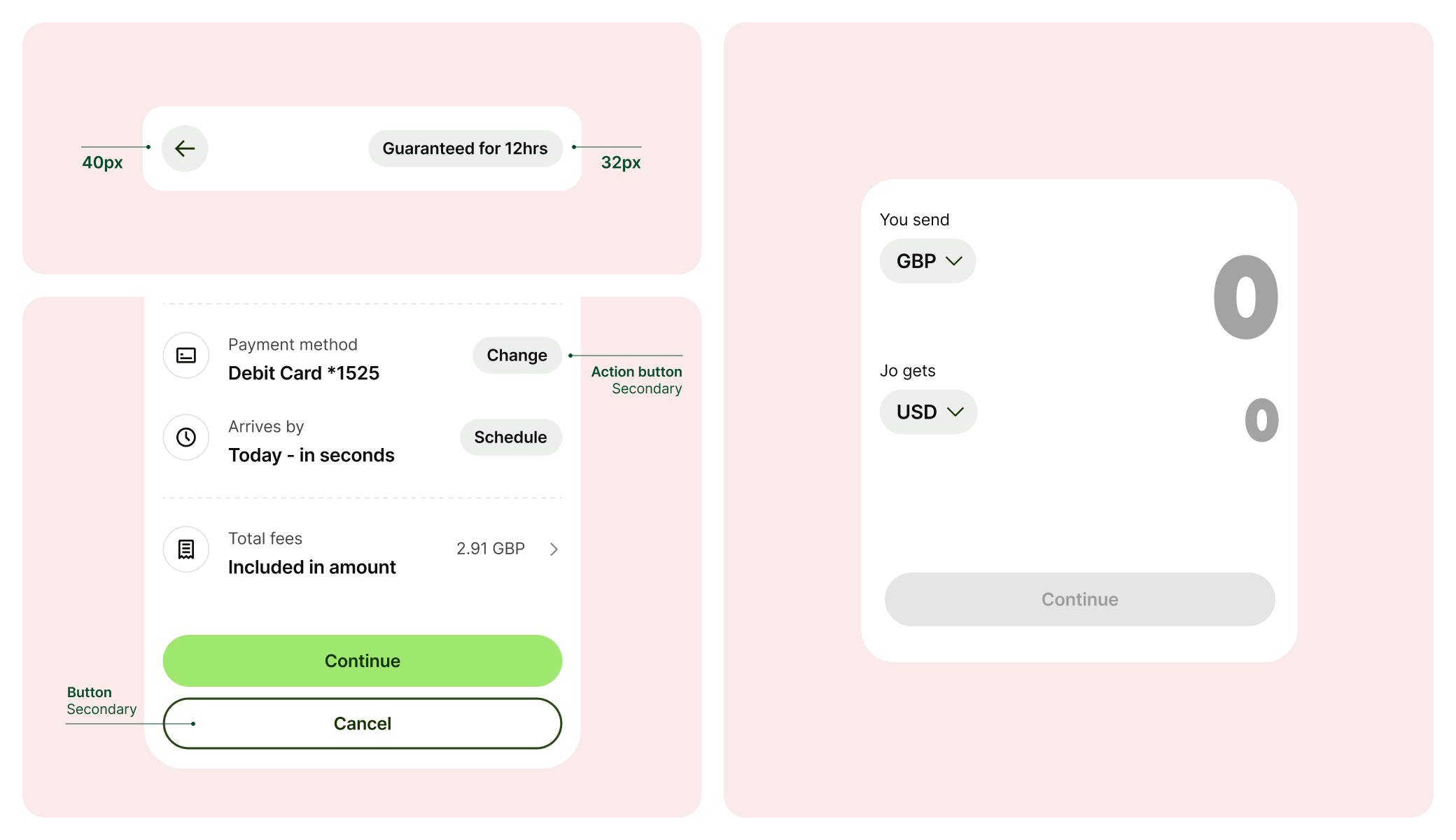
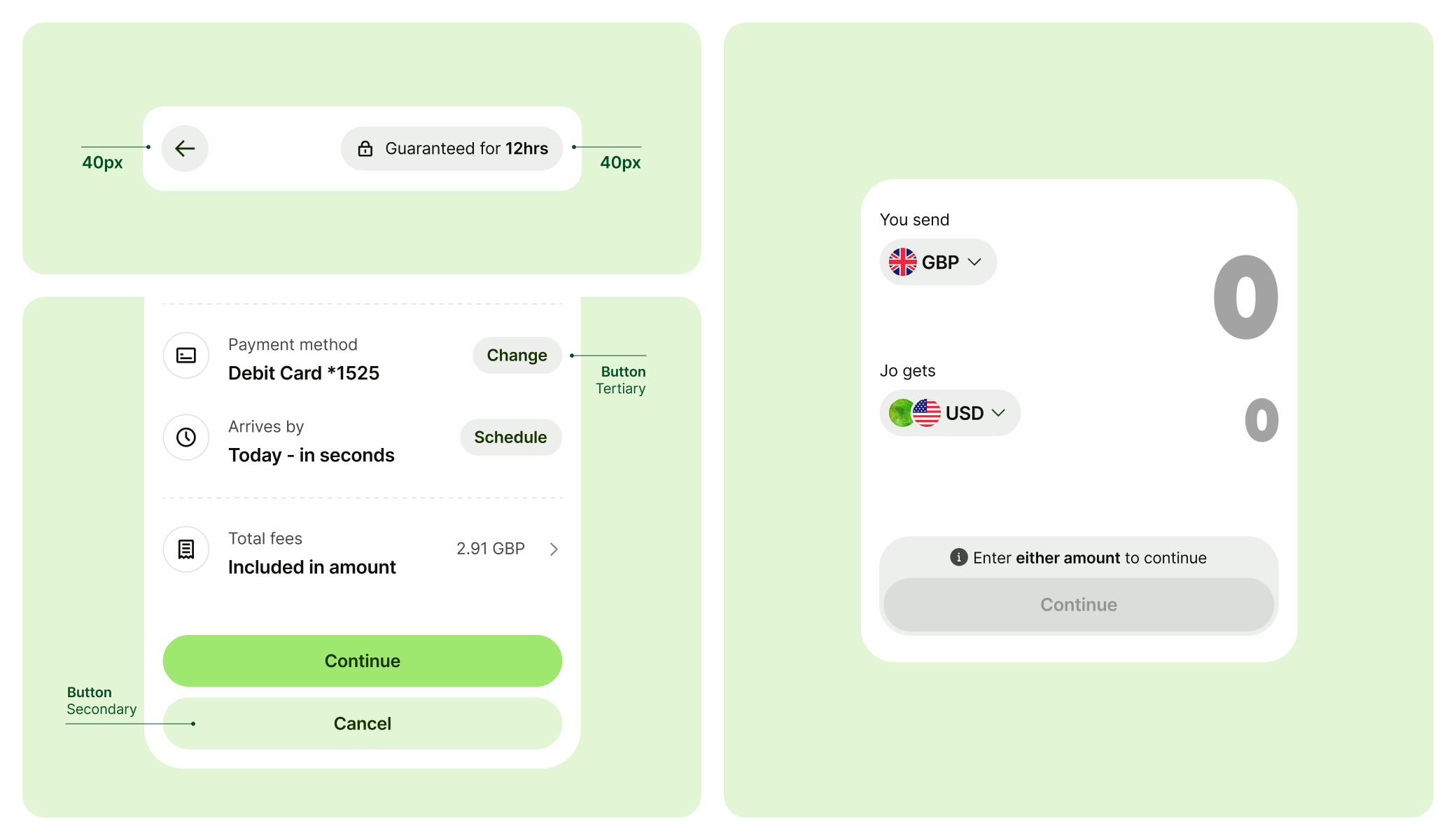
The wise calculator
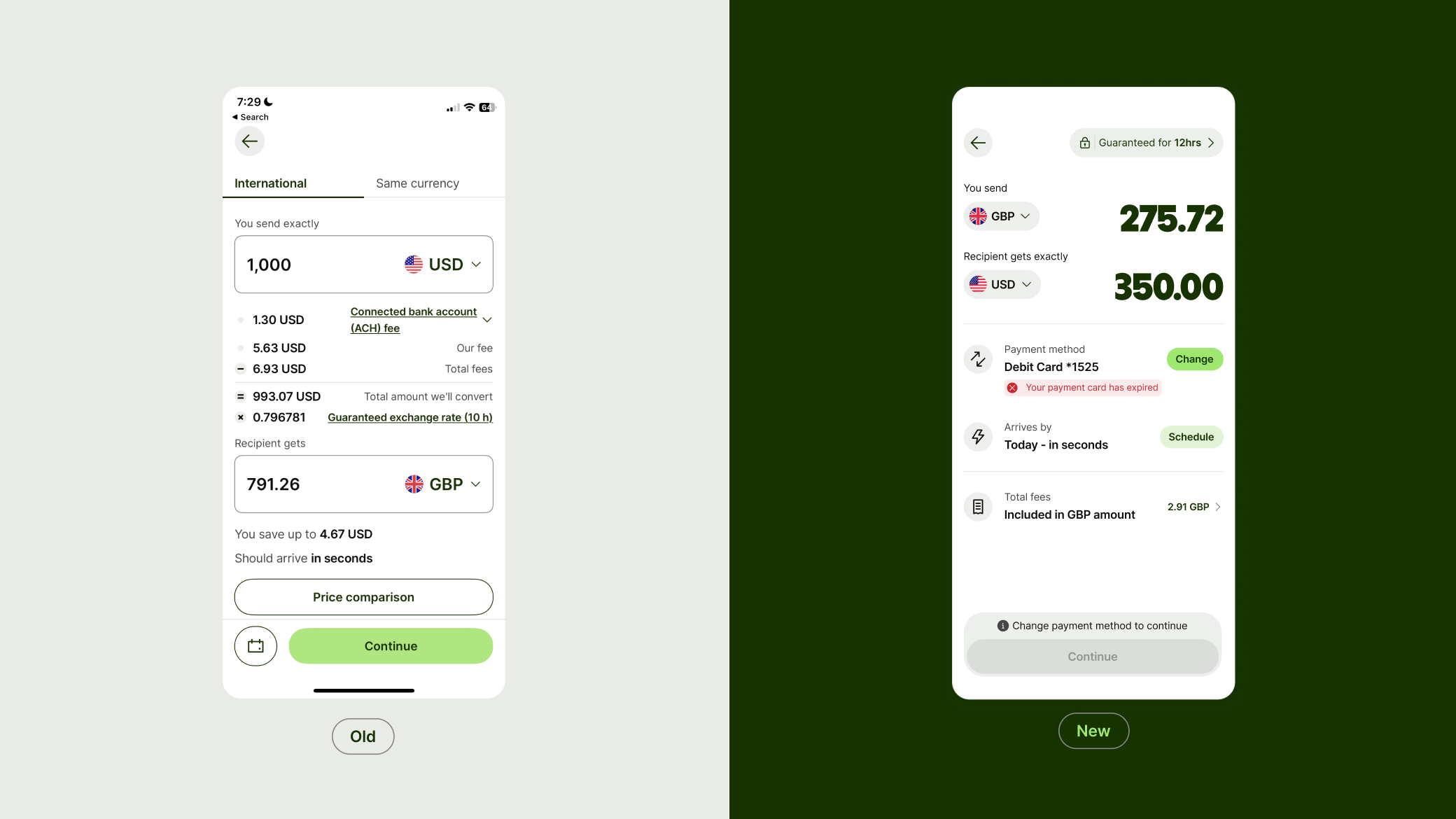
The calculator has powered cross-currency transfers for over a decade, driving 87% of volume and much of Wise’s revenue and profit. Yet the flow had seen little change and remained a weak point for conversion.
We partnered with the Send team to reimagine the experience, updating core components and using the redesign as a chance to strengthen the system more broadly.
Proposed updates and additions
The redesigned calculator pushed the system to its limits, exposing the need for foundational changes to some of our most basic components.
As part of the audit, we identified where these updates would have the greatest impact across product to ensure we were building for scale, not just for one team.
Phasing
Atomic breakdown
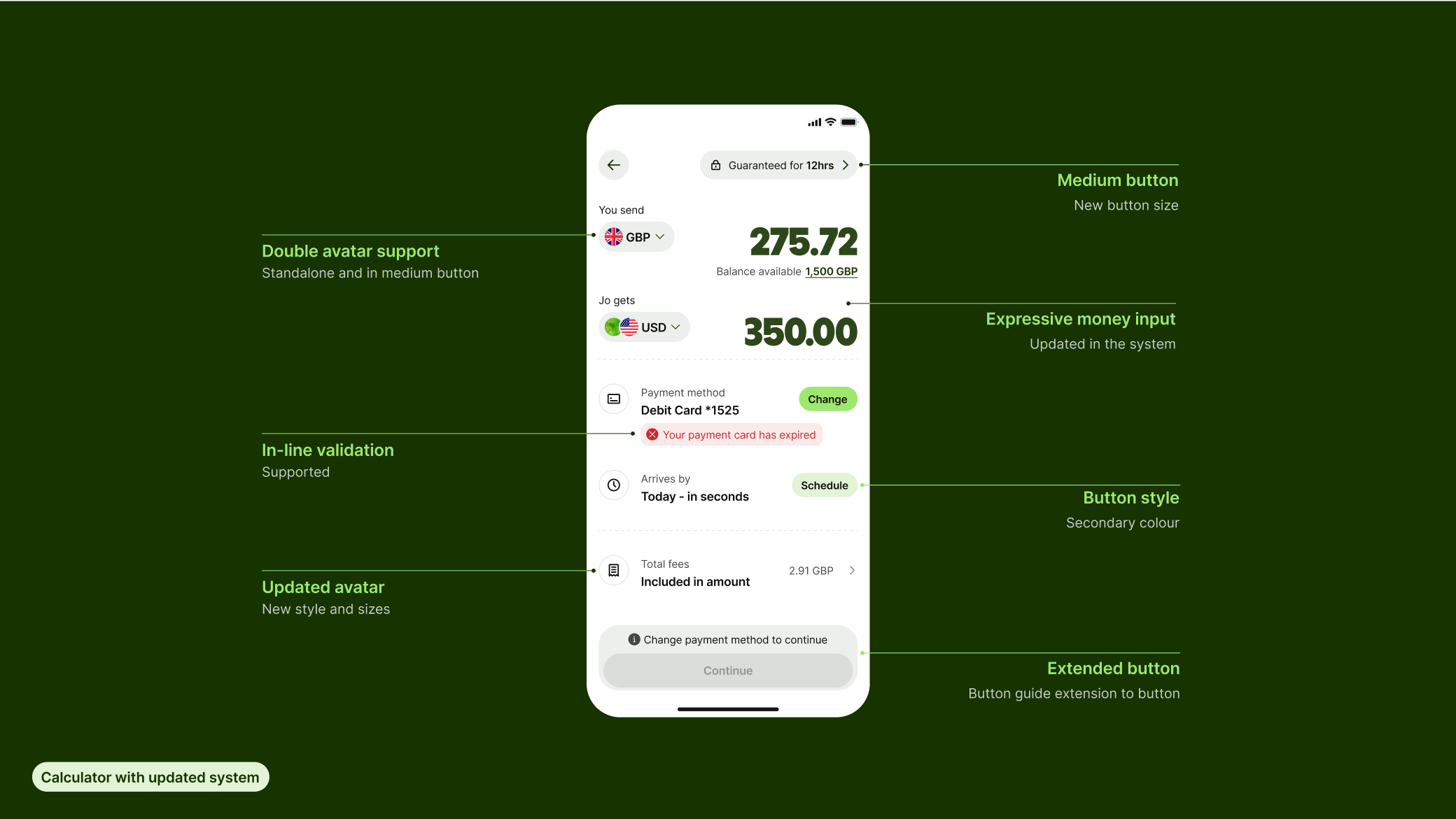
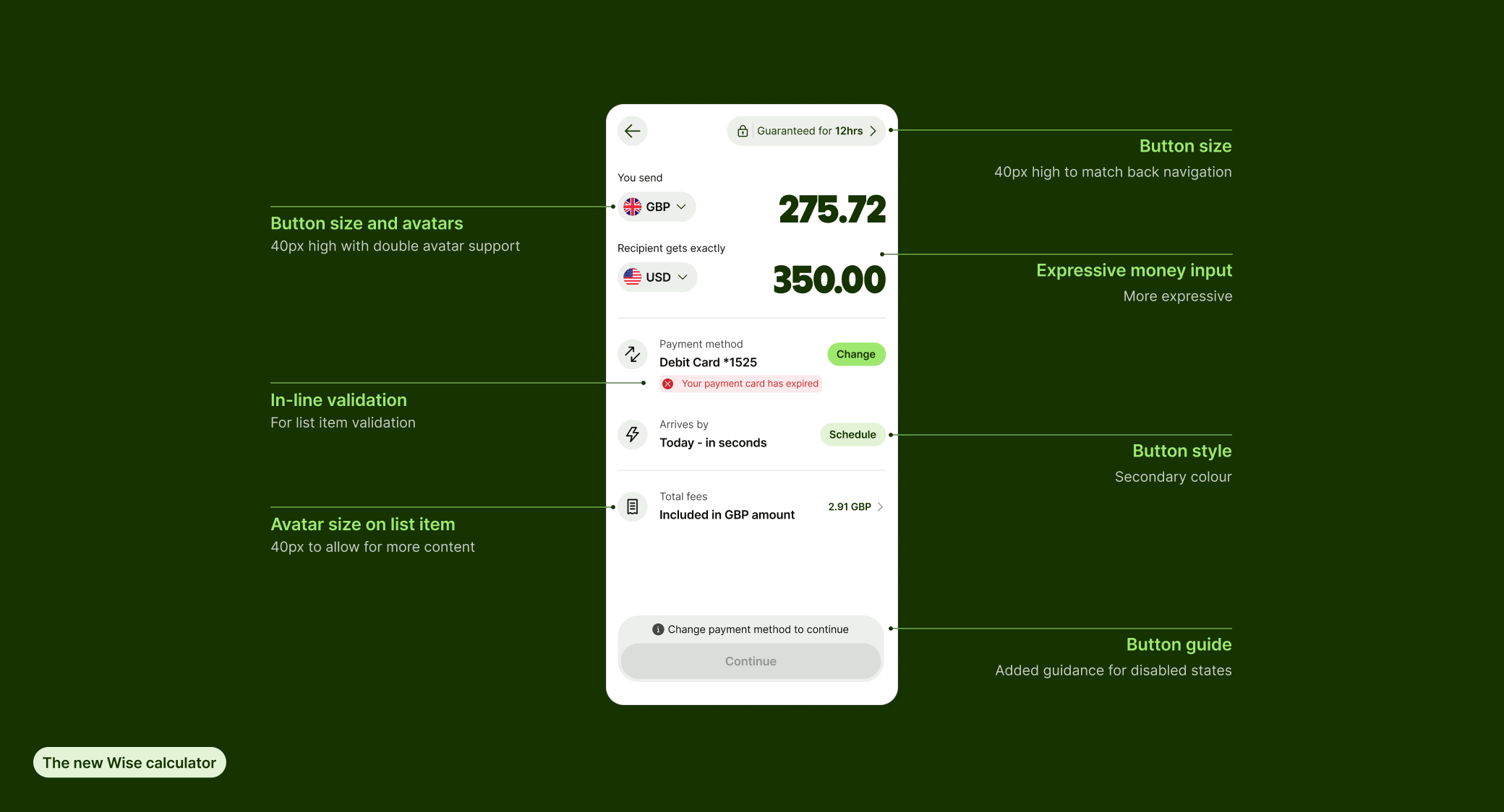
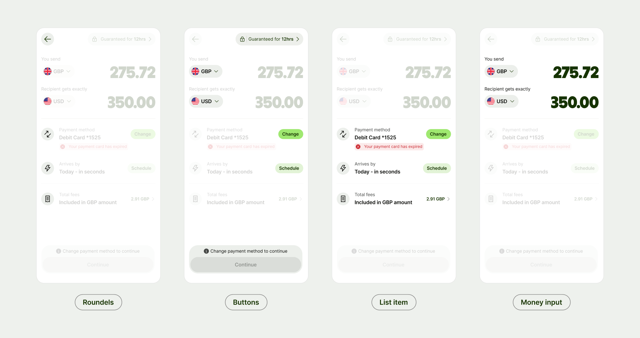
We approached the work in atomic phases, starting with our roundel components like avatar and progressing through to list items and the money movement input.
By focusing on smaller elements with broad impact, we ensured the updates would improve not just the money movement experience, but the wider product as well.
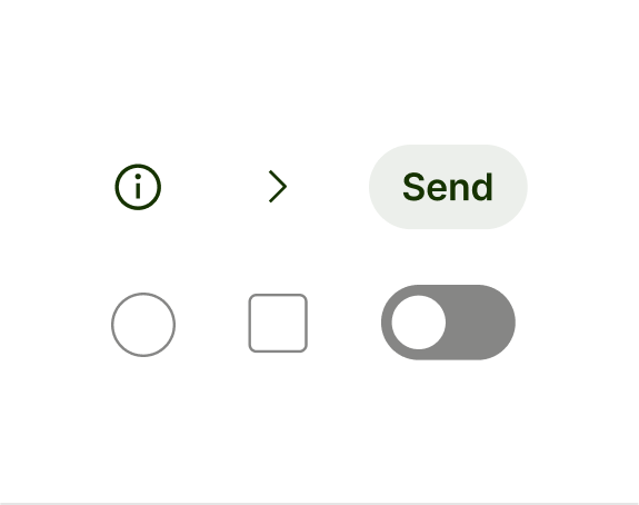
Phase 1: Roundels
Improvement opportunities
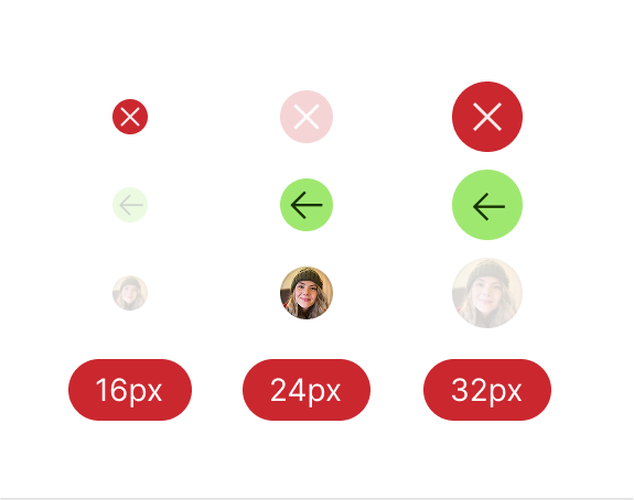
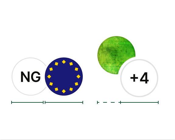
Misalignment
Inconsistent sizes across status, icon buttons and avatar.
Double avatars
No standard for paired avatars leading to customisations.
Lack of affordances
Interactive and non-interactive defaulted to flat grey backgrounds.
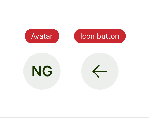
What we did
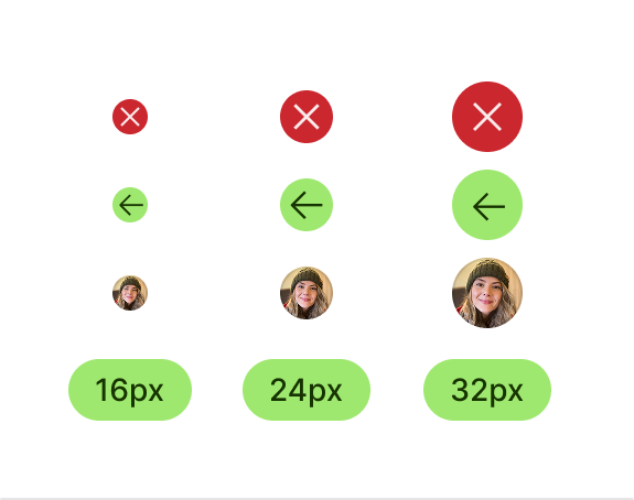
Double avatars
Support with safe zones for content.
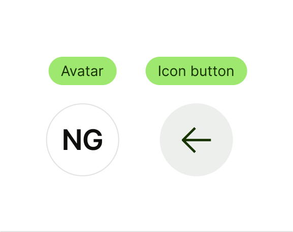
Clearer affordances
Added interactive and non-interactive variants.
Phase 2: Buttons
Improvement opportunities
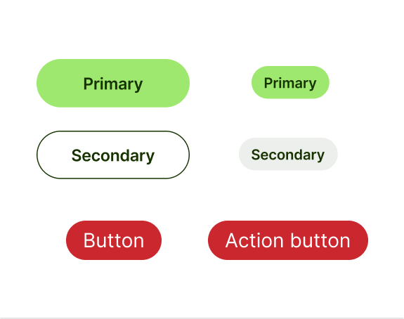
Multiple button types
Action button vs. button, different styles same thing.

Size and accessory support
Gaps in sizes for usage, no support for avatar.

Disabled buttons
Ambiguous disabled buttons confused users.
What we did
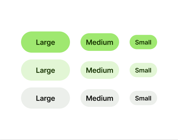

Accessories
Avatar and Icon support on select sizes.
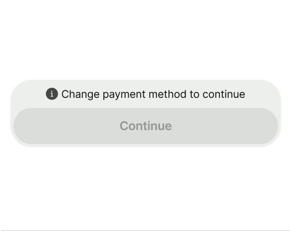
Button prompt
Extension on the button to guide the user to the next step.
Phase 3: List item
Improvement opportunities
Too many components
Seven components, across 100k+ Figma instances, with minor differences.
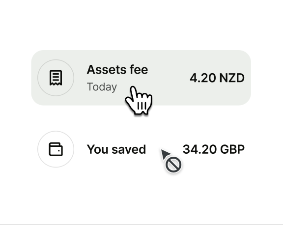
Unclear affordances
Teams used the same styles for clickable and static list items.

Highlighting key items
Most list items were equal, but a few deserved extra attention.
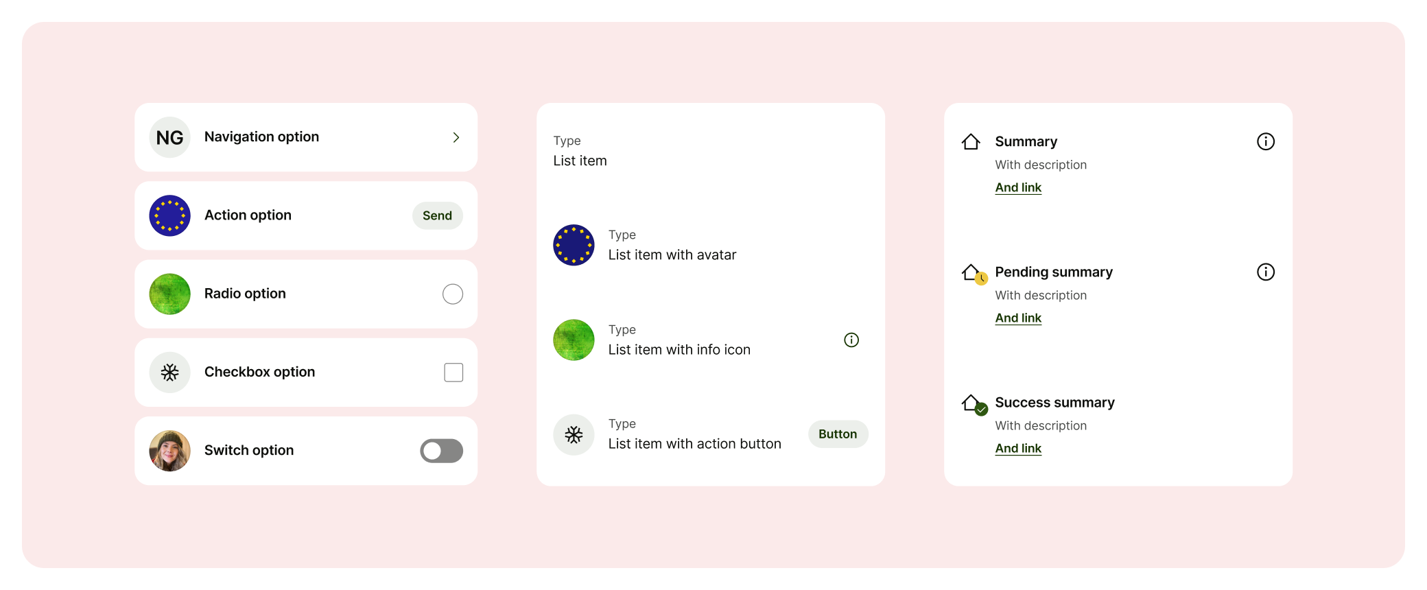
What we did
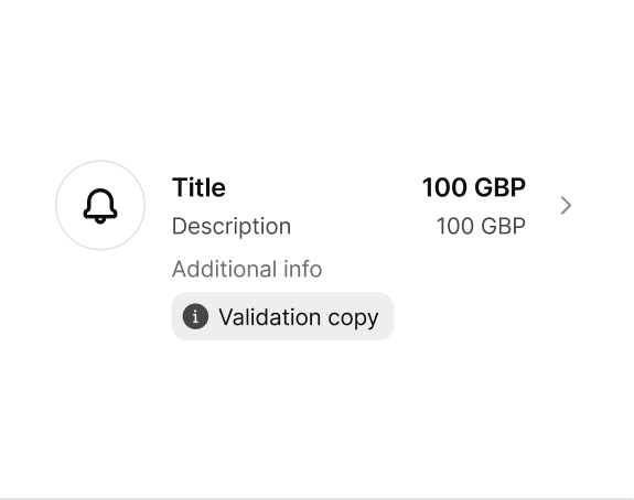
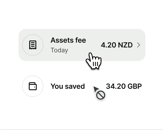
Clearer affordances
Using accessories to guide users.
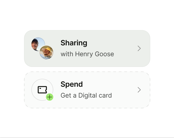
Spotlight support
Extension of the list item to support all types.

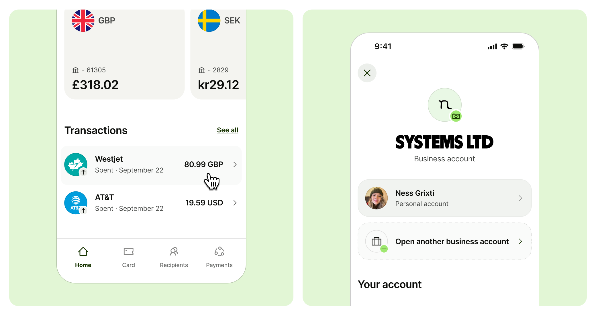
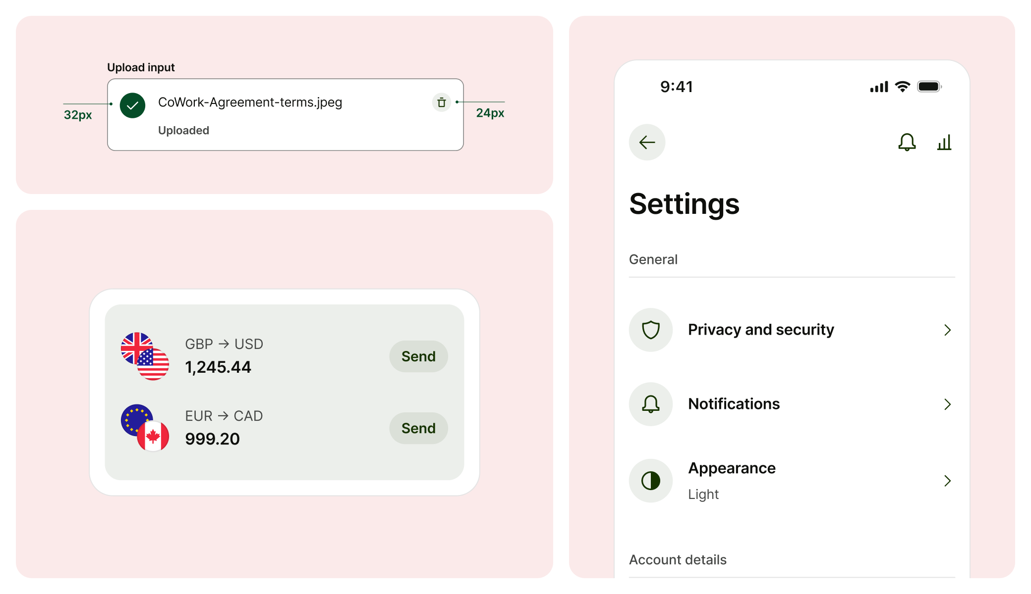
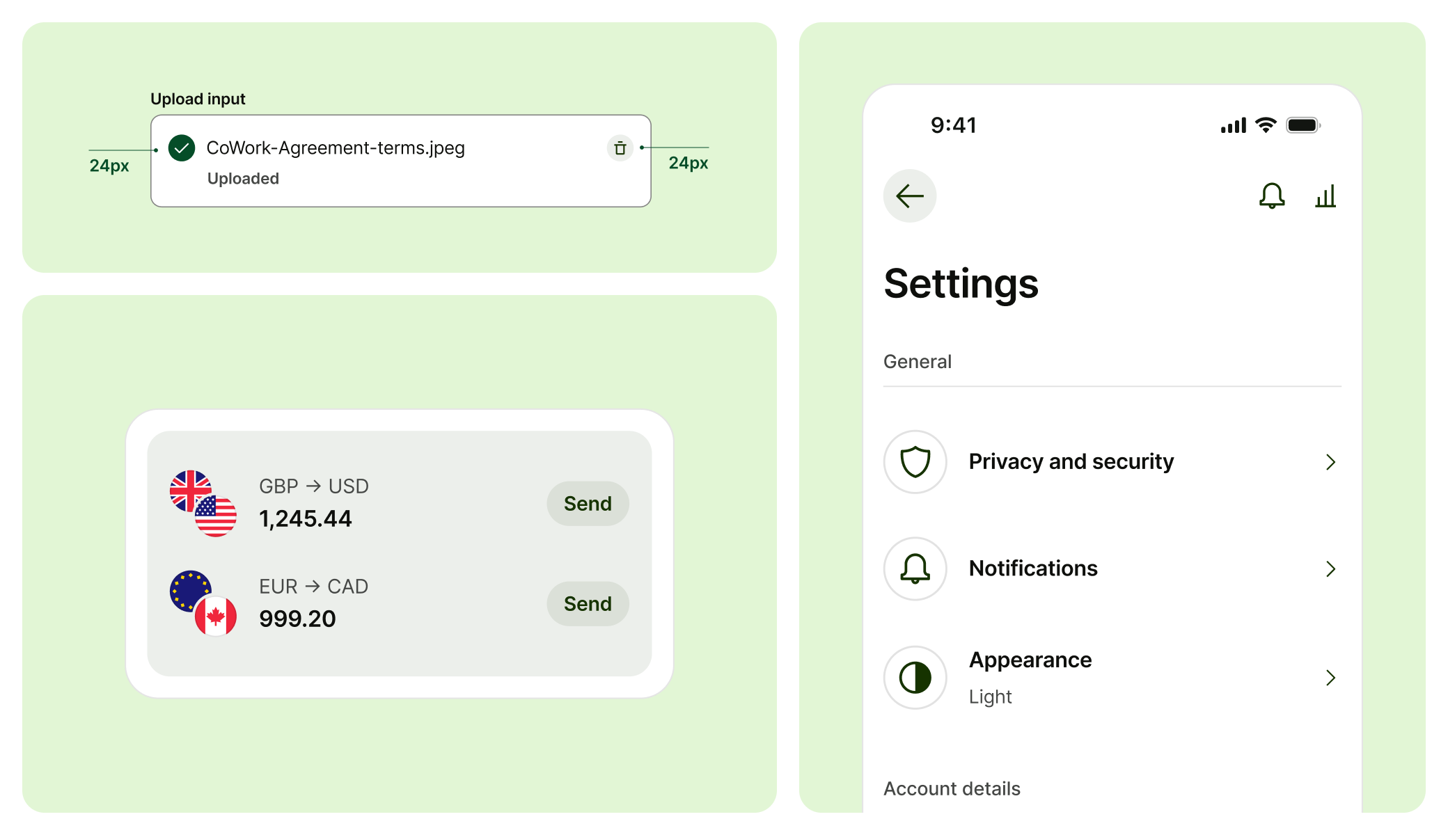
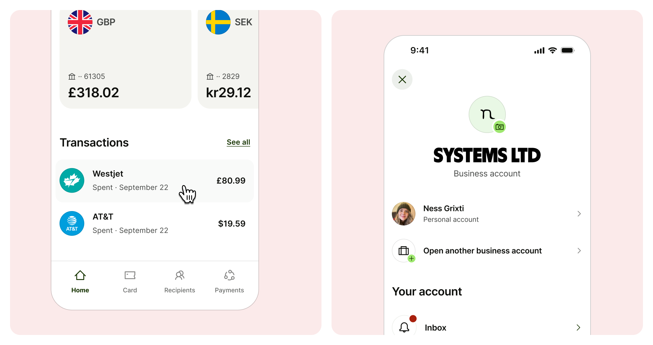
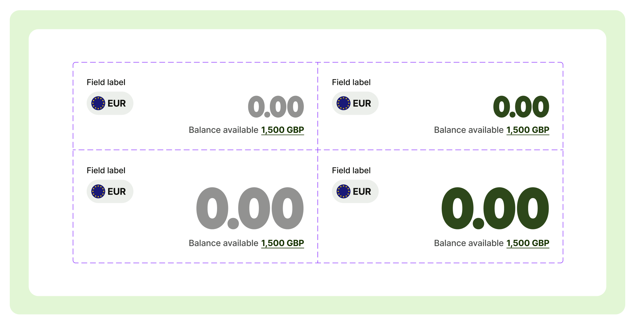
Phase 4: Money input
Lift and shift
With all the pieces in place, we took the Send team’s implementation and brought it back into the system. Creating additional light touch usage guidance for support.
This ensured core money movement flows had clear access to the updated component.
The results

Teams benefitted from component improvements


Uplift in conversion from the new calculator experience


Core money movement flows supported