Wise Design System Onboarding
The Wise design system was in good shape, but designers weren't getting the most from it, going custom, raising support requests for things that already existed, and suggesting work we'd already shipped. The system didn't need fixing, the onboarding did, so we built one from scratch. An interactive Figma course with a custom plugin and two widgets to make it genuinely useful and maintainable long-term.


The challenge
Lack of onboarding, and it was showing
Back in 2021, the design system was still finding its feet, and one of the first projects to land on the team was building a video onboarding series to help new designers get up to speed. For a while it worked, but it dated fast as every system change made a video slightly wrong, and the rebrand made them all redundant at once. We got rid of them and fell back to ad hoc sessions and occasional onboarding calls whenever someone new joined.
Over time, the cracks started to show as designers went custom, raised support requests for things already in the system, and suggested work we'd already shipped, not because the system was lacking, but because there was no good way to discover what was in it. The design system was already big and continuing to grow, which made the gap feel even larger, and a session you attend once and forget was never going to close it.
The approach
Building inside Figma
Another video series wasn't the answer, and more calls weren't either. The inspiration came from Figma's own approach to new feature launches, interactive demo files that let you see and copy real examples. That format felt right because it lives where designers already work, it's hands-on rather than passive, and unlike a video it can be updated without a reshoot. The goal was something you'd actually go through, not just bookmark and forget.
We structured it like a course, linear enough that someone new has a clear path but modular enough that someone experienced can jump straight to what they need. The whole file is a sandbox, you duplicate it, make it yours, and nothing you do touches the source. It wasn't just for new starters either, for designers who'd been at Wise for years it was a way to get up to speed on parts of the system they hadn't touched in a while.
Testing and iteration
We tested it before we shipped it
Before releasing, we ran structured testing sessions with designers across the team, from new joiners to experienced product designers. The design challenges landed well, with people finding the hands-on exercises genuinely useful and several asking for more. People also flagged wanting more context before diving into component variations, and the examples skewed too mobile for how most designers were actually working.
The most consistent feedback was around configurations. Seeing designed states helped, but it kept designers one step removed from the component itself, and they were still switching to the properties panel to make sense of what they were looking at. We restructured the pages, added desktop coverage, and leaned further into the hands-on challenges, but the properties panel problem pointed toward something content alone couldn't fix, and it ended up shaping the direction of the tooling entirely.
The tooling
Making it interactive on the canvas
We'd been thinking about Figma widgets at Wise for a while but had never had a use case compelling enough to actually build one. The testing gave us that use case. The goal became making the file as interactive on the canvas as possible, so we started exploring what was achievable with Figma's plugin and widget APIs, which led to three tools, each solving a different piece of the problem.
A way to control component properties directly from the canvas, a way to bring documentation into the file without leaving it, and a way to build and maintain the component pages at scale without them becoming a full manual rebuild every time something changed.
OnDeck
A plugin that builds component pages at scale from a template, cycling through each component, dropping instances into place, pulling descriptions from Figma, and filling repeated text fields automatically. What would have taken days to build manually became something we could run, update and maintain.
LinkPreview
Opens any URL in a dialog on the Figma canvas so designers can reference documentation without leaving the file. Designed for global reference at the component or page level, with a reset button to return to its original URL. Available for any designer to use in their own files, making it one of the most broadly useful things to come out of the project.
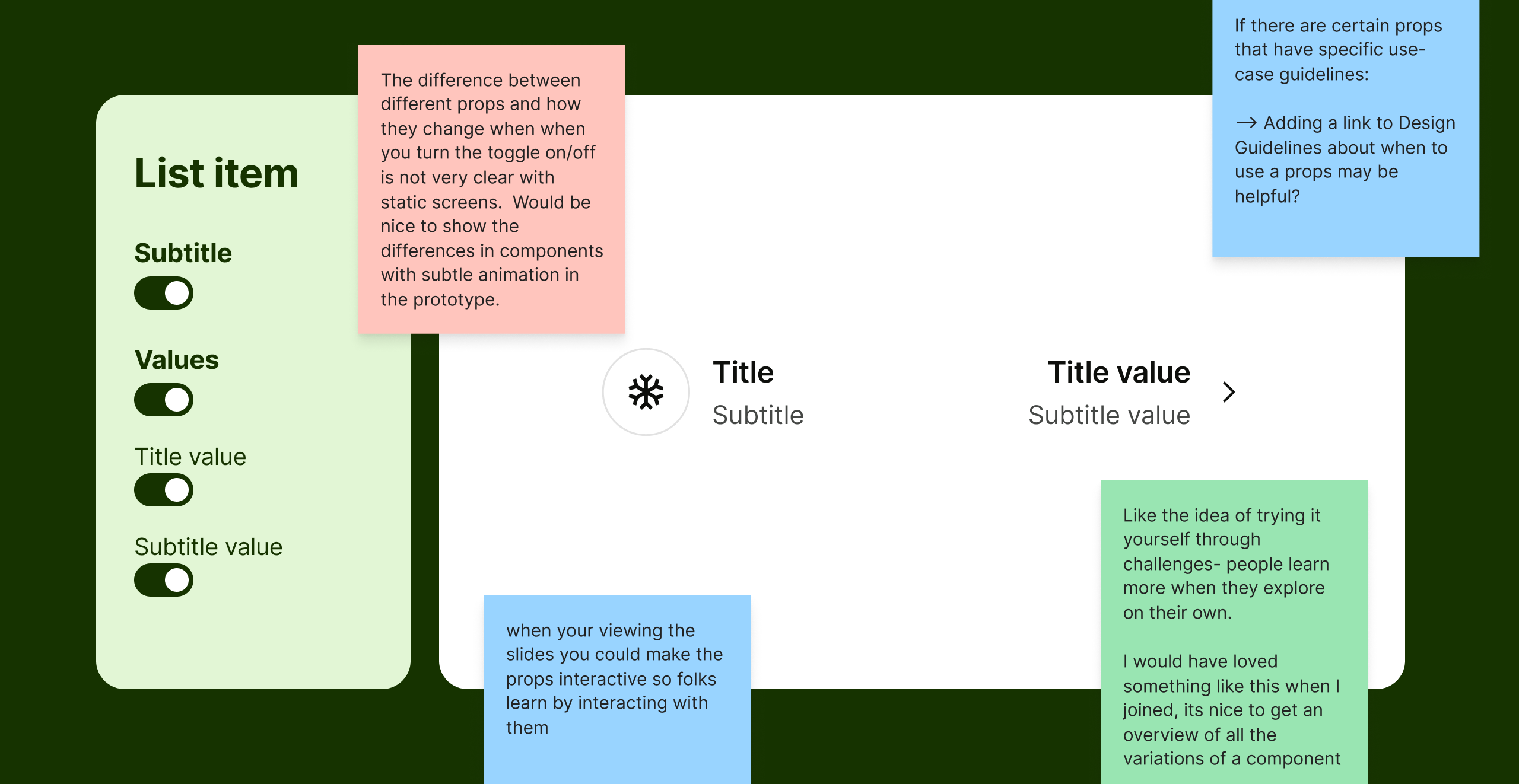
PropShop
Born directly from the testing insight, PropShop sits on the canvas next to a component and controls its properties in real time, variants, states, slots and dynamic text, without touching the properties panel. For complex components the panel gets overwhelming fast, so PropShop surfaces only what matters, lets you search and reorder, and has its own contextual LinkPreview to jump to variant-specific guidance without leaving the canvas.
Inside the course
Getting started
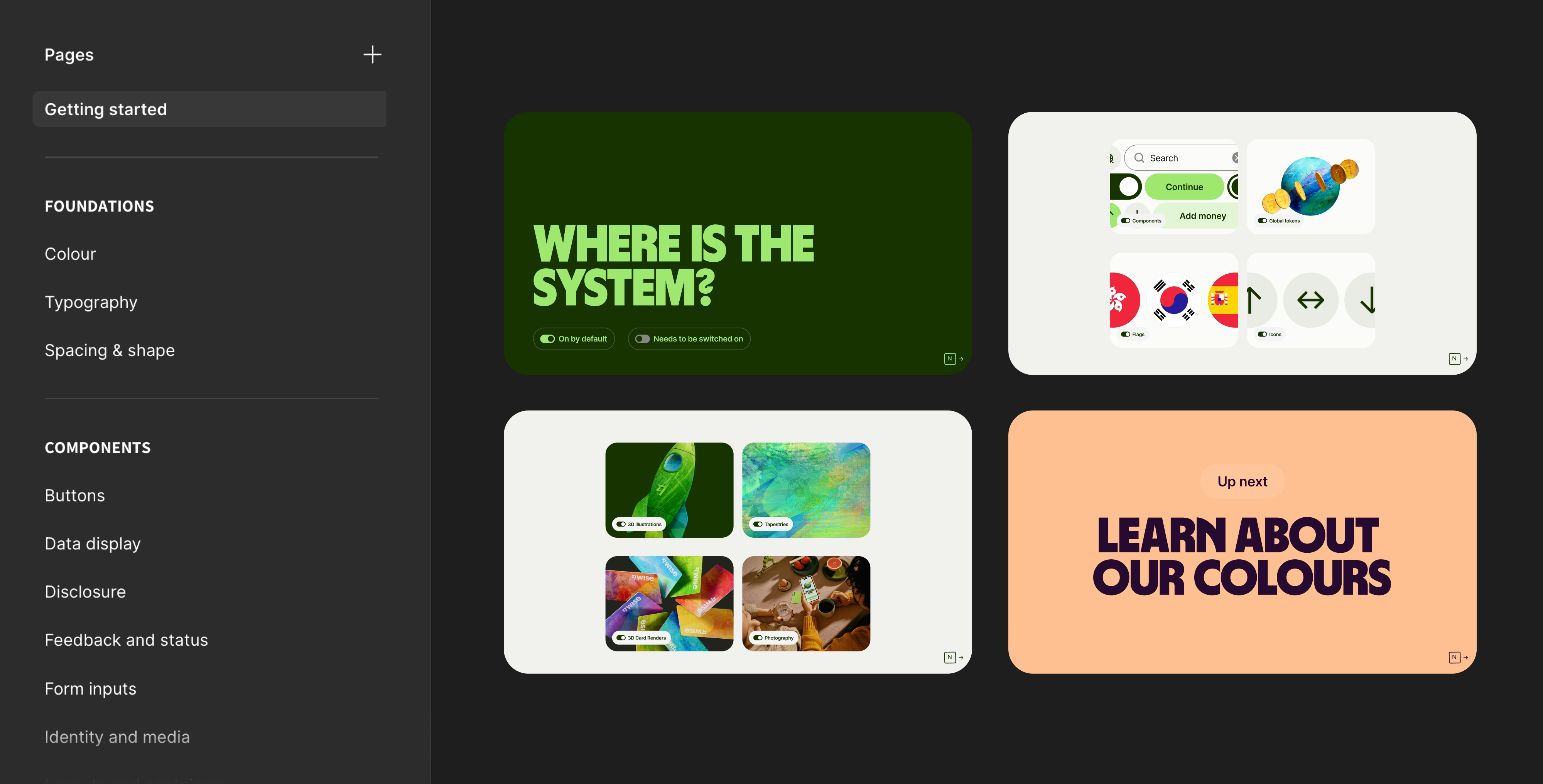
The first stop covers everything you need before you touch anything else, from who the team is and what we're trying to do, where the library files live, which internal plugins are supported and how to install them, how to get onto the dev libraries, and how to get help via Slack. There are also links to the platform documentation for web, iOS and Android, and a curated set of Figma resources for anyone who wants to build their skills alongside the system. Context first, then content.
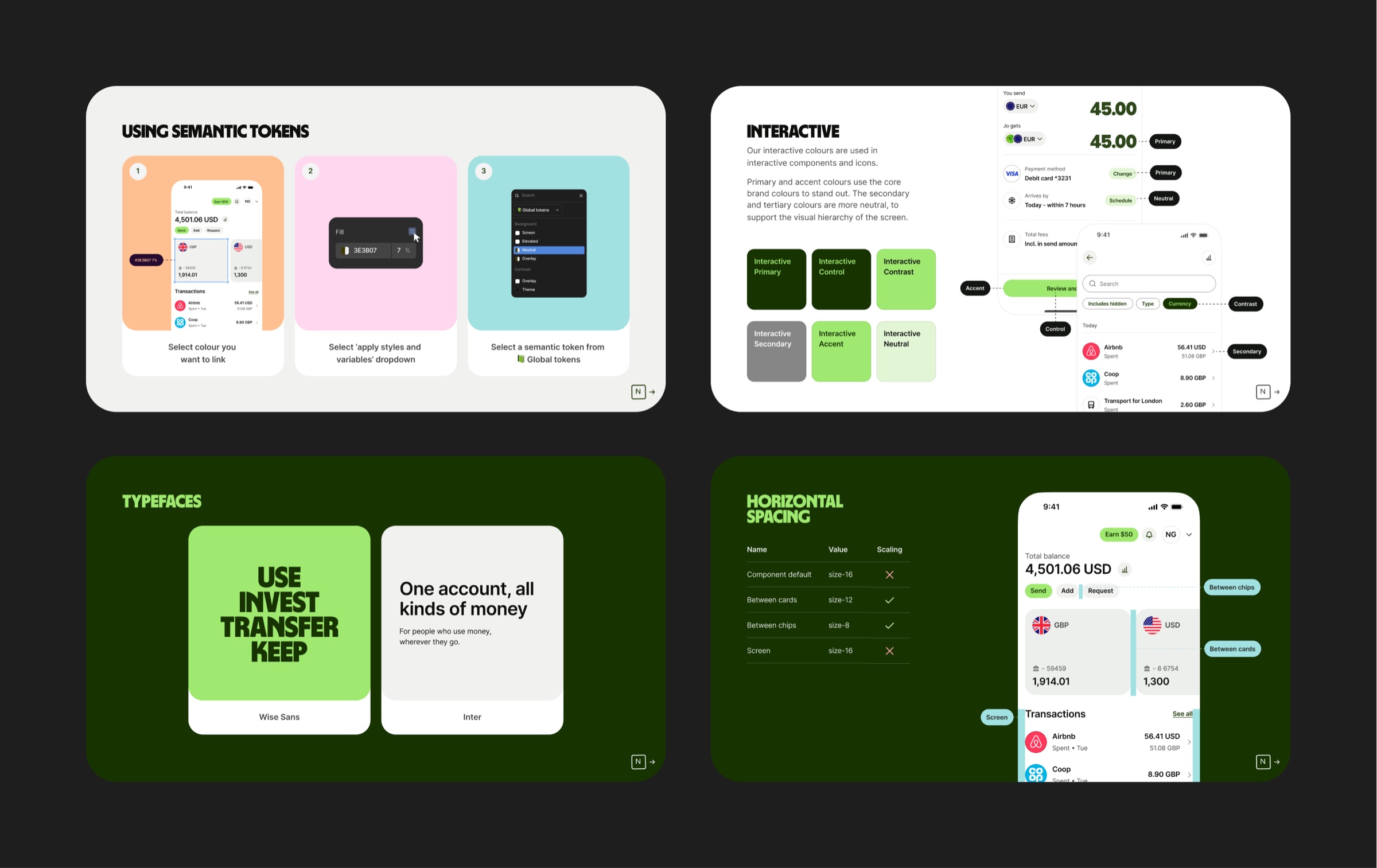
Foundations and tokens
The biggest section. Semantic tokens, colour modes, and design foundations, all grounded in real product examples so designers can see how the decisions play out in context, not just in the abstract. Colour alone was substantial enough to be its own chapter.
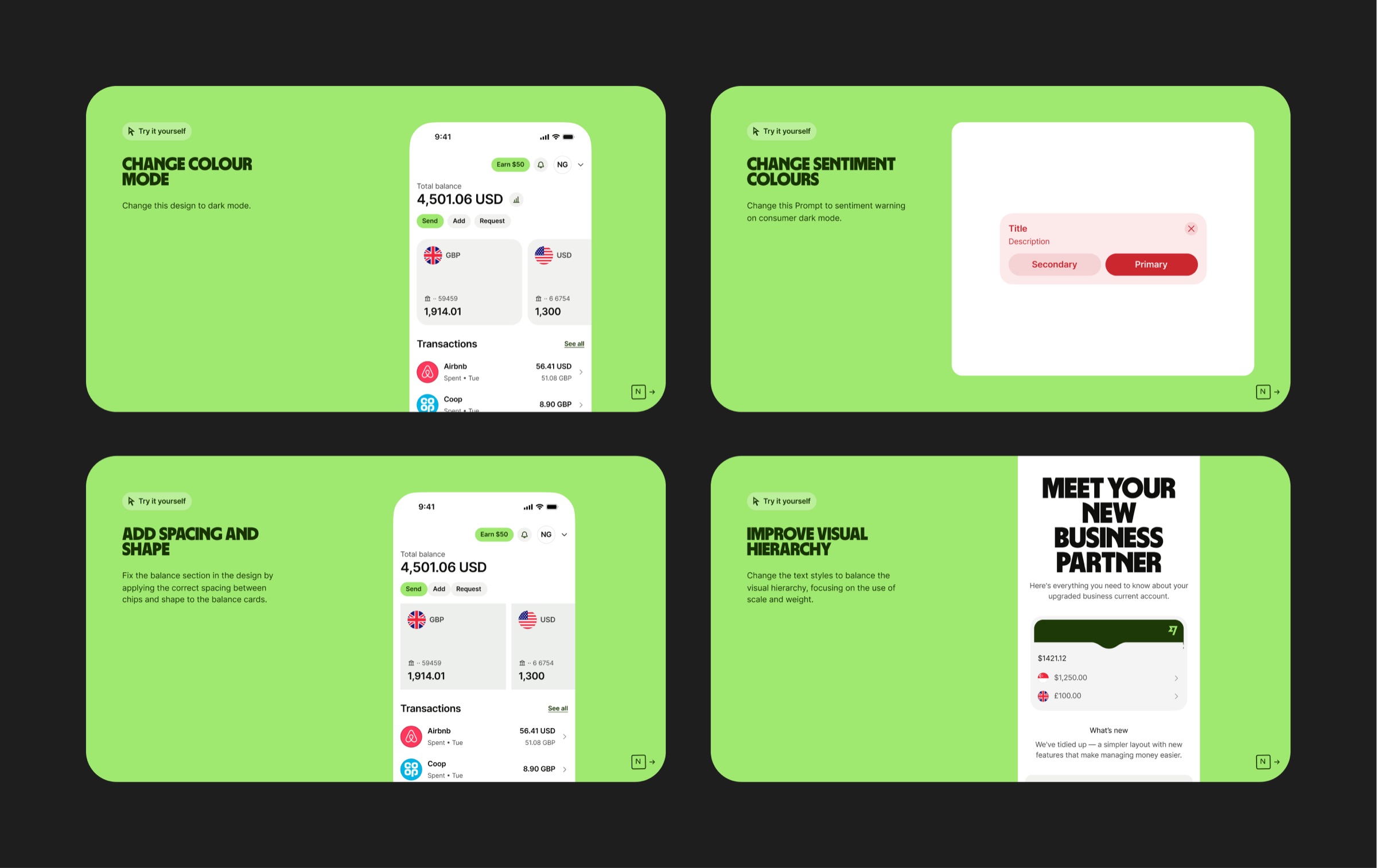
Design challenges
Reading about a design system and actually using it are two different things. The challenges section gives designers hands-on exercises to apply what they've learned. It's the bit that makes it stick rather than just something you went through once.
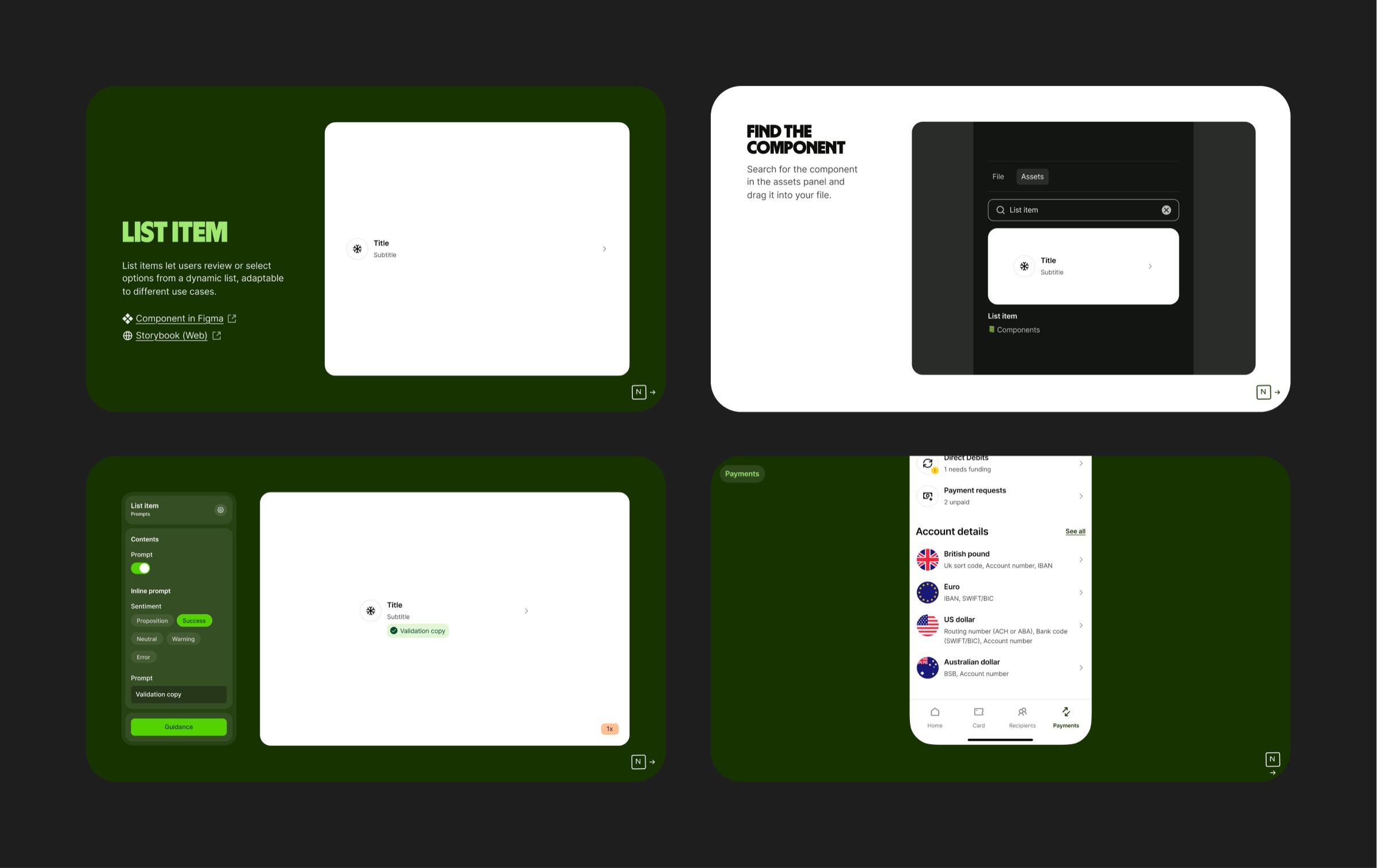
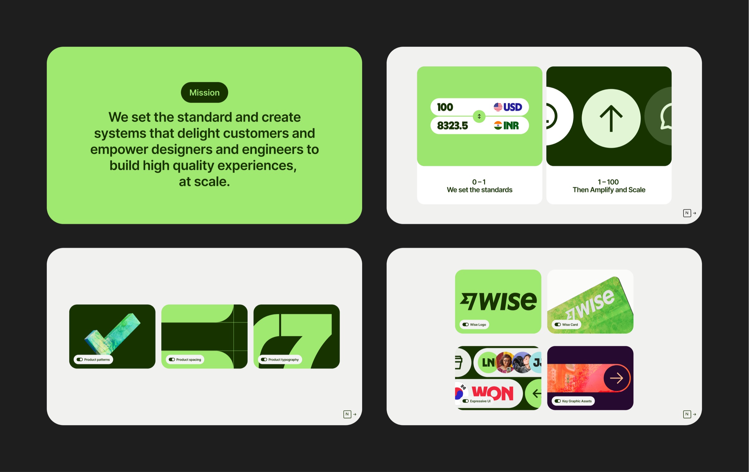
Component documentation
Components grouped and documented with links to the full reference material, grounded in real product examples throughout. Built with the wider design team, each page follows a consistent format so the experience holds together from start to finish.
The results
 Outcome
150+
designers onboarded, replacing ad hoc calls with a self-serve course that's become the standard way to learn the Wise design system