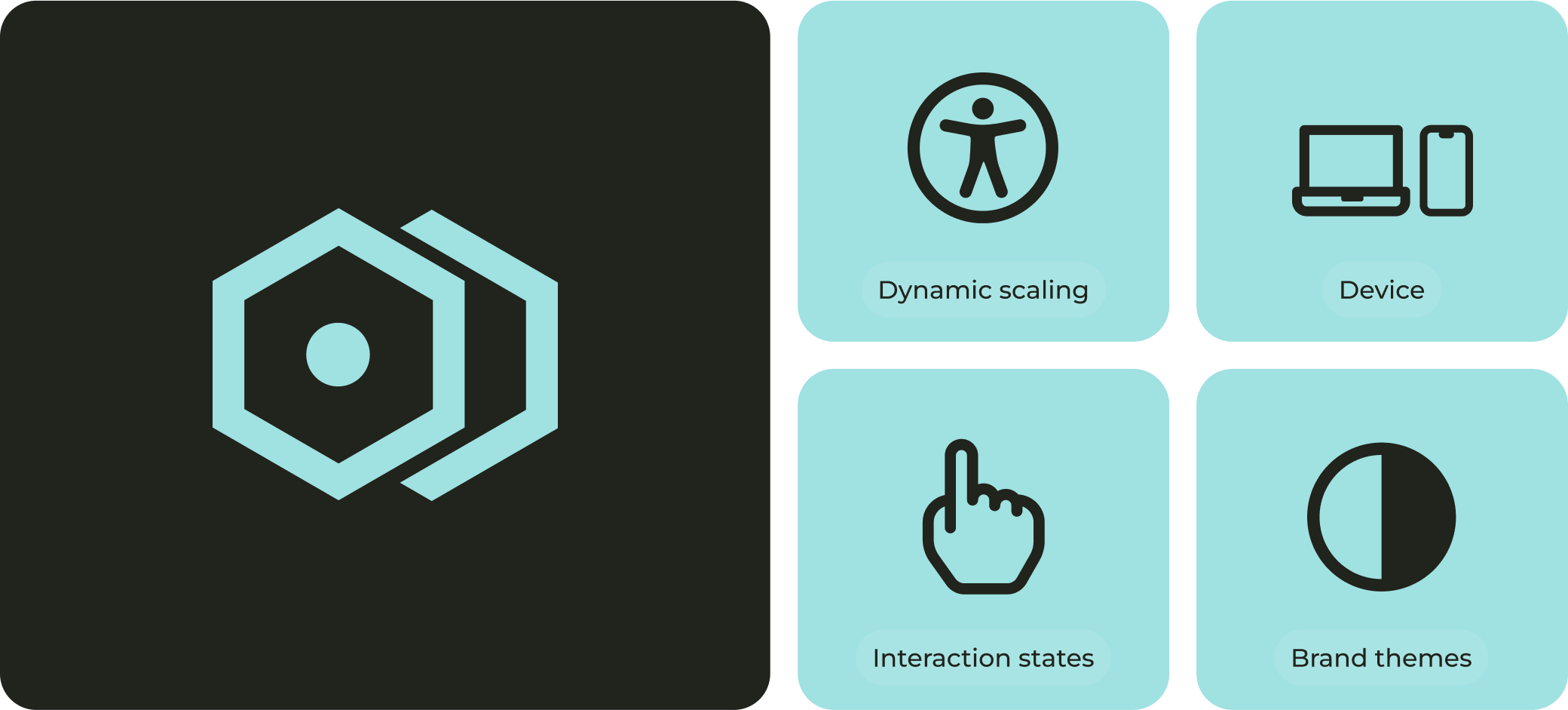
Making Wise Design
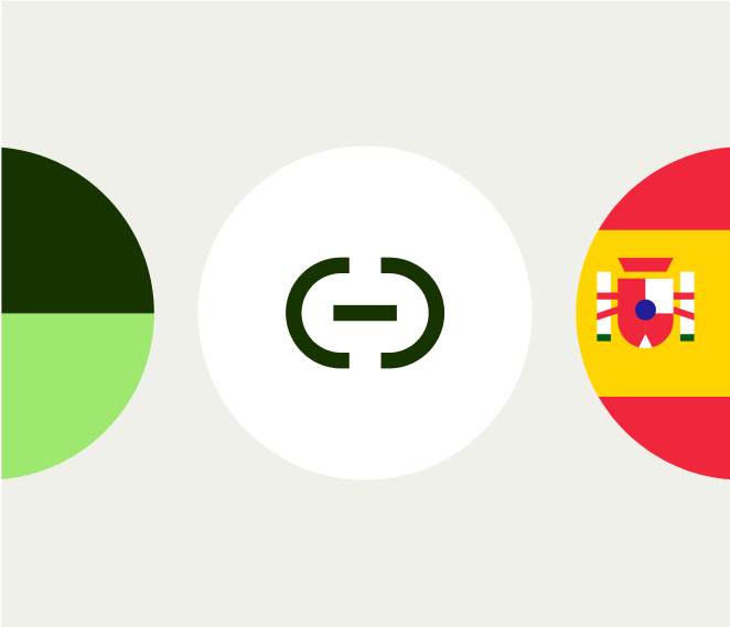
multi-brand
How do you design a system that works seamlessly across multiple brands and multiple systems? Following Wise’s 2023 brand refresh and the 2024 launch of the Editorial Design System, we restructured our entire setup. This meant developing a new multi-brand, multi-system token infrastructure in Figma and applying it everywhere.
In parallel, our engineers have been adopting parts of this approach and exploring how to scale their own systems.


The Challenge

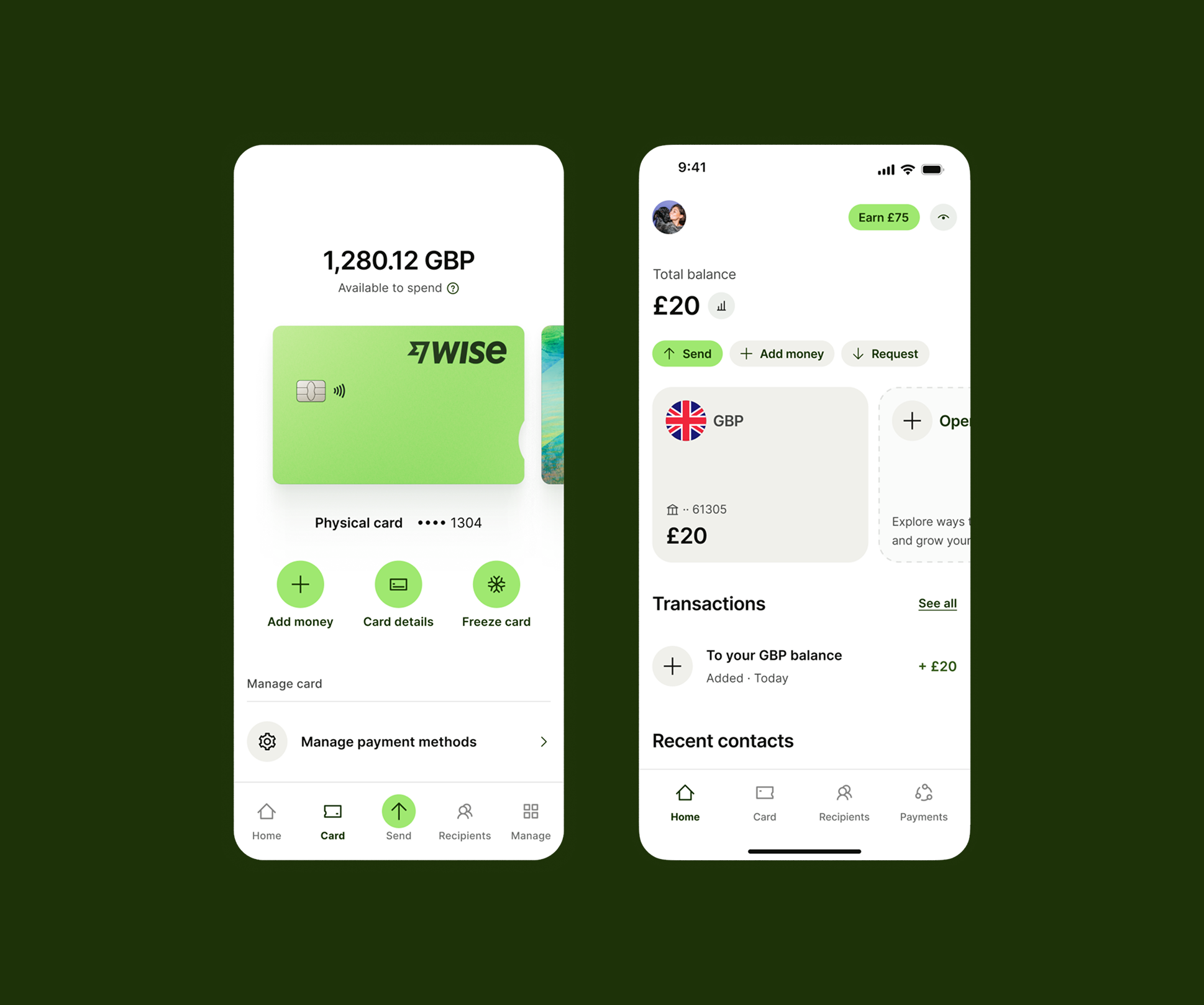
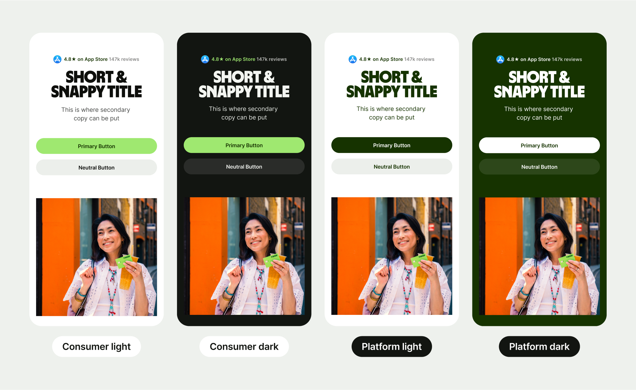
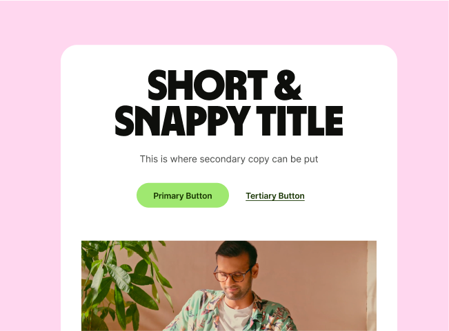
The Consumer Product system
When we first began building the design system at Wise, our single goal was to unify the logged-in consumer experience across iOS, Android, and Web.
As a result, the system was primarily focused on product design and only loosely supported Editorial use cases like marketing pages.
Editorial, the afterthought
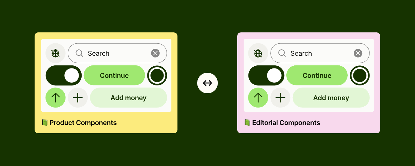
Before the 2024 brand refresh, the Editorial team had been building on top of the Product system. But as the brand evolved, Editorial became more expressive and needed greater flexibility.
The existing system could not meet their needs, so they introduced their own fluid spacing and typography libraries. They continued to share the same colour tokens to maintain brand continuity.
A (brand) new product
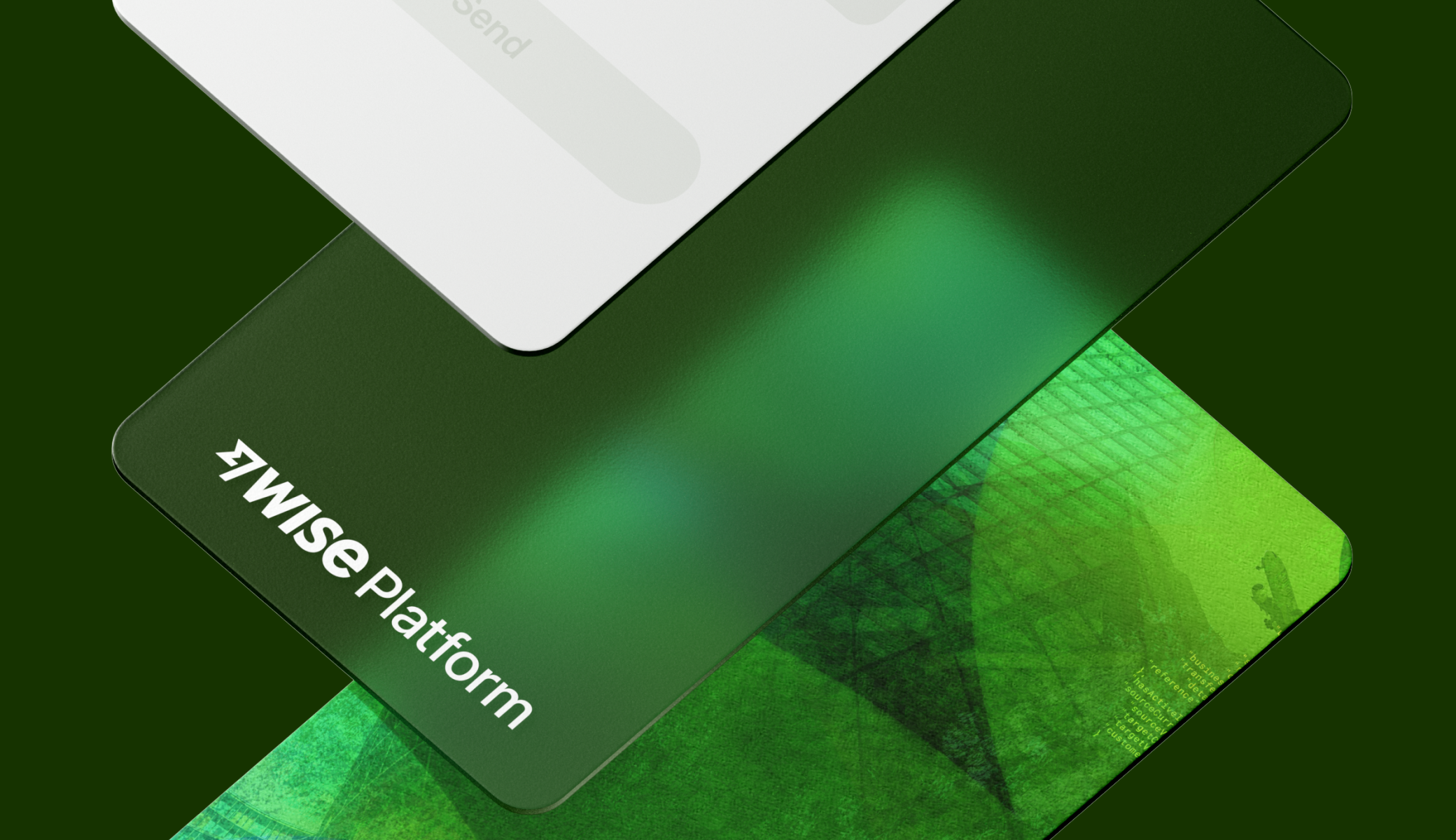
Introducing Wise Platform
Wise Platform is how banks and businesses integrate Wise’s API to offer international payments directly within their own products. It brings Wise’s speed and low-cost transfers to customers around the world.
In 2024, we worked with Ragged Edge on a brand refresh. The new direction stayed rooted in the core Wise brand but introduced a more professional tone, tailored to resonate with banking partners.
Can we duplicate the system?
“The Platform team are asking if they can duplicate our Wise Editorial Design System and rebrand it for Wise Platform?” — this line still sticks in my head when I think about where we came from to where we got to.
Wise Platforms new visual language was unique, but the only major differences were cosmetic. It was built off the same foundations, so there was no reason we couldn’t make it work in the same system.
Splitting the systems
Expanding the colour library
When Product Systems, previously called Design Systems, were asked to add a new colour theme for Platform, we pushed back. It only affected Editorial, so updating the core system for a second brand didn’t feel justified.
To move forward, the Editorial team duplicated the shared colour library and expanded it to support multiple brands and modes. That decision ended up creating more problems than we expected.
We broke the library
What I had overlooked was that many core Product System components were used within the Editorial system and were still linked to the original single-brand colour tokens.
So when a new theme or brand was applied, the surrounding Editorial patterns updated correctly, but any nested Product component such as buttons retained the default Wise colours, breaking visual consistency.
A fork in the road
At this stage we had two options. The first was to duplicate the entire design system to support Platform, effectively managing two separate libraries. It would have worked in the short term, but introduced huge overhead and risk.
The second was to bring the systems back together under one shared foundation and define a Figma token strategy that could scale cleanly across multiple brands, themes, and use cases.
Creating a global token strategy
Reimagining from the ground up
Around the same time, we began exploring how to extend the brand across both Product and Editorial through the system. It felt like the right moment to bring the systems back together under a unified approach.
I took a step back to reassess the broader challenge and began defining a global token strategy that could scale across systems in the short, medium and long term.
Iterate, fail and iterate again
We went through a number of iterations to figure out how best to structure the library. We started with the simplest idea: one core colour library shared across everything.
At first, it seemed like a good solution. But during testing, we quickly realised that it would create duplications if we ever needed to implement responsive typography for Product.
One library to rule them all
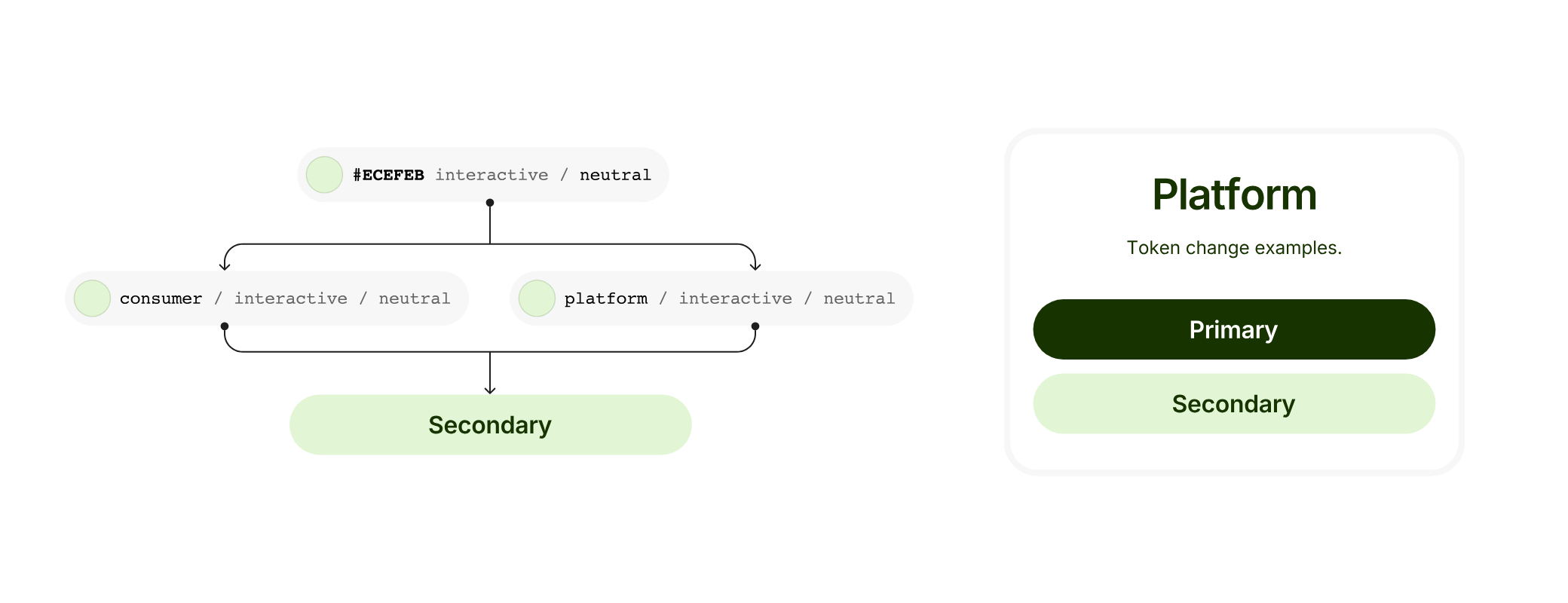
What we landed on was a system where the entire library was controlled by a top brand layer, which contained nested libraries for typography, spacing and colours.
We started with the end result and worked backwards to achieve the desired user experience.
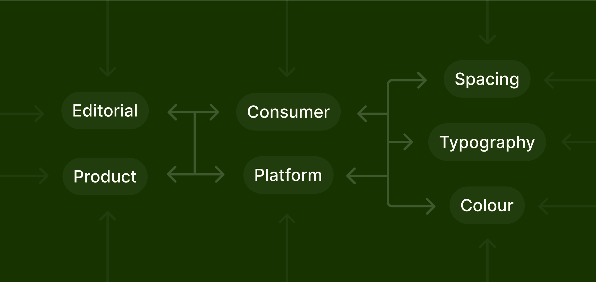
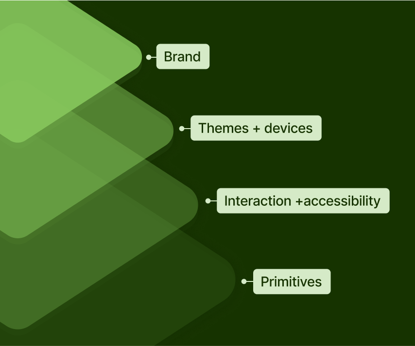
A Wise System of Systems
Two tracks, one system
Our system of systems was split into two tracks: typography and spacing on one track, and colour on the other. Both pulled from shared primitives and were brought together in a single Global Token library that housed all our brands.
This structure allowed us to manage responsive and dynamic type, spacing, and interaction states across all colour themes. Each set could be adjusted through a dropdown, all controlled by one central brand layer.
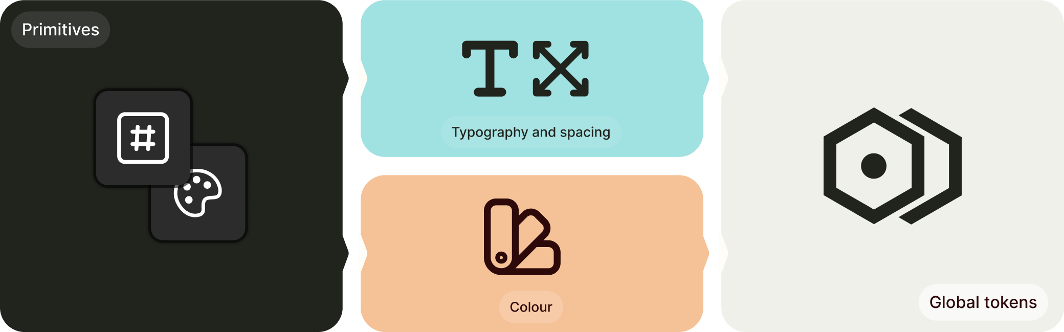
Primitives
Raw values
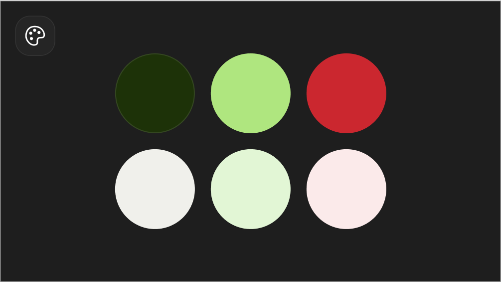
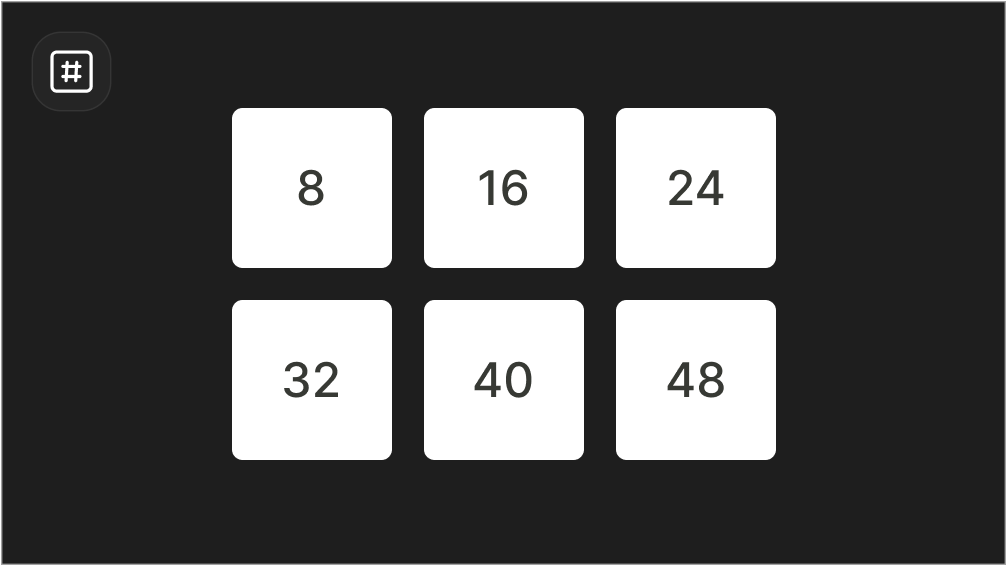
We began with a single core library containing colour and number-value primitives for typography and spacing. Since nothing like this had been done before, it gave us a chance to review all the values used across brands and systems.
Colours were named using base colour and hex code, without brand associations. Spacing used raw pixel values. We could have excluded this library, but it became a useful inventory for the system and a consistent reference point when building new brands and styles.
Type and spacing
Nested variables
Our typography and spacing library needed to support both static and dynamic variables to enable scaling tokens within the device layer.
To do this, we nested the dynamic scaling library inside our responsive device library, making it accessible and scalable from the ground up.
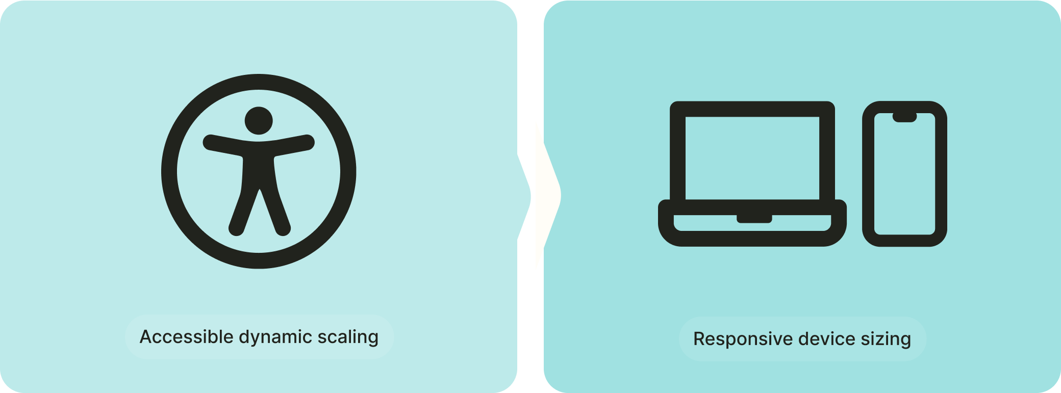
Accessible dynamic scaling
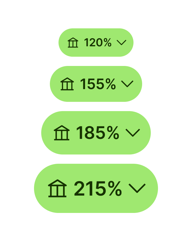
Our first layer focused on dynamic scaling for type and spacing values. This library used the primitive value as the base size (100%) and derived other values using percentages ranging from 85% to 275%.
This approach allowed us to apply scalable values to padding, text, and assets across all systems. It enabled us to test and design for accessibility, ensuring a consistent experience for every user.
Device Responsive
The next layer introduced support for both mobile and desktop modes. It was built using a combination of primitive values, dynamic tokens, and string variables to allow responsive behaviour across different devices.
This library became the foundation for our type styles, spacing, and radii. It included settings for font family, weight, size, line height, and letter or paragraph spacing to ensure consistency across all platforms.
Centralising our systems
Given our Editorial and Product systems used different semantics, we needed to include spacing and type tokens from each system and brand so that they would link to the same dropdown.
We then used those tokens directly on the Editorial and Product typography and spacing libraries so they would pull the right styles.
Colour
Nesting libraries to scale
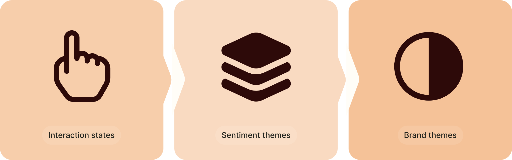
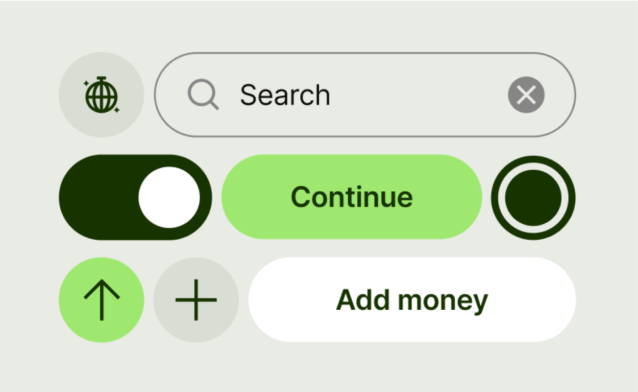
To support interaction states, brand themes, and sub-themes, we structured our colour libraries so that each layer built on the one before it. This made the system easier to manage and adapt across multiple use cases.
We began by referencing primitives in a dedicated interaction library. These defined all state and mode combinations, which were then applied to each brand theme. All themes were rolled into a single global token layer that formed the core of our brand system.
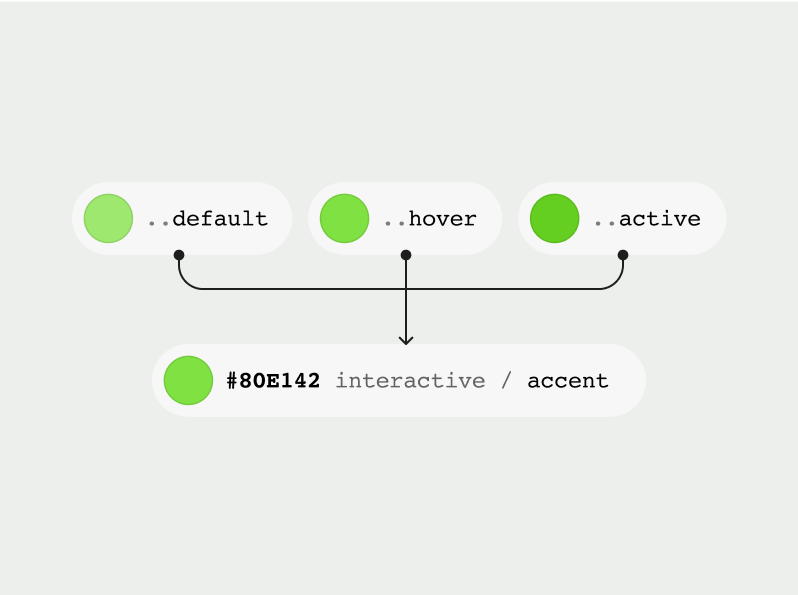
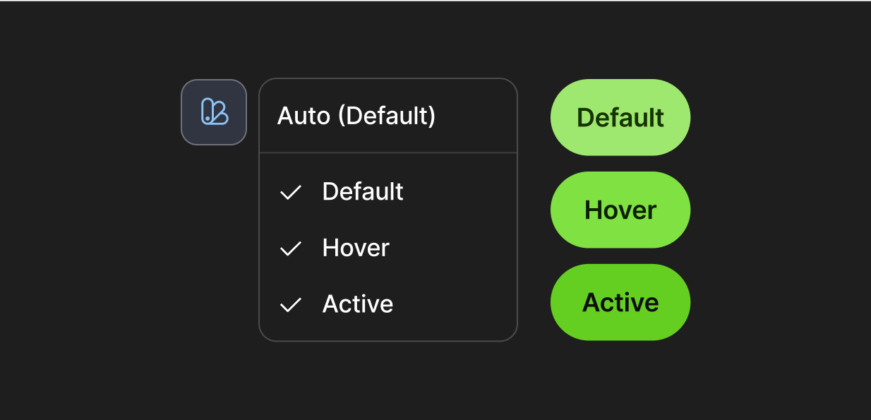
Interaction states
We referenced surface theming tokens into interaction modes for default, hover, and active states. If a token had no interaction behaviour, the same colour was applied across all three modes to ensure consistency.
This approach eliminated redundant state tokens from the system, making it more intuitive for designers. It also enabled variable swapping in prototypes, allowing us to build interaction states directly into base components.
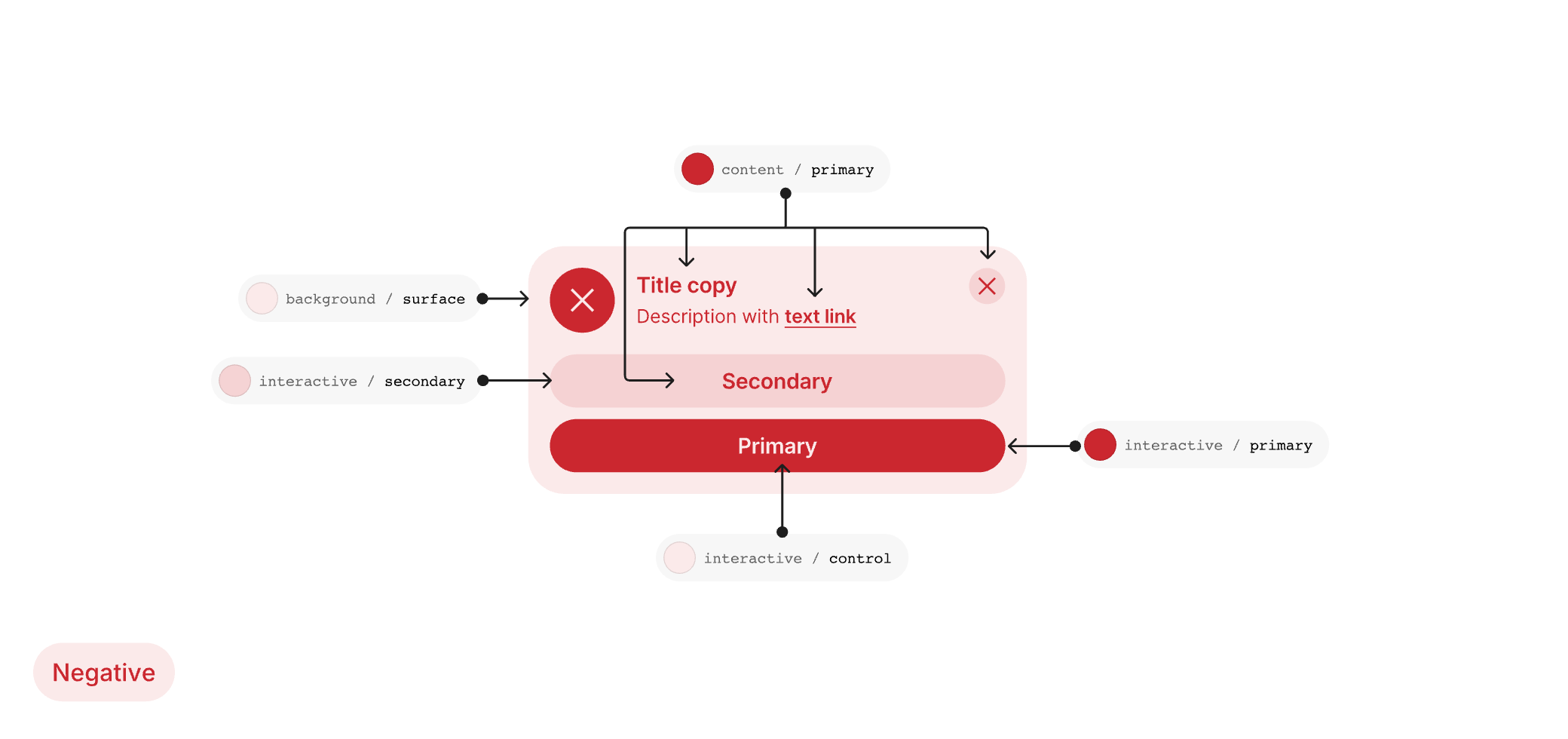
Sentiment themes
We introduced sentiment theming to support prompts across all brands, covering surface colours for different sentiment states including alert, neutral, warning, success, and proposition.
Sentiment tokens were accessed through a dedicated dropdown, helping designers apply them correctly and avoid misuse.
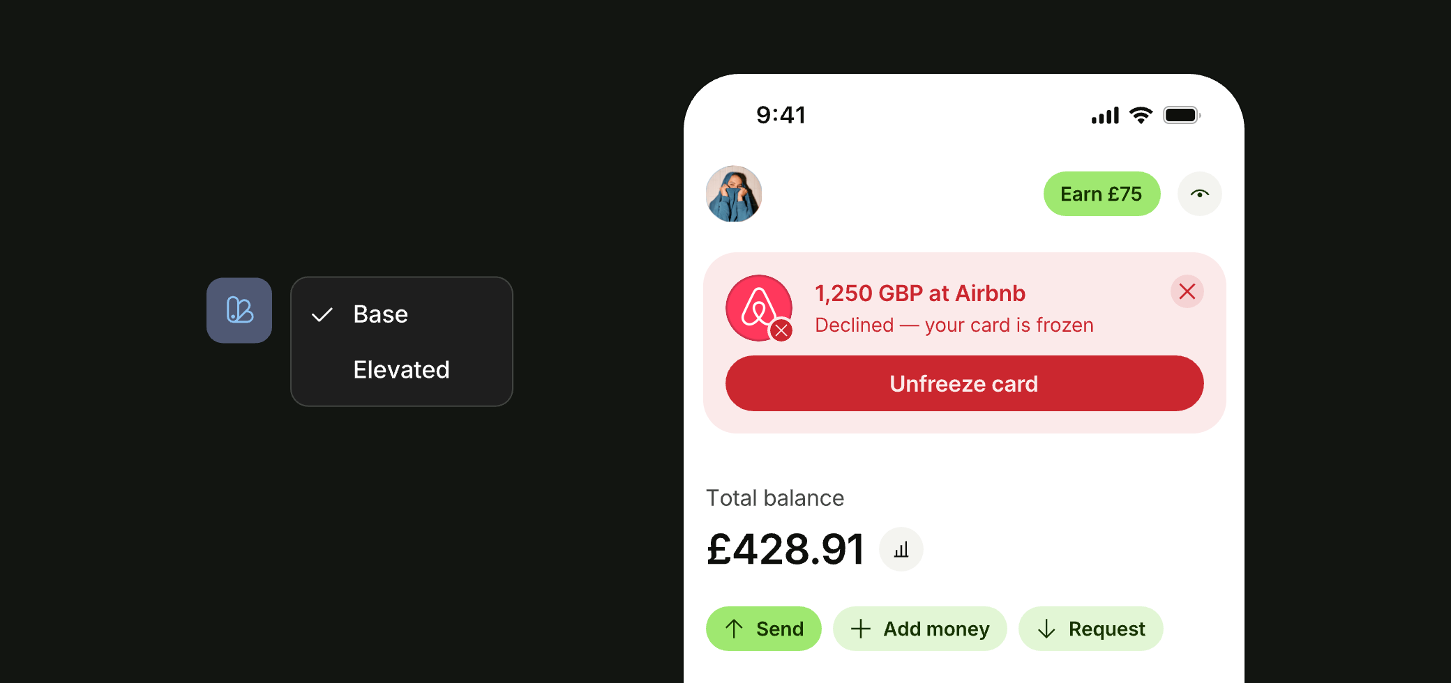
Sentiment emphasis
Our sentiment themes included an additional emphasis layer, allowing certain prompts to be elevated to critical or high-contrast variants.
We structured this as a secondary layer and built the modes into components, giving us greater control over how they were used across the product.
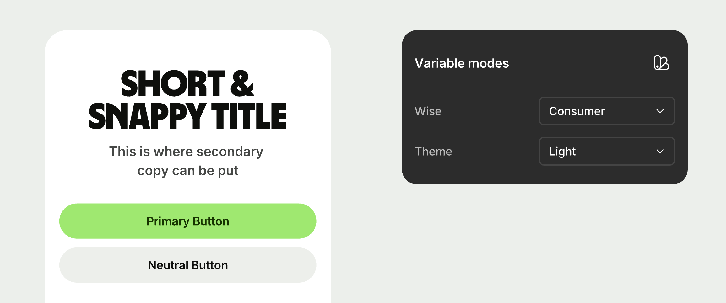
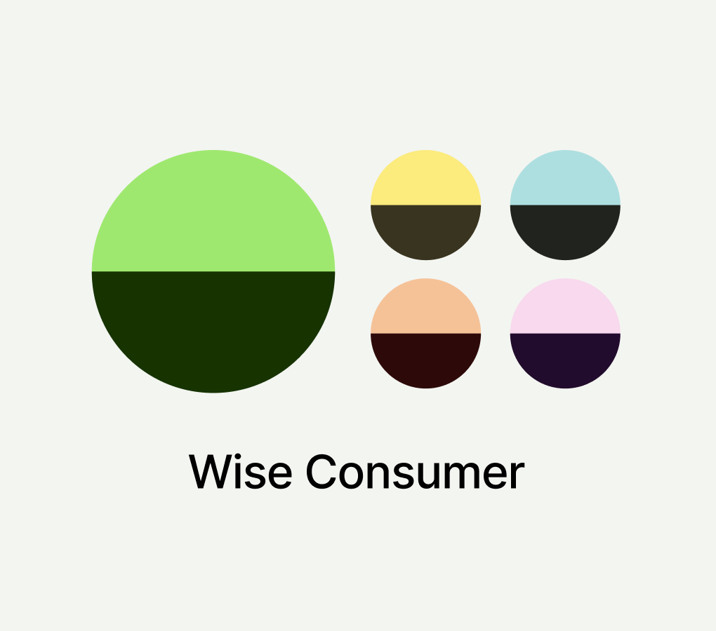
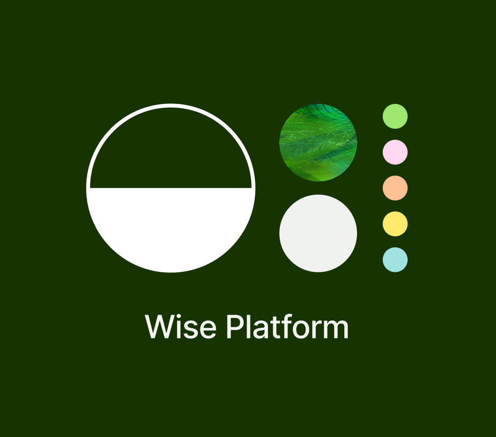
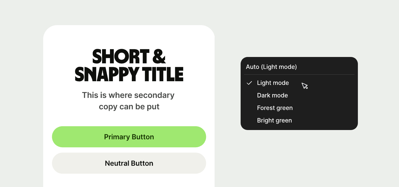
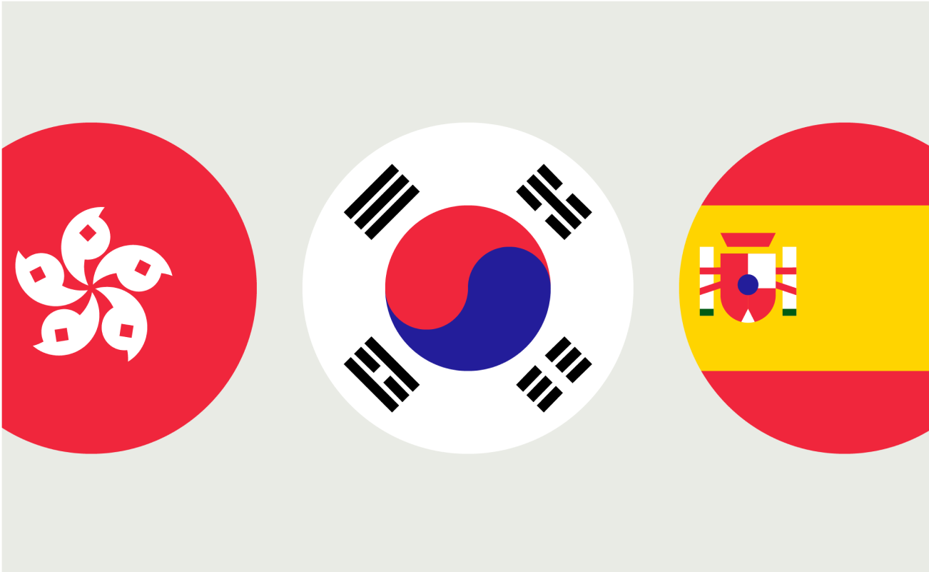
Brand theming
Wise’s sub-brands needed more than just light and dark modes. The consumer product used four themes, while Platform used three.
We introduced a shared semantic theming model, making all themes available through a single switcher. For Platform, the accent light theme reused standard light colours for consistency.
Bringing it together

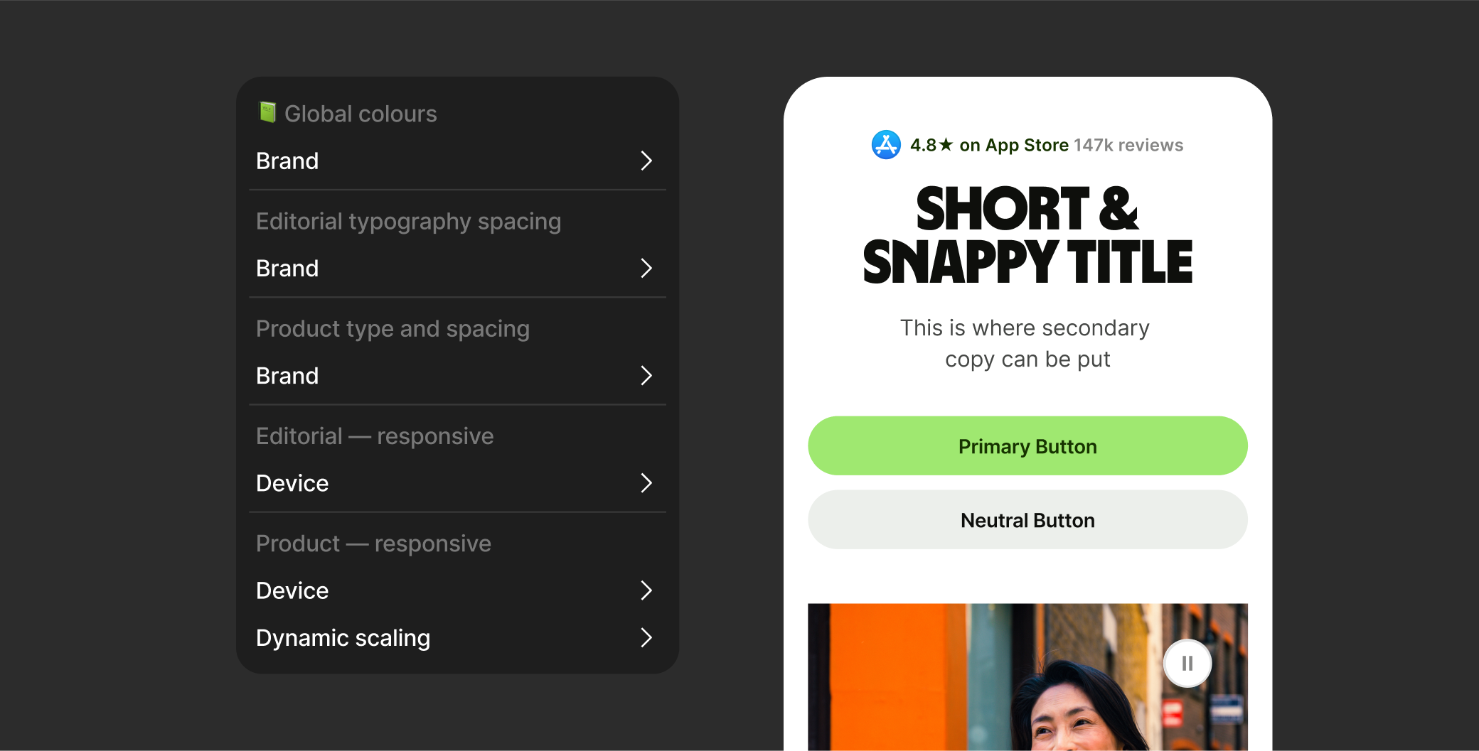
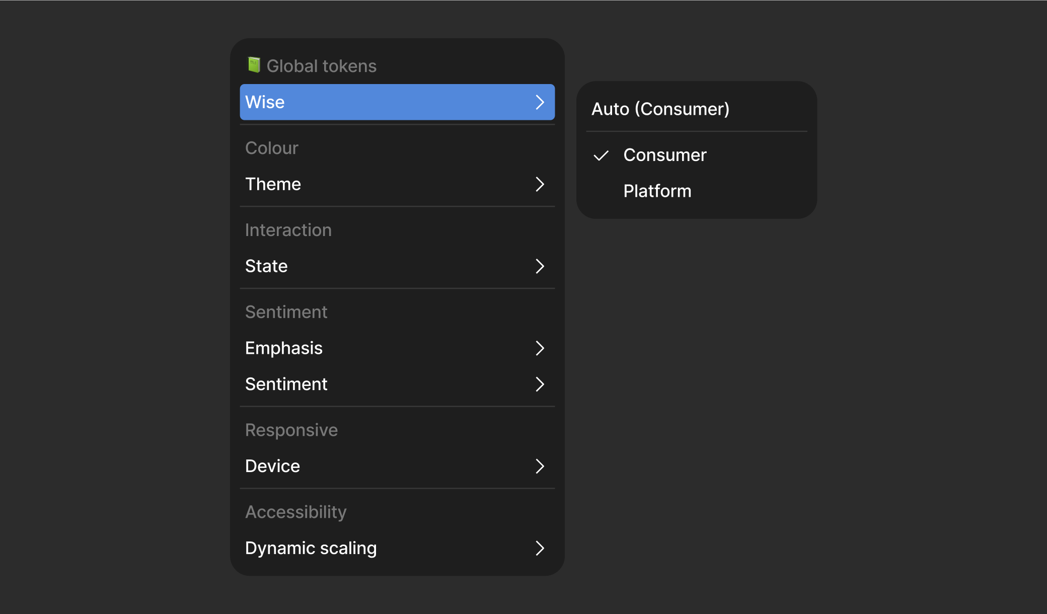
Global tokens
The final layer was our brand library, using brand-specific modes and referencing all other libraries to expose the full token structure in design files. Typography and spacing tokens for Editorial and Product remained separate but lived in the same file.
This setup allowed us to link variables directly to each brand’s Typography, Spacing, Component, and Pattern libraries. Designers could easily access and apply colour tokens from this global layer.
Token optimisations
We initially planned to create separate tokens for each brand and mode. The library quickly reached around 400 tokens, and with another brand and five sentiment themes coming, it could have grown to over 4,000 without early optimisation.
After reviewing usage, I saw we were mostly referencing base tokens in higher layers. So we combined shared tokens, like sentiment, and only split out the differences. This kept the library lean and easier to manage.
Library setup
Setting up to scale
We now had a collection of libraries supporting different areas of the product, all capable of handling multiple brands. To make them easier to find and use, we restructured our Figma setup.
We created a new Wise Design team in Figma and split it into three sub-projects: Core, Product, and Editorial. This let us scale the system around each team's specific needs.
Foundational token libraries
The foundational token project housed the libraries that fed into our global tokens. These included primitives, accessibility scaling, device responsiveness, colour states, and themes.
We placed these in a hidden folder so they stayed behind the global tokens layer. This reduced confusion and helped teams focus on the libraries meant for day-to-day use.
 📗 Components
 📗 Wise cards
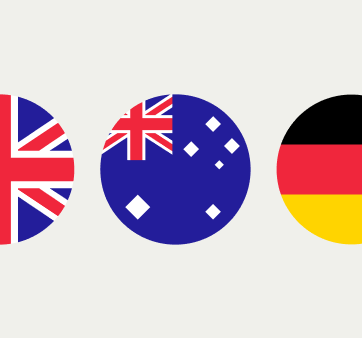
 📗 Flags
 📗 Icons
 📗 Global tokens
 📗 Illustrations
Core libraries
Our core libraries included reusable elements across all brands and platforms. These covered icons, components, flags, illustrations, and our global tokens library.
When brand-specific assets were needed, like illustrations, we used a clear tagging and folder structure. This let teams swap assets easily without slowing down their workflow.
 📗 Product patterns
 📗 Product typography
 📗 Product spacing
 📙 Editorial patterns
 📙 Editorial typography
 📙 Editorial spacing
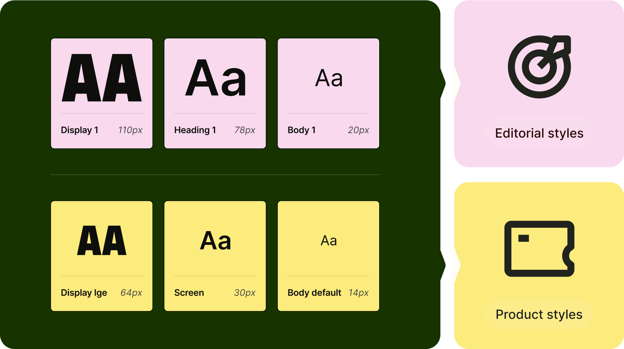
Editorial and product
Our Editorial and Product projects contained platform specific styles, like typography and spacing, as well as pattern libraries.
Keeping an expansive structure allows us to explore potential extended systems for internal tooling or email and digital marketing.
The results
Simple, clean and user friendly. Creating a foolproof system for designers.

One central hub where we update tokens that trickle through the entire experience.

The ability to add brand and theme modes to scale as our brand does.