Behind the Wise Design brand refresh
In 2022, Wise partnered with Ragged Edge to refresh its brand and stand out in a crowded market. This case study explores how the new identity was brought to life across the product, with a focus on the Design System team’s role and my contributions to key work-streams.
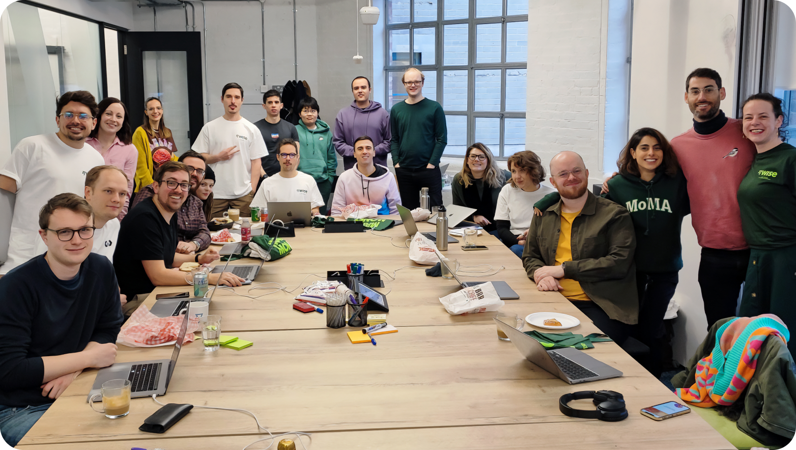
The Team
Design Leads

Ness Grixti


Designers

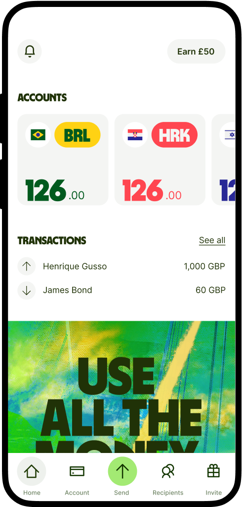
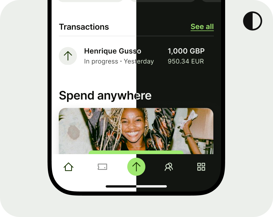
Henrique Gusso


Engineers

Joao Cevada


Why change?
Lost in the sea of sameness
Wise had been evolving it’s brand since it’s conception in 2011. Over the years the market continued to shift and Wise slowly started drowning in the sea of sameness, and all of a sudden we were getting lost in the mix of every other fintech and bank in the market with no key differentiators.
Wise’s bold and direct mission — money without borders meant we didn’t belong here and needed a change to avoid becoming stagnant.
The before times
Neptune, our old design system
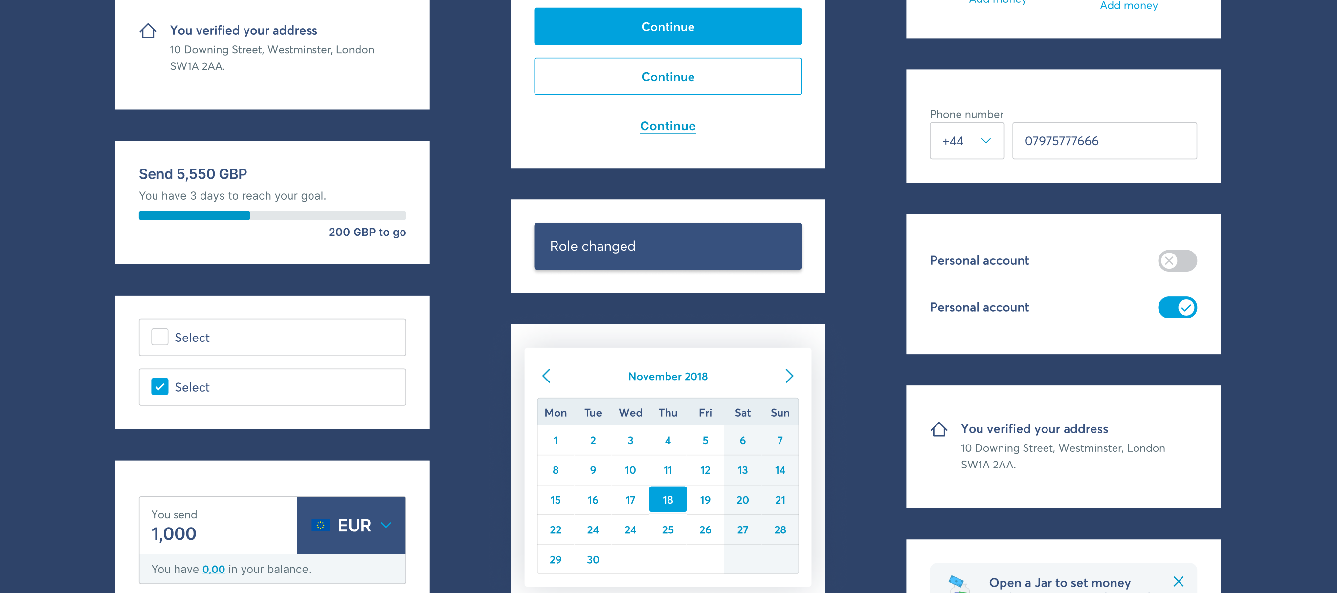
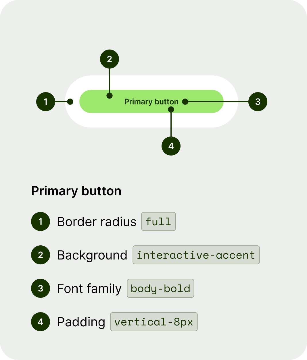
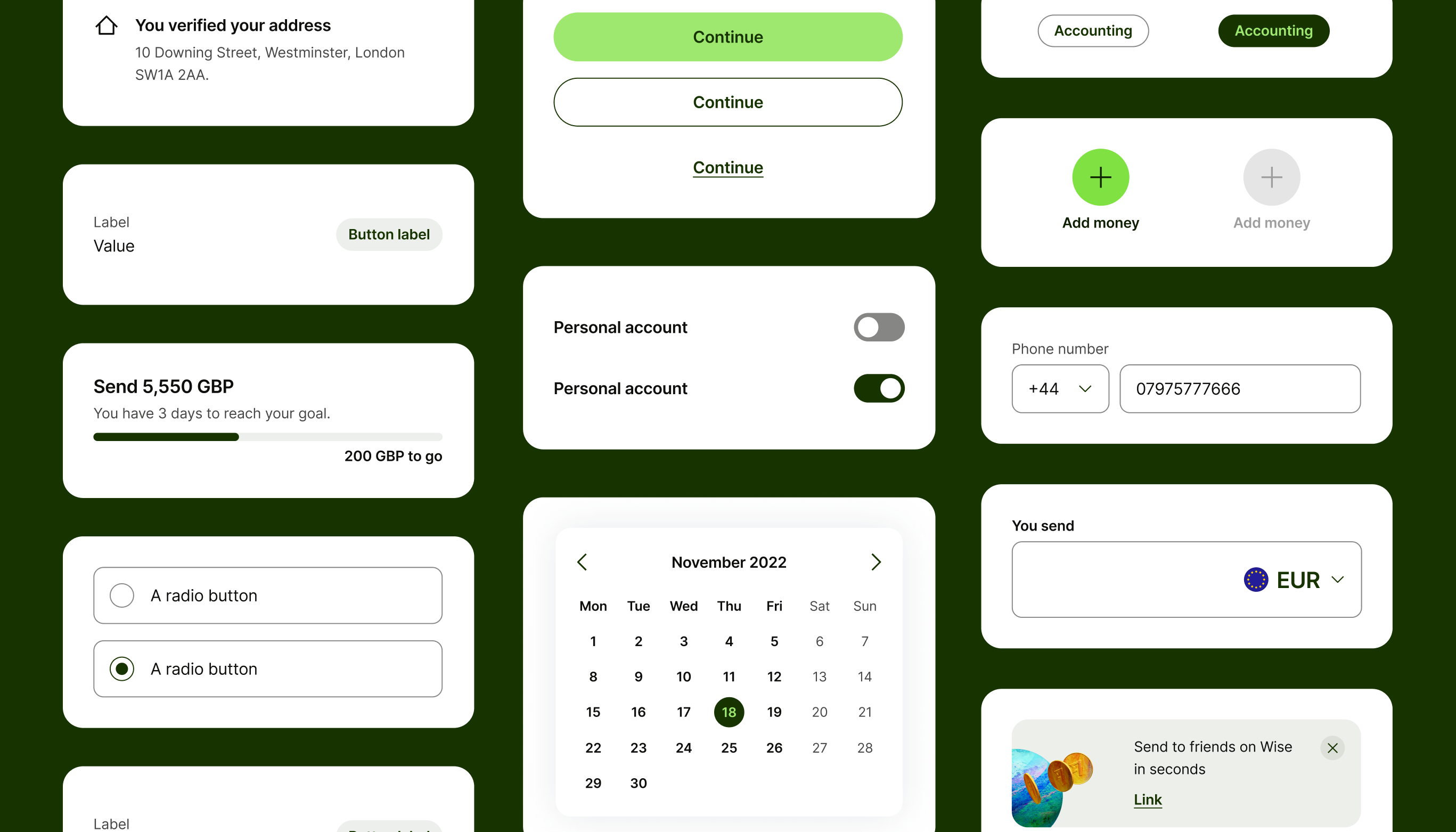
Yep, Wise already had a system before the refresh, Neptune. It contained the basics — components, (some) patterns, colours, typography and iconography. But they were each riddled with different issues and we didn’t have the highest adoption rates.
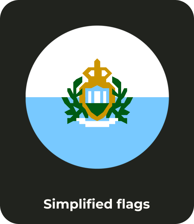
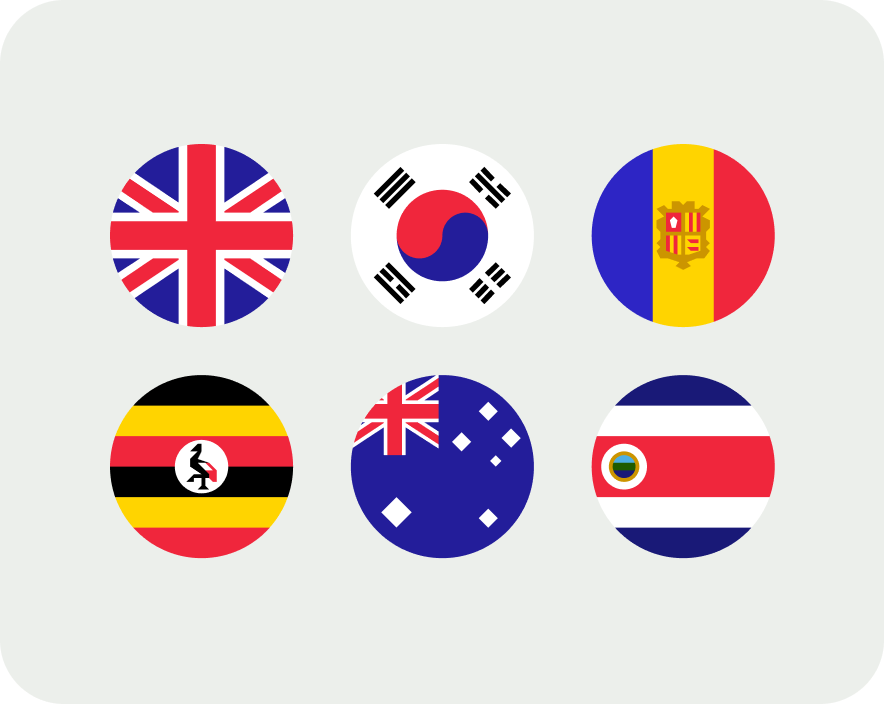
Not to mention we didn’t own flags or illustrations, which meant that there were no governing rules around how to use them. This led to hundreds of rogue animations scattered around product or different open source flag repos being used.
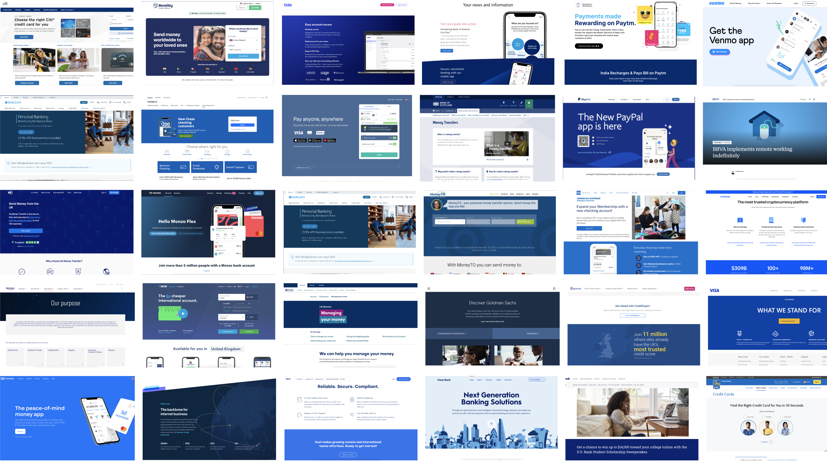
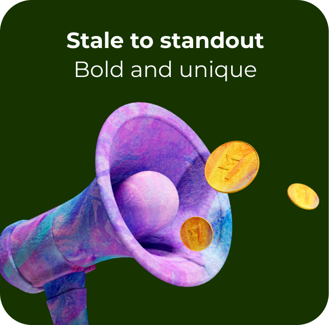
The brand refresh
A partnership of dreams
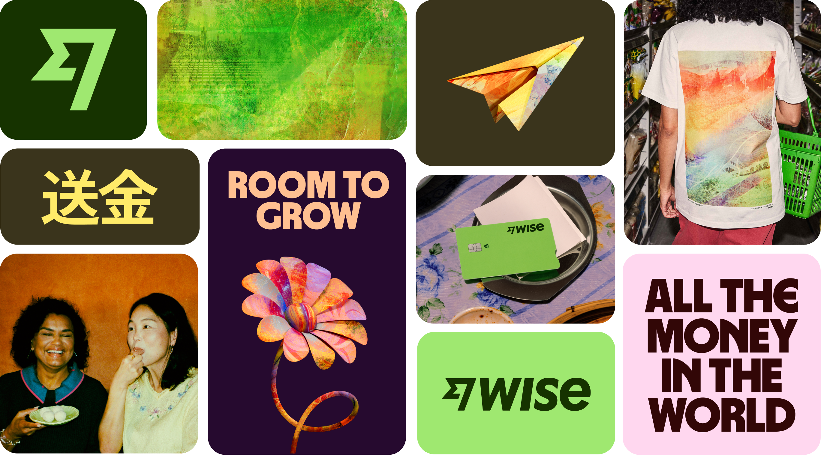
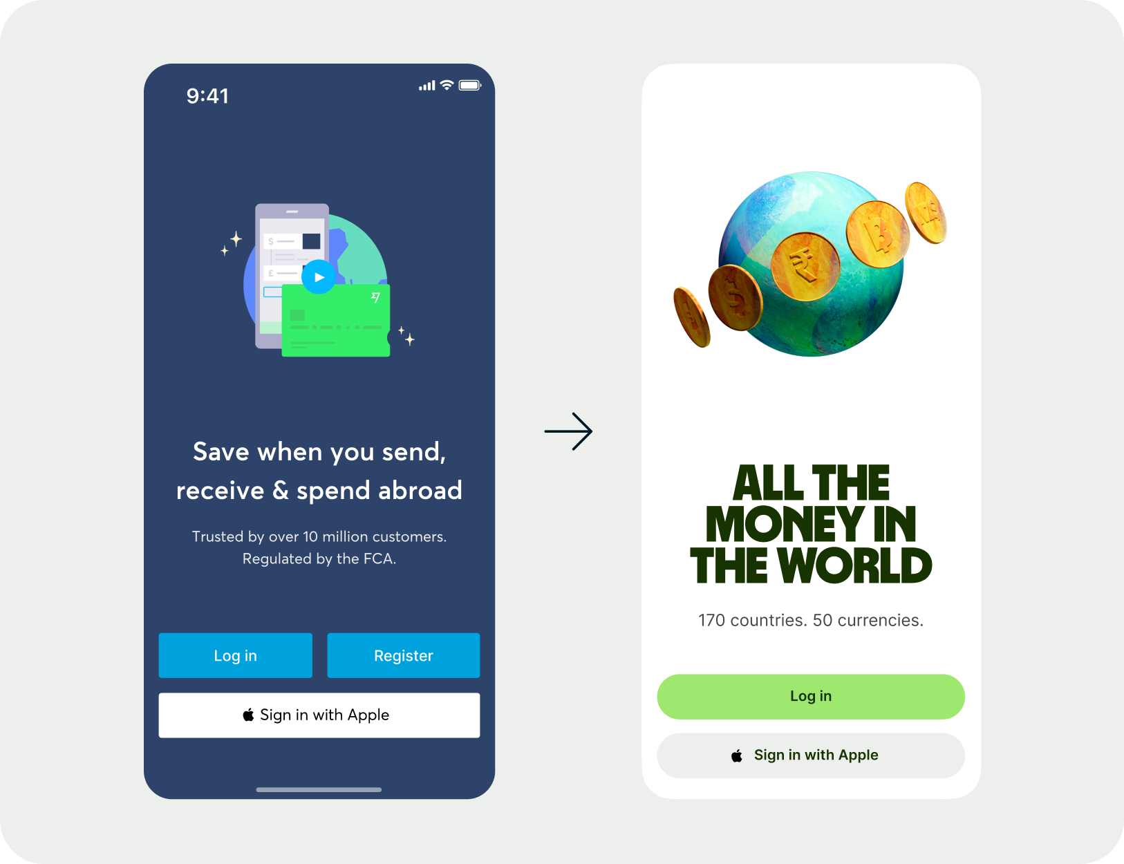
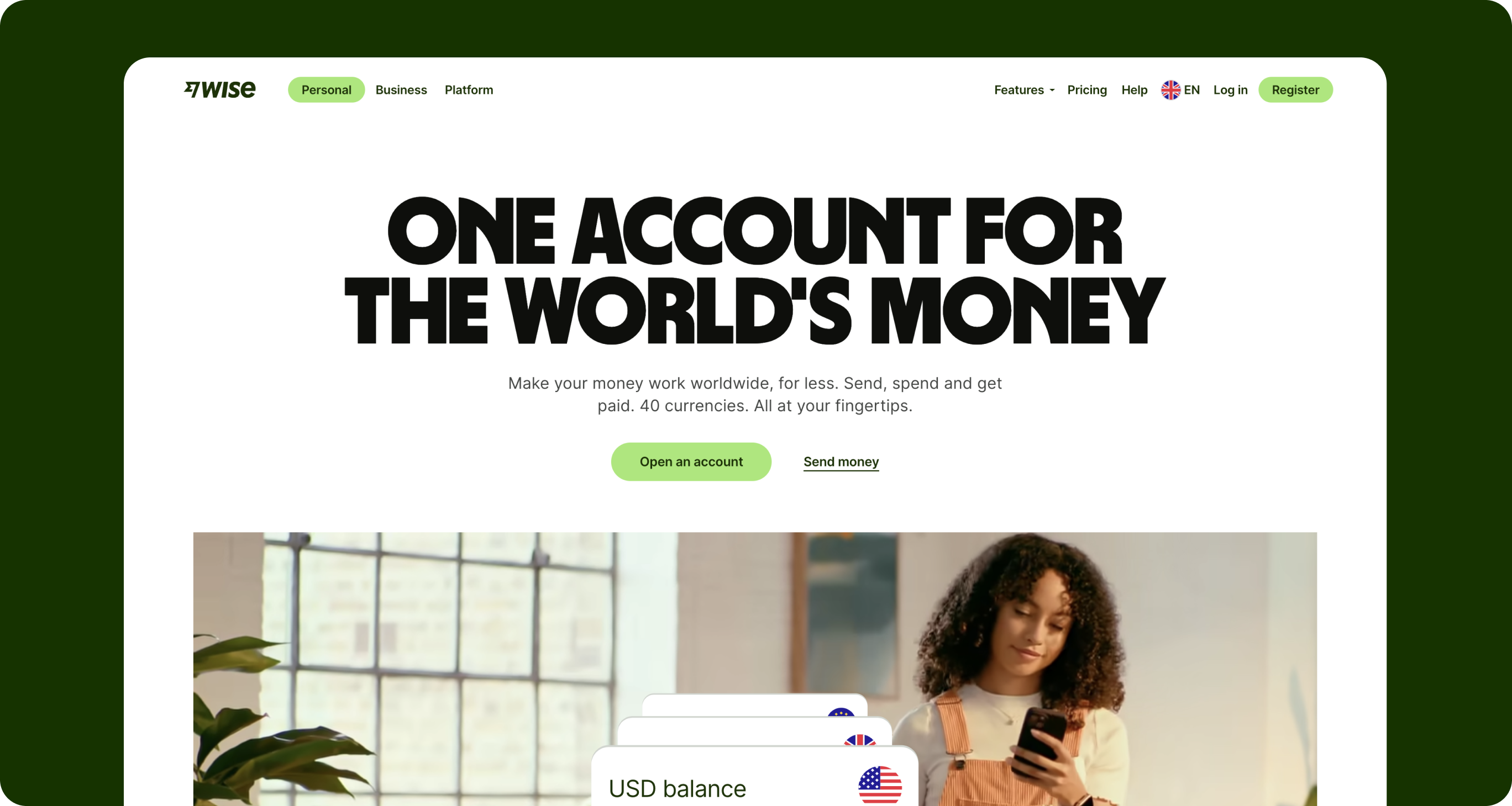
We worked closely with Ragged Edge who developed and evolved a bold new face for Wise. Through many iterations we landed on an identity that reflected our brand and mission.
It was bold, unique and totally different from the rest of the market, allowing us to set the standard and show we’re not afraid of change, no matter how big we are.

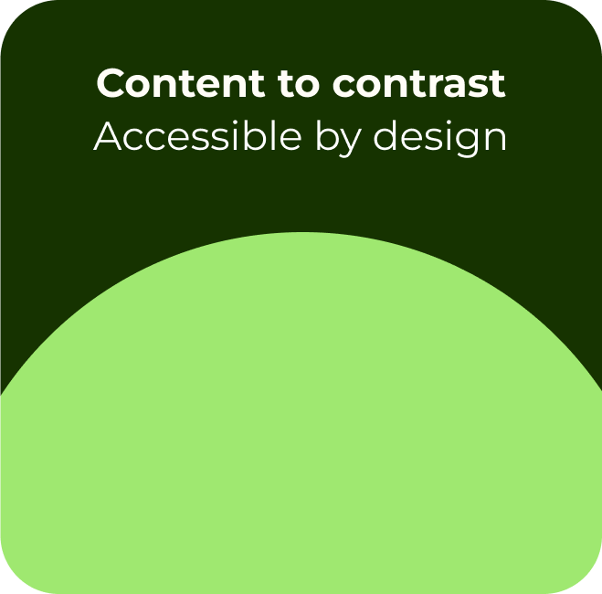
Foundations
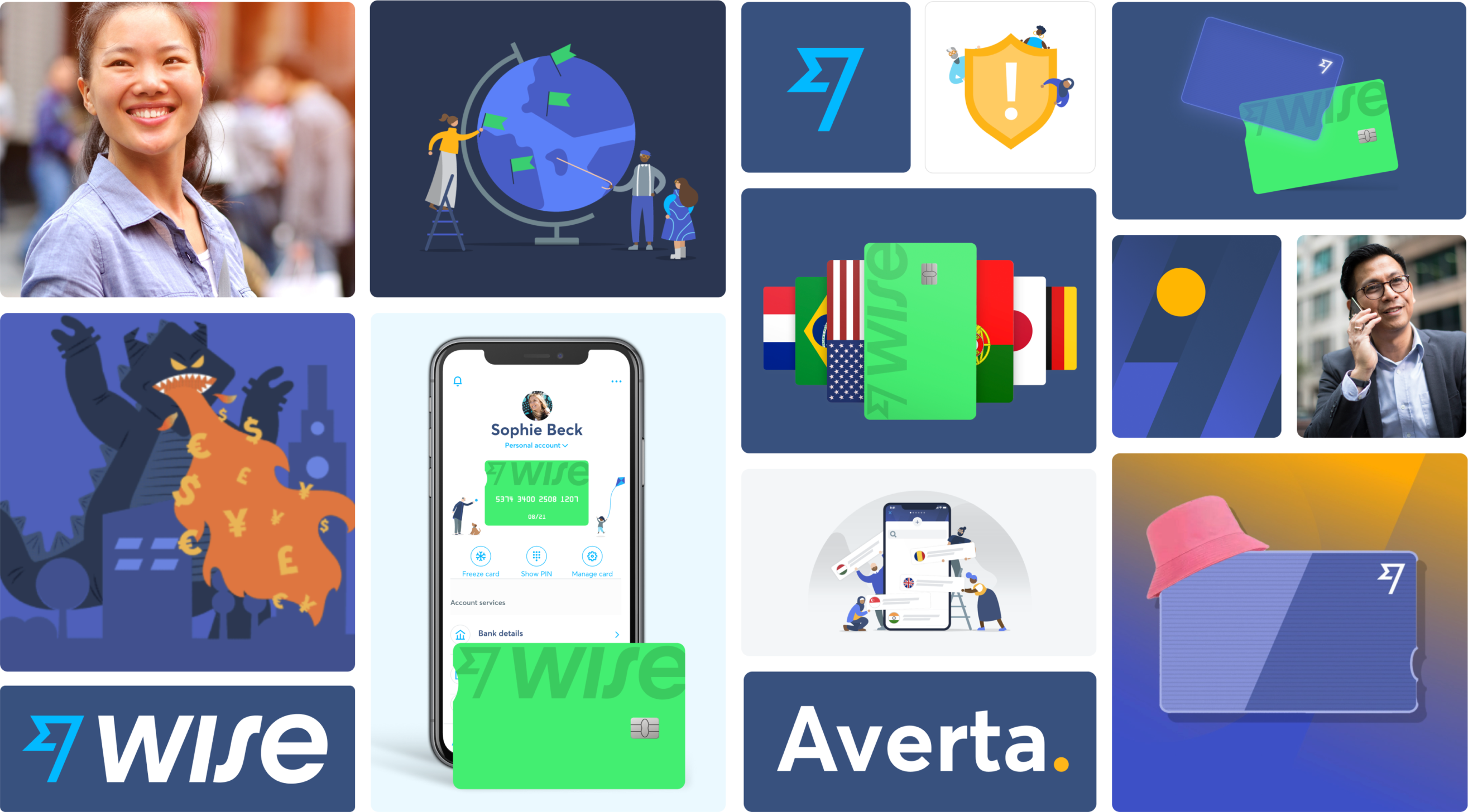
As part of this visual direction, Ragged Edge created foundational building blocks for us to use.
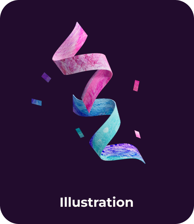
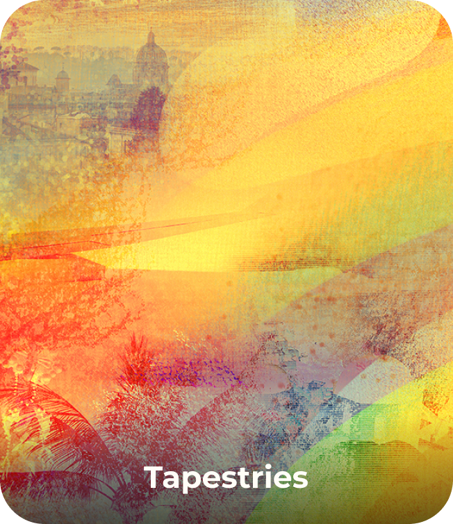
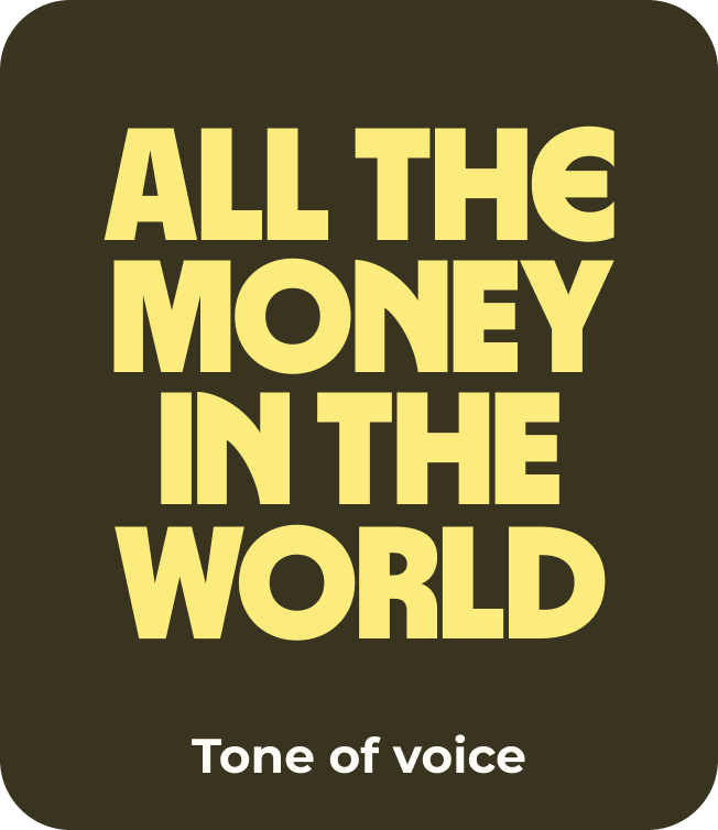
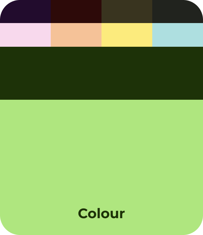
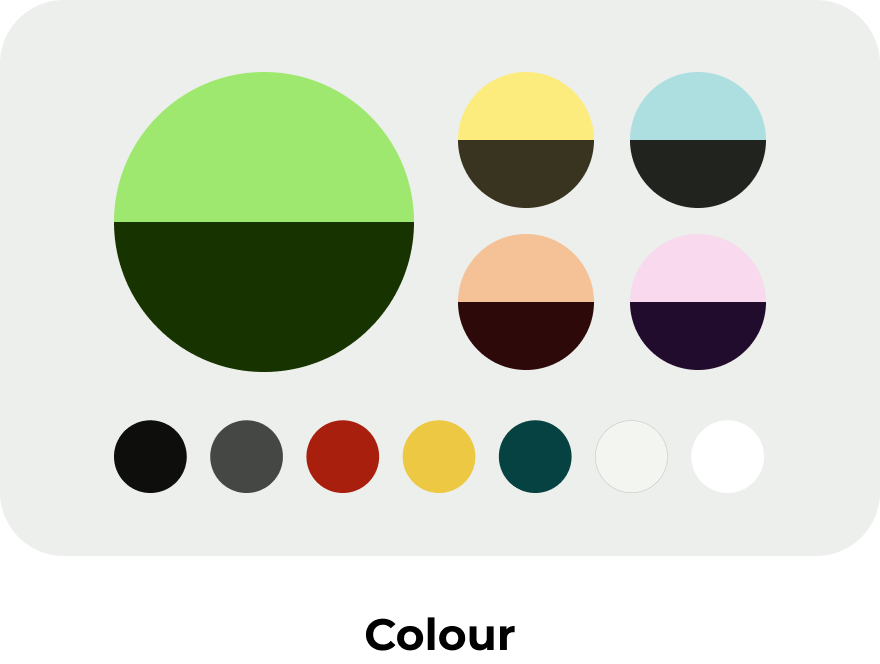
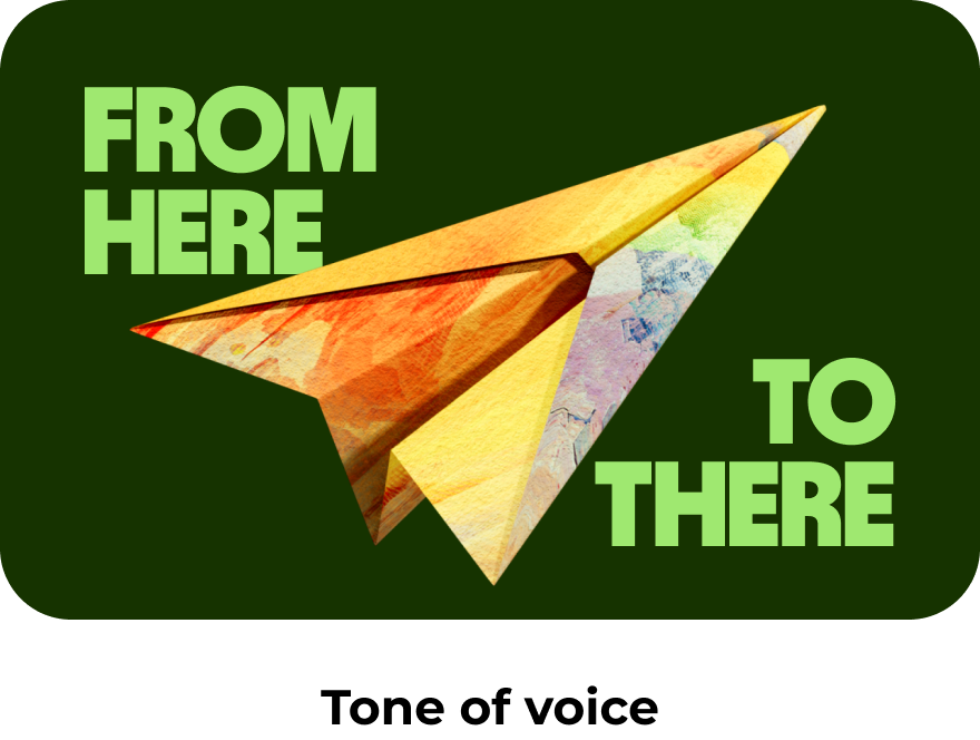
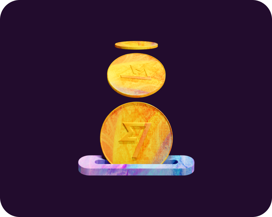
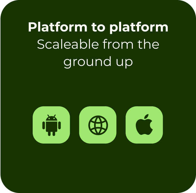
These included illustrations, iconography, tapestries, colours, typography, photography, flags as well as a bold new tone of voice.
Product exploration
As well as foundations, Ragged Edge had explored in-situ designs to showcase how we could implement those changes. While these helped guide us, it was up to us to figure out how we translated them to work across all of product and amplify through our system.
While their initial directions worked well across a few select screens, it wasn’t as simple as finding and replacing styles in our existing system — trust me, we tried.
Systemising the refresh
Work streams
Given the work had many moving parts we looked at how we could split it into streams where we had clear owners across the system.
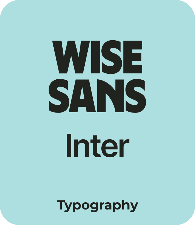
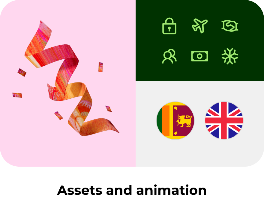
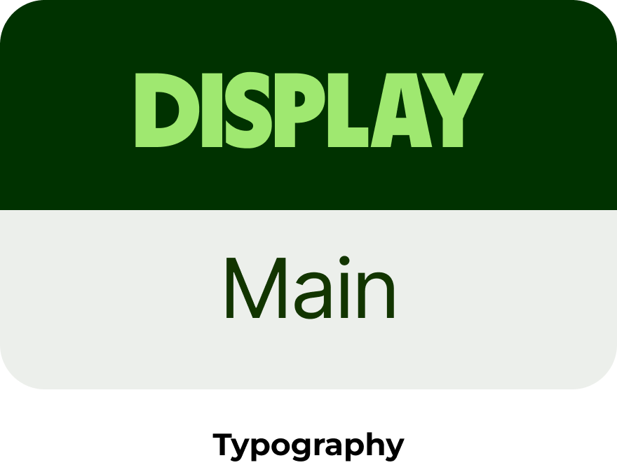
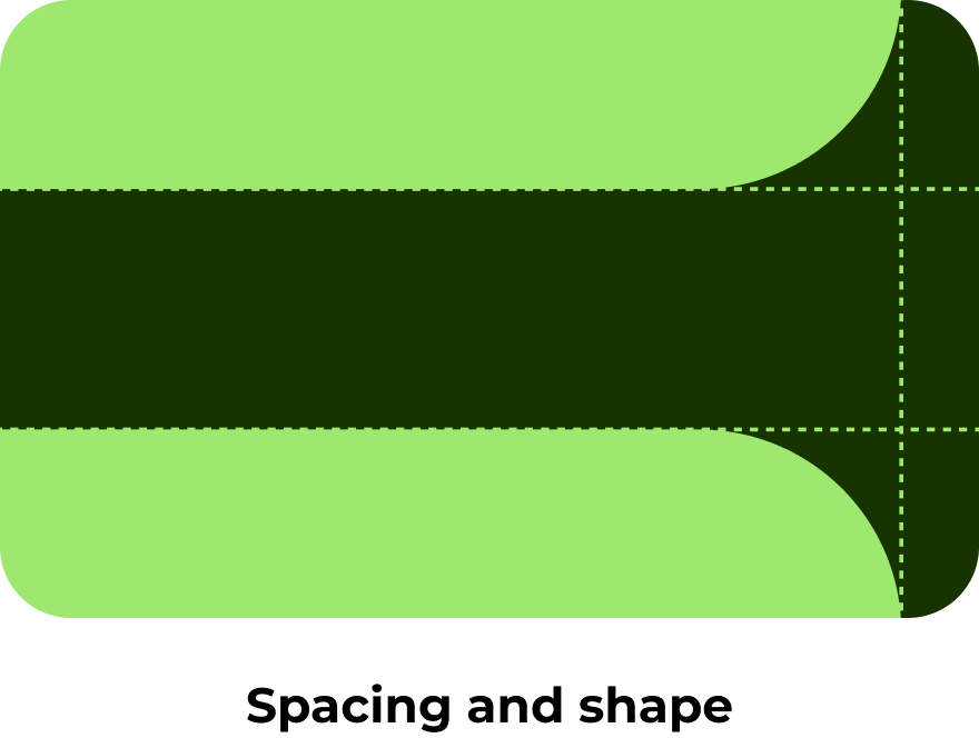
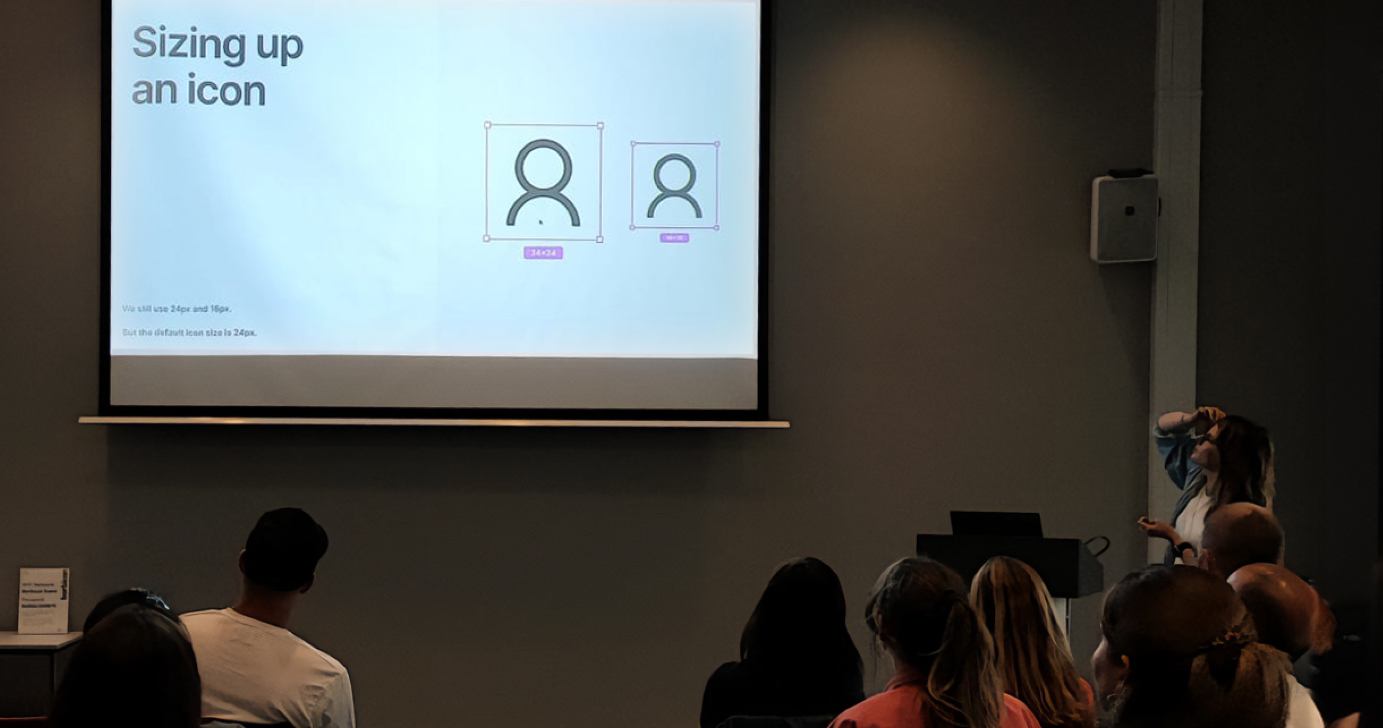
I owned the systemisation of assets and animation, which included icons, flags and our new animated and static 3D illustrations, as well as typography and spacing.

Project syncs
Team syncs were used for keeping our designers and engineers in the loop throughout each stage of development.

Cross-stream jams
Jam sessions were used to share work across streams, so that we could easily bring the work back together.

Design crits
Designers and engineers from the team as well as the occasional external stakeholder participated in crits to ensure we were all aligned.

Sprint reviews
We held biweekly sprint reviews for senior stakeholders to keep them in the loop on progress and decisions.
Bringing it all together
As part of this work, it was important that everyone—from stakeholders to team members—stayed aligned across different workstreams. Regular rituals helped us share progress, give feedback, and ensure we were moving in the right direction together.
We brought everything together through frequent check-ins, stress testing in real product UIs, and sharing with product teams as things evolved. This helped us balance the system holistically and make confident, informed decisions throughout.
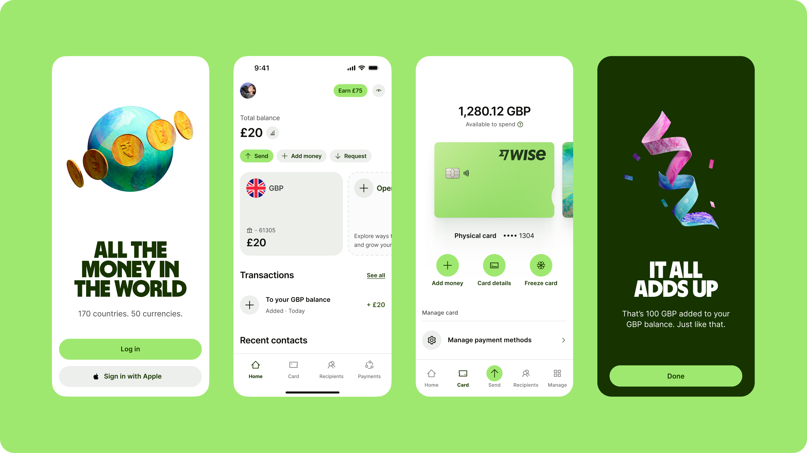
The updated system
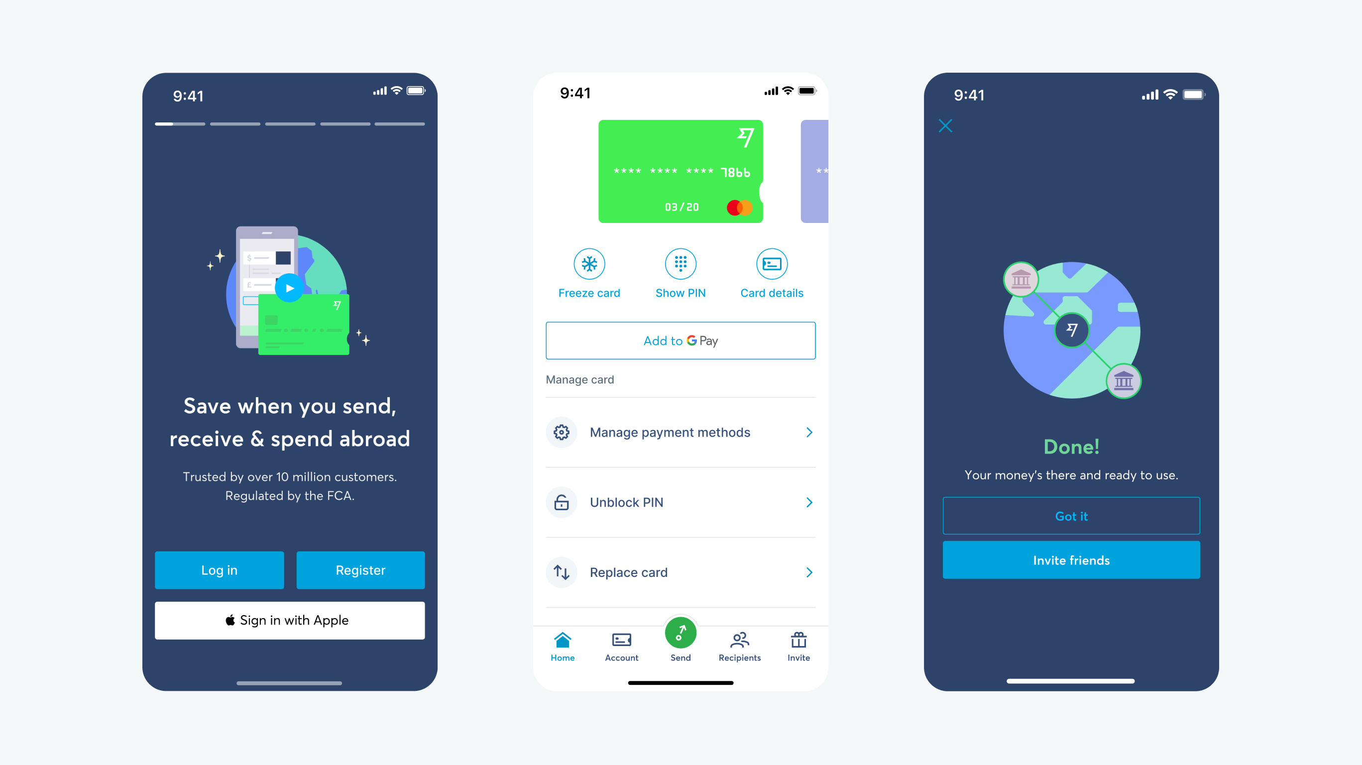
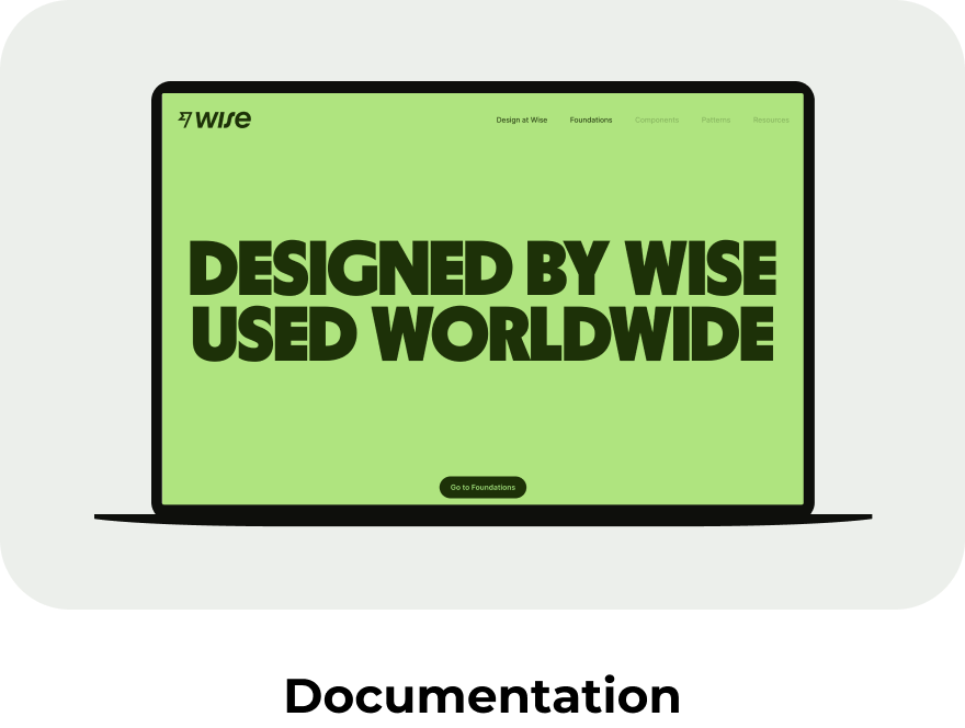
By the time we had aligned on our system, we updated our core libraries and started migrating changes across all our system touch points. Instead of updating our existing libraries, we created new ones to give ourselves a clean slate.
This forced designers to consciously make changes and allowed us to update the system in a much better structure. As well as updated components, our new library included foundations for illustrations, icons, flags, colour, typography, and spacing.
Getting adoption
The deadline
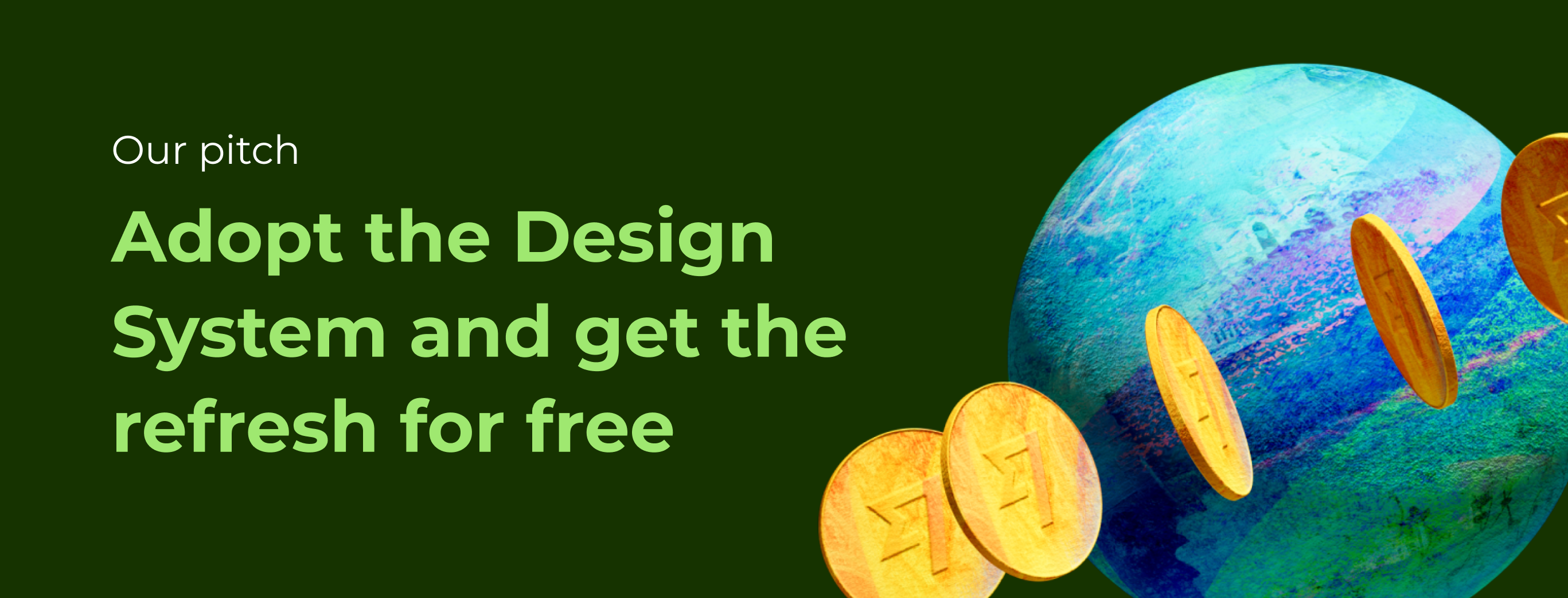
The business had a big bang launch planned for March 1st, 2023. The design system had to be ready by Q4 2022 so other teams could adopt and upgrade in time. While adoption was decent, it wasn’t enough to handle a system-wide update. We had to make using and upgrading the system as easy as possible.
To help, we pitched the system as the fastest route to the refresh. Adopt the Design System and get the refresh for free. That framing got teams on board and tied our work directly to a key business goal.
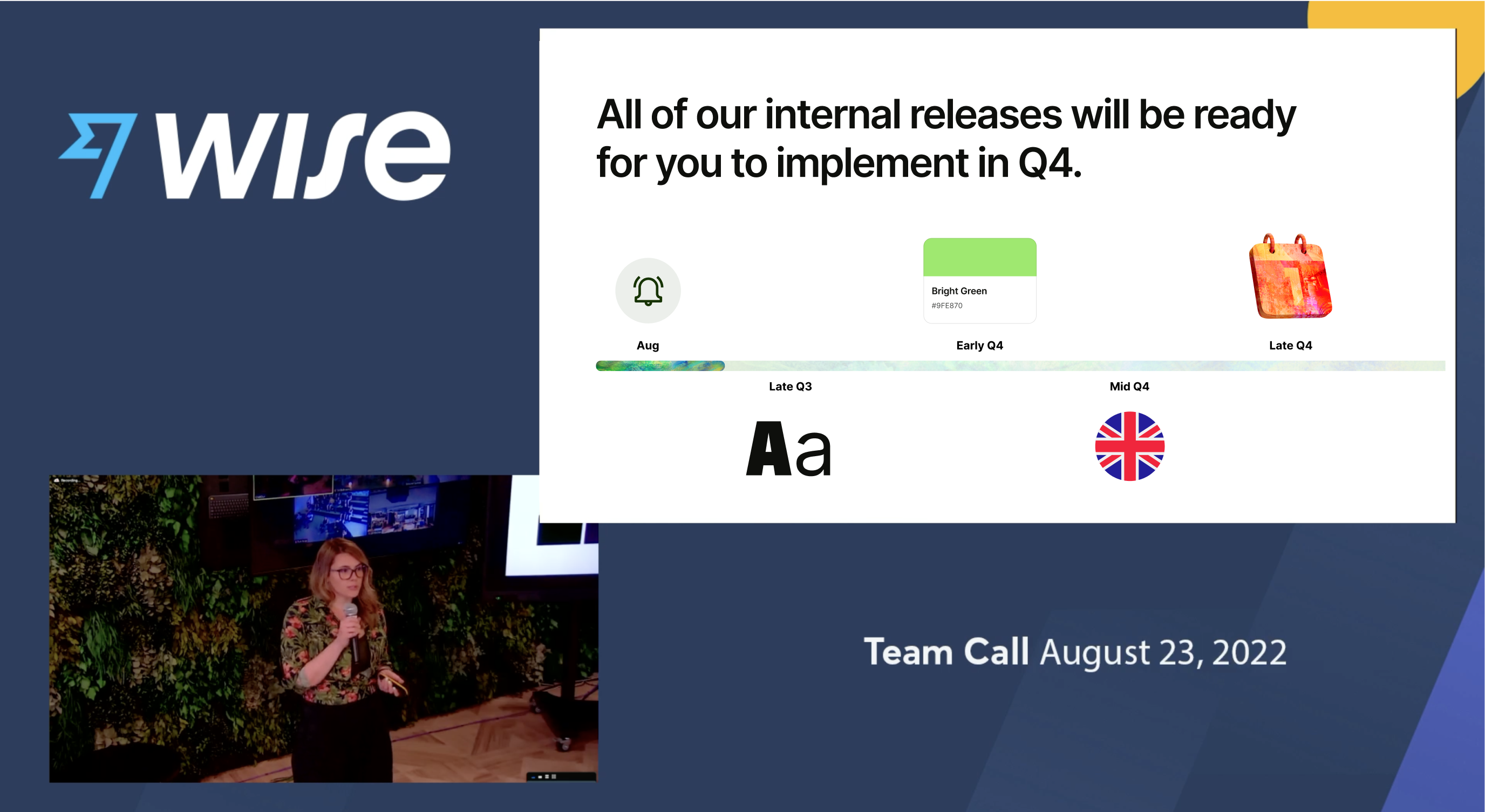
Team Call
In August 2022 on a Team Call to 3000+ Wisers globally, in an outfit to match my backdrop, I presented the new system.
Including what had changed, when it’ll be ready, what teams needed to do in order to be refresh ready and most importantly, our pitch.
Design Systems day(s)
To kick off the work and get everybody aligned, we then presented the system back in detail. This was an opportunity to show everyone what we had done with the refresh in the system.
Split across 2 days, we presented each stream of work from the new system to product teams and gave them guidance on how to use it.
Support and workshops
Each member of the team was assigned to support different teams across the org to ensure they understood how to use the new system and help in updating their experiences.
This was an initiative shared across design and engineering to ensure teams had support in upgrading their repos as well as their Figma files.
Making it simpler to update
We wanted to make upgrading as seamless as possible, so our genius design engineer Henrique Gusso created a refresh plugin that would allow designers to easily update their designs to the new brand.
While it did 80% of the work, it required the original system to be implemented. Those gaps were where it didn’t work, and that’s where our workshops came into play.
Team checkins
As we got closer to releasing, we needed to keep track of our 90+ product teams to ensure they were on track with updating their part of the product.
To keep on top of this, we had a master spreadsheet and weekly checkins owned by our design ops legend, Sheena Lydon.
Launch day
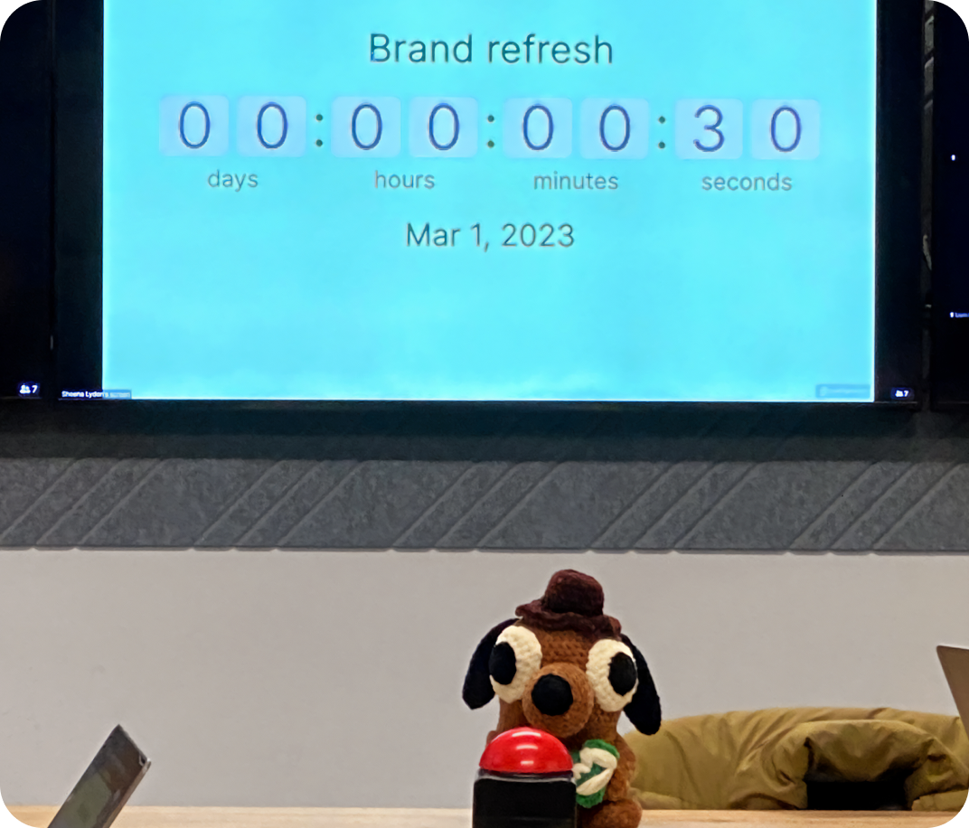
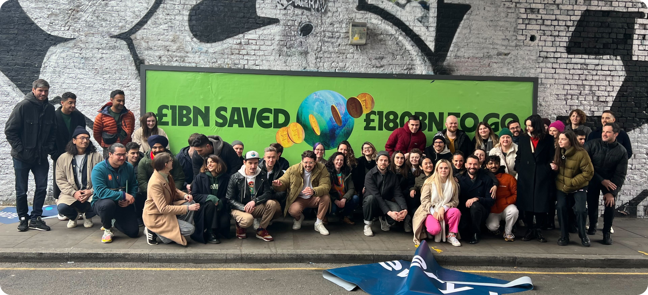
March 1st, 2023
At 7am on a cold, Spring morning we pressed the big red button and went live.
Featuring a Wise themed Question Hound stressfully crocheted by me.
The results
A surprisingly seamless rollout
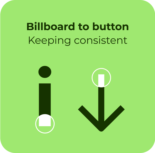
I don’t think any of us really thought we would pull it off. After collecting a few more grey hairs, we’d built a system to support product and editorial from billboard to button.
Not only was the rollout a success, the feedback to this day has been overwhelmingly positive.
The awards
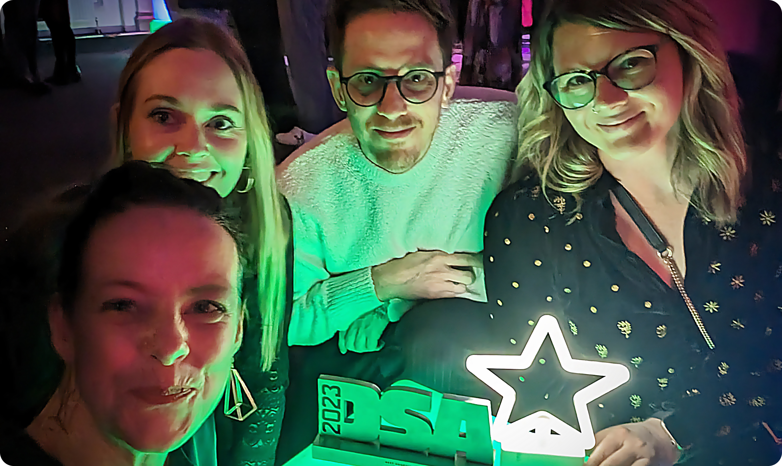

Design System Awards
Winner of best system adoption 2023.
Design Week
Winner of Writing for design, New voice. Highly commended on Best adoption 2023, Identity design, Rebrand and Best internal team;
D&AD
Shortlisted — Branding, Design Systems

Fast Company
Honourable mention

Brand New
Number 1, The best
Site Inspire
Featured on Front Page
Art Director’s Club
Merit honour, Brand Communication Design

CSS Design Awards
Special Kudos, Best branding project
Awwwards
Site of the day
Béhance
Front page feature, Mission Days 2023