Wise Design typography refresh
As part of the rebrand, we were given bold new fonts to work with. While Ragged Edge provided direction, we had to figure out how to implement two new fonts in a way that was scalable, versatile, and accessible across global experiences.
See the live typography documentation at wise.design.


Brand new (type)faces


Wise rebrand
We previously used Averta across our product, but as our design matured, it no longer felt like the right fit. As part of the rebrand, Ragged Edge introduced two new typefaces to better reflect where we were headed and to support a more global, accessible product experience.
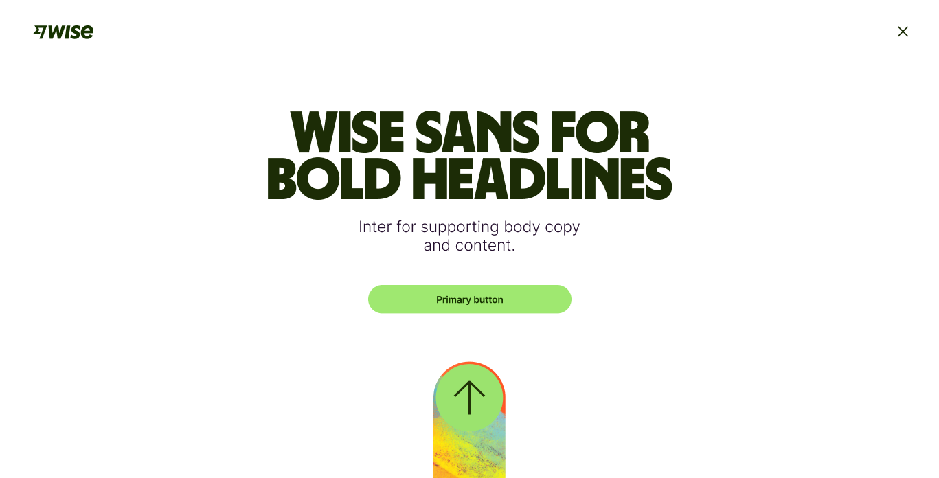
Inter is a versatile Google font that supports 148 languages. It improves accessibility, reduces load times, and fits seamlessly across platforms. Wise Sans is a bold custom typeface, evolved by Ragged Edge from existing letterforms, inspired by scripts from around the world to create a truly distinctive look.
The challenge

Too many styles
With 25 styles in total, it was difficult to know what to use and where.

Lack of hierarchy
Designers were unsure how to apply styles, leading to visual inconsistency across the product.

Unclear naming
Generic names made it harder to understand purpose and contributed to poor usage.

Limited language support
Wise supports 9 core languages, but Inter and Wise Sans were missing coverage for a few key ones.
Exploration
Making our new fonts work
We started by replacing our existing styles with the new fonts. While it worked in theory, it didn’t solve our core problems. The type still felt flat, and the structure lacked clarity.
This led to a two-phase design exploration. First, we ran a straight swap to see what held up and what didn’t. Then we refined the system to better support the strengths of the new typefaces.
Detailed exploration
We took a step back and started from scratch, exploring a wide range of designs without being limited by the old system. Removing those constraints helped us think more freely and experiment with new ideas.
This approach allowed us to streamline the style set and improve visual hierarchy, making the system easier to use and more effective across product.

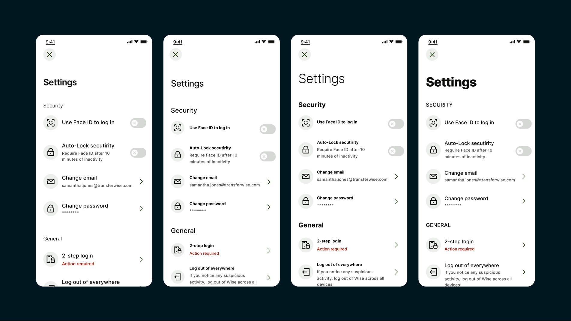
A reduction in styles
As a result of this work, we streamlined our type set and reduced the number of supported styles. This made it easier for teams to choose the right option without getting overwhelmed.
With fewer, more purposeful styles, we created stronger visual hierarchy and made it easier to reuse them consistently for specific functions across the product.
Semantics

Semantic naming for typography
With a smaller set of styles in place, we knew our heading options could still cause confusion.
To address this, we explored semantic naming to make it clearer which styles to use and where.

Testing our styles
I created a game for our designers called “Name That Style,” asking them to match style names to text in the UI.
It helped us spot patterns in confusion and refine the naming based on real feedback.
Internationalisation


Wise Sans
While Inter supports 148 languages, our display font Wise Sans didn’t cover as many. To improve internationalisation, we introduced font fallbacks and adaptive line heights—ensuring consistency while Wise Sans expands coverage in 2024.
Wise supports nine core languages, with Inter and Wise Sans covering all but Simplified Chinese and Japanese. To implement this, we standardised line heights across languages to keep the visual rhythm consistent.

Dynamic line heights
We’d set a tight line height (85%) for Wise Sans to give it a bold, compact feel. But to maintain legibility across all Latin-based languages, we needed to introduce dynamic line heights.
A slightly looser 105% line height was applied to Latin scripts, improving readability without compromising the visual integrity of the type system.
The results

Reduced set
We simplified our type system by cutting the core set from 23 to 12 styles, including display variants.

Clearer hierarchy
A smaller, semantically named set made it easier for designers to know when and how to use each style.

Semantic naming
Descriptive names reduced reliance on our documentation and improved consistency across designs.

International-ready
The system now works better across our supported languages, creating a more consistent experience globally.