Wise Design iconography refresh
Ahead of the rebrand, I kicked off an icon overhaul to tackle long-standing scalability issues in our system. With a bold new direction coming, it was the perfect time to fix our processes and foundations.
See the live icon documentation at wise.design.


The challenge
Function-specific naming
Icons were tied to specific uses, making them difficult to reuse in other contexts.
Unclear metaphors
Several icons lacked visual clarity, making their meaning hard to interpret.
Inconsistent sizing
Each size had a different design, which limited scalability and increased production time.
Manual process
New icons had to be shared manually across multiple platforms, slowing down updates.
Discovery
Naming & search
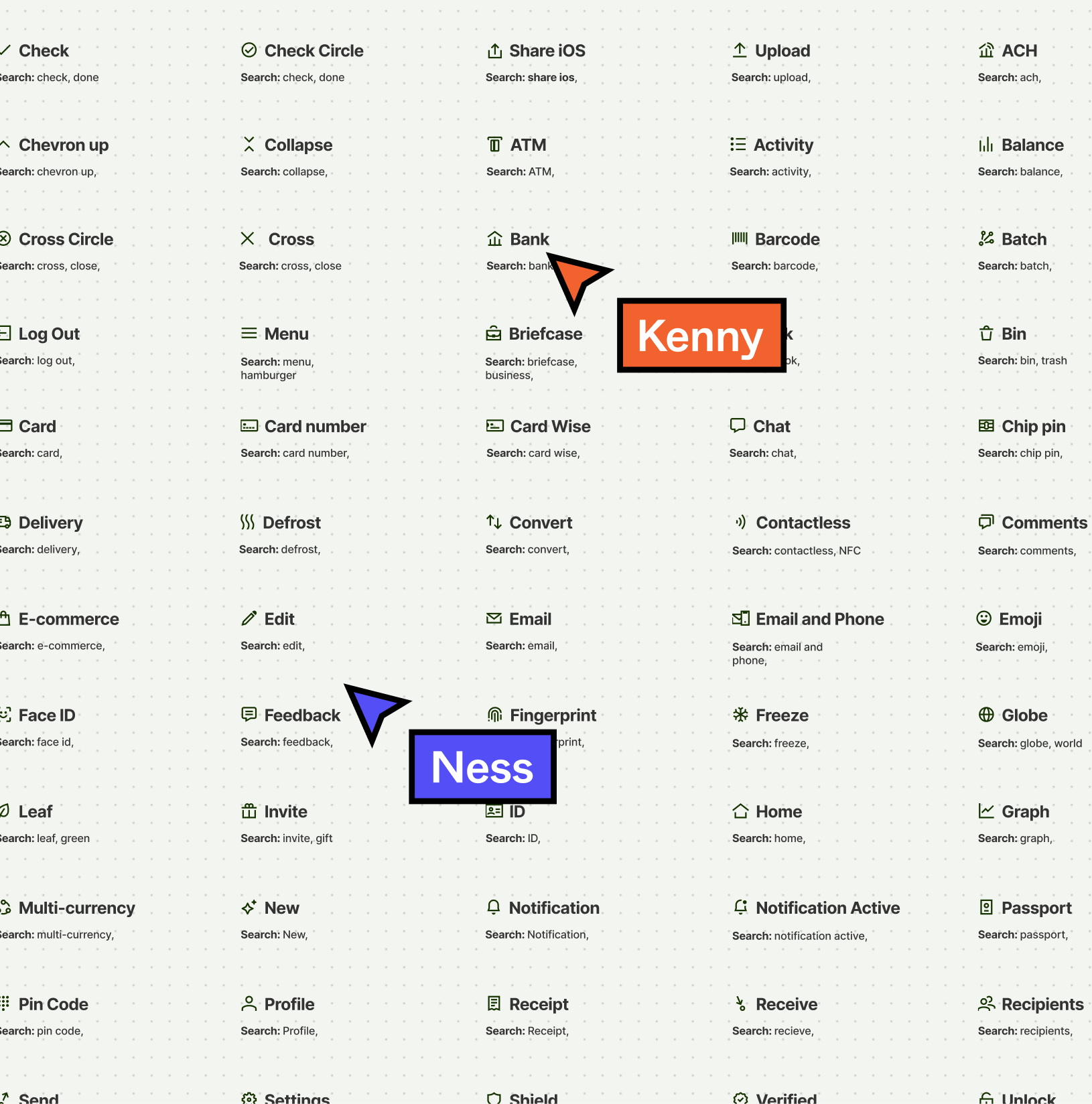
After an initial audit, I wanted to understand how our teams were currently perceiving our icons. I knew we needed to rename them, but we also needed to define relevant search terms to make them easier to find.
So I asked the design community to go into a (very) large Figma file containing 150 icons and rattle off some search terms. Only one designer did it, thanks Kenny, but I needed to find another method.
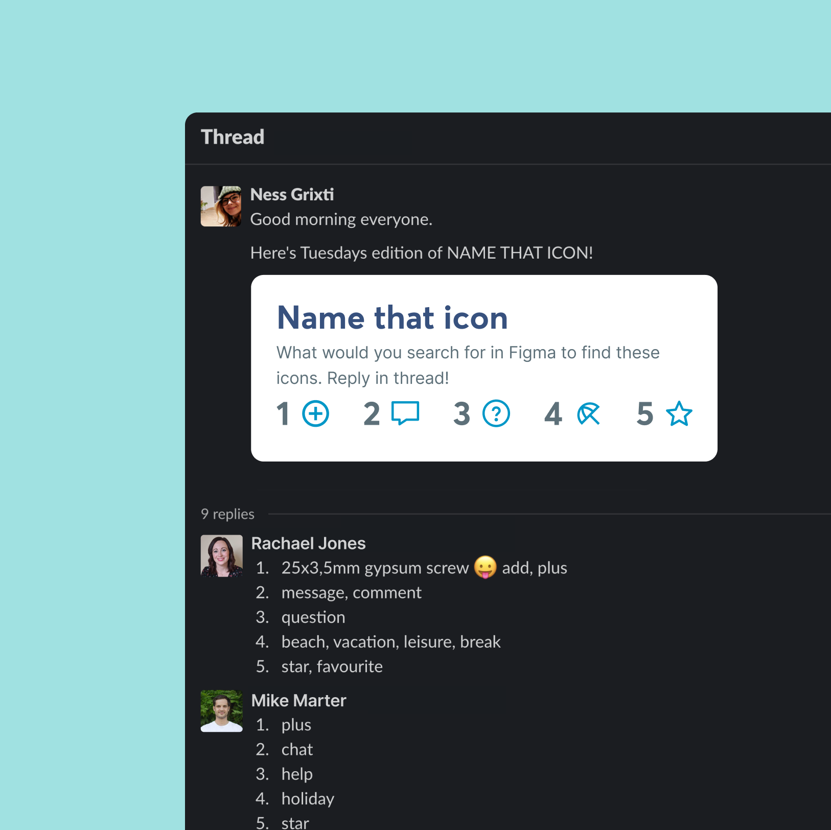
Name that icon
I turned icon research into a game, which quickly became the foundation for how I approached design research going forward. The game was called Name That Icon, and it wasn’t just for designers — everyone could take part.
Each day, I posted five icons with no context and asked people to name them exactly as they would in conversation. Engagement soared, with people genuinely looking forward to playing, and we gained invaluable insight along the way.
Collecting the data
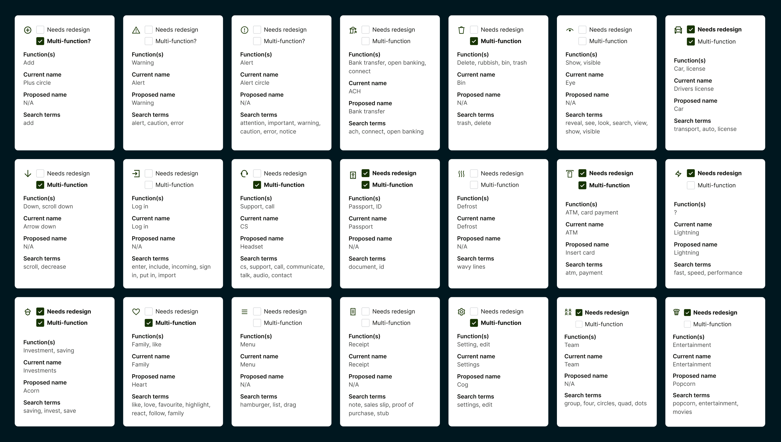
I created a detailed document summarising the findings for each icon, capturing whether people understood what it was meant to represent.
It also included how they interpreted the icon and any alternative names they might have used, helping us identify patterns and improve clarity.
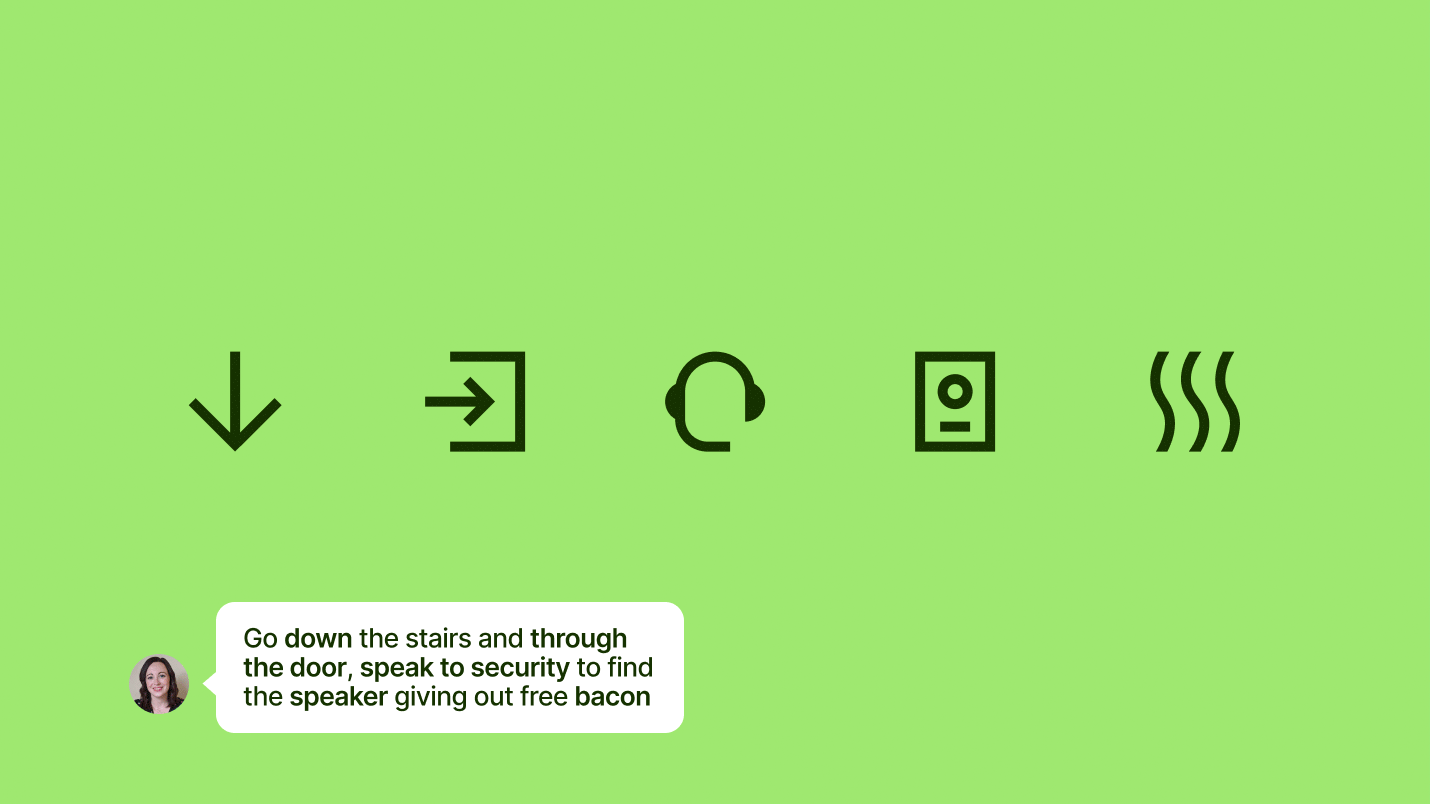
Happy accidents
People really enjoyed the game and got unexpectedly creative with their responses. Many sent in clever or intentionally funny guesses—some even turned it into a running joke.
It not only gave us valuable insight into how icons were interpreted, but also helped foster a sense of community and boost engagement in a natural, lighthearted way.
Categorisation Workshop
To understand how our teams perceived the icon library, I ran a workshop where designers grouped unnamed icons based on instinct. This surfaced natural categorisation patterns that shaped both renaming and search terms.
I then restructured the library to align with the team’s mental model, making small adjustments where needed to ensure it felt intuitive and easy to navigate.
Design
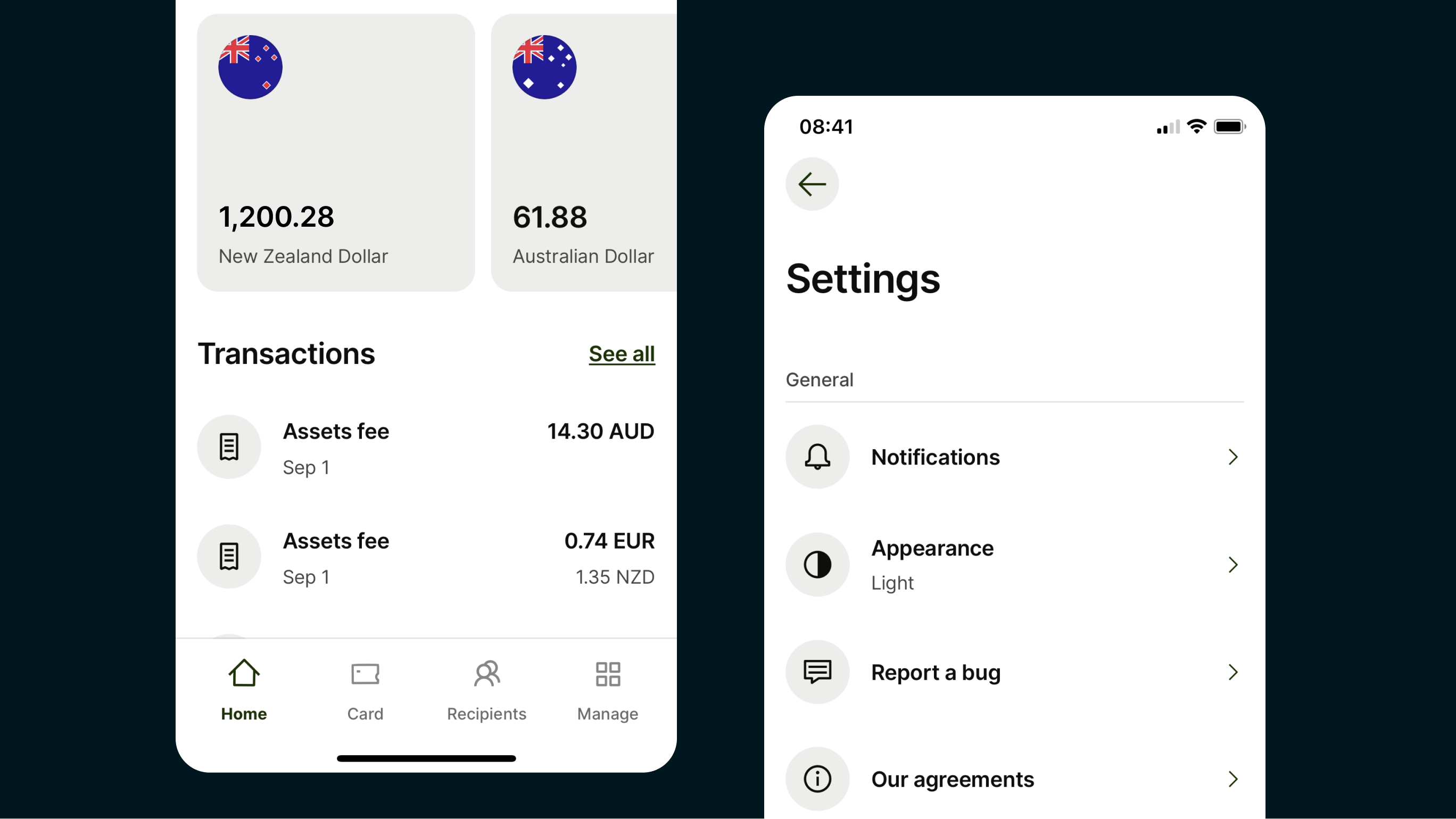
Icon redesign
These new designs—created by Ragged Edge and refined by Felipe Gonzalez—were developed as part of our rebrand to tackle issues with the previous icon set, including visual inconsistency and unclear metaphors.
The updated icons brought stronger cohesion and better alignment with our evolving brand. They also addressed technical concerns around scaling, optical balance, and harmony with our refreshed typography.
Implementation & Automation
Wise atoms
With developers spending 2–9 hours a week updating assets, we created Wise Atoms—a GitHub repo with all reusable assets and metadata for naming, categorisation, and search.
Platforms, including Figma via a plugin, pulled directly from it, automating updates and ensuring consistency. The icons were also redesigned to complement Inter, one of Wise’s new brand fonts.
Icon remapping
Given the large number of changes made to our existing set, we needed a way to transition smoothly without breaking existing usage.
We remapped the old icon names to the new structure so each platform could migrate cleanly to the updated setup.
Support
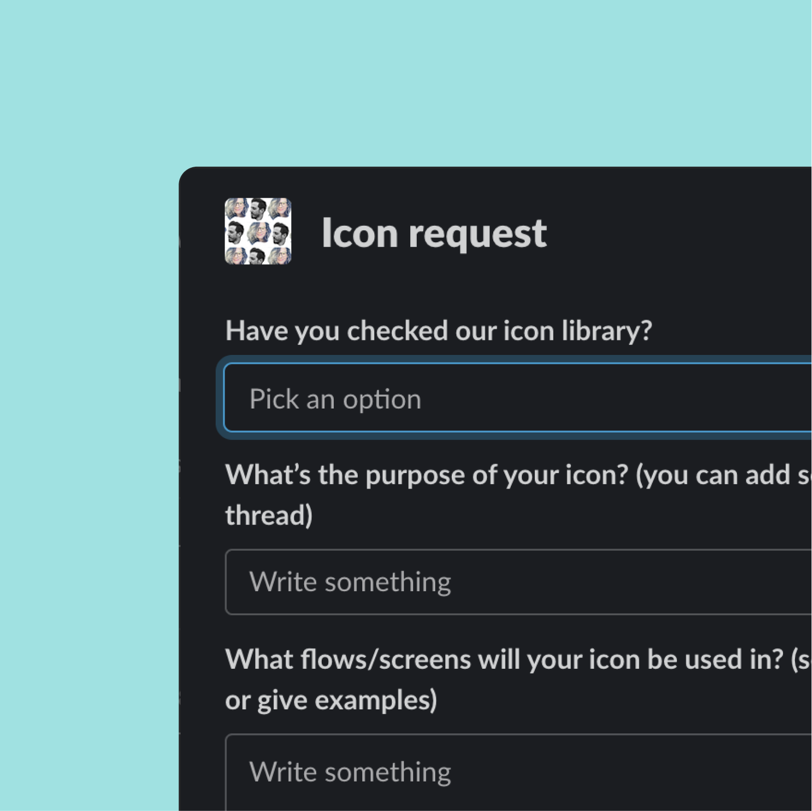
New icons and improvements
Our library continues to grow. To support incoming requests, we use a dedicated Slack workflow. In some cases, we also run ad hoc rounds of “Name That Icon” to validate design ideas with the wider team.
This lightweight, playful approach helps us gather fast feedback, uncover naming gaps, and make sure new icons are intuitive before they go live.
The results
Clearer naming
Icons were named based on what they looked like, making them easier to find and reuse.
Refined metaphors
We removed icons that didn’t visually communicate their intended meaning.
Unified styles
We removed redundant variations at different sizes, making the set easier to scale and maintain.
Relevant search terms
We added tags based on how teams naturally described the icons to improve discoverability.