Wise Design spacing refresh
After our 2023 rebrand, I revisited our spacing system to fix post-launch issues causing inconsistency across product. With the release of Figma variables, it was the perfect time to improve both structure and accessibility.
See the live spacing documentation at wise.design.


The challenges

Hard to interpret
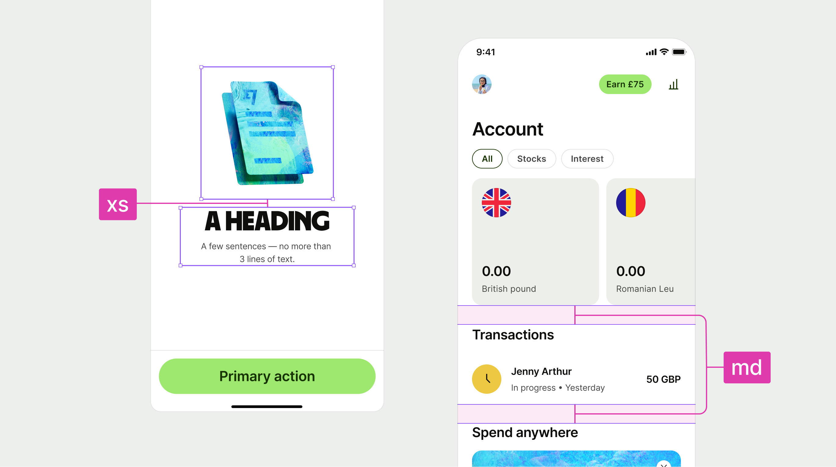
Inconsistent naming and no variables meant teams had to rely on documentation and guess what sizes like 'extra extra extra small' actually meant.

Weak foundations
T-shirt sizing felt more intuitive than abstract tokens but still lacked meaning, scale, and adaptability.

Limited accessibility
Our spacing didn’t scale with accessibility settings, making proximity and legibility harder for some users.

Inflexible components
Some components had hardcoded spacing, which broke consistency and created scaling issues across the system.
Alignment & Consistency

Refining the spacing system
The audit revealed inconsistencies in our spacing tokens and templates, with misaligned rules causing confusion across teams.
I standardised naming, structure, and global spacing rules to create a consistent, scalable system that was easier to use and maintain.

Grouping by size and type
As part of the alignment work, I reviewed how spacing tokens were used across the product. I started by grouping them by size to understand scale relationships, then sorted them by usage.
This helped reveal inconsistencies in naming and structure, and gave me a clearer path for introducing more meaningful, semantic tokens based on actual design behaviours.
Dynamic scaling

A scaled experience
By baking accessibility scaling into our core foundations and components, we ensured the system could support all dynamic scaling sizes without breaking layouts or compromising design intent.
This approach allowed us to deliver a more inclusive experience by default, making accessibility a natural part of how we design and build.
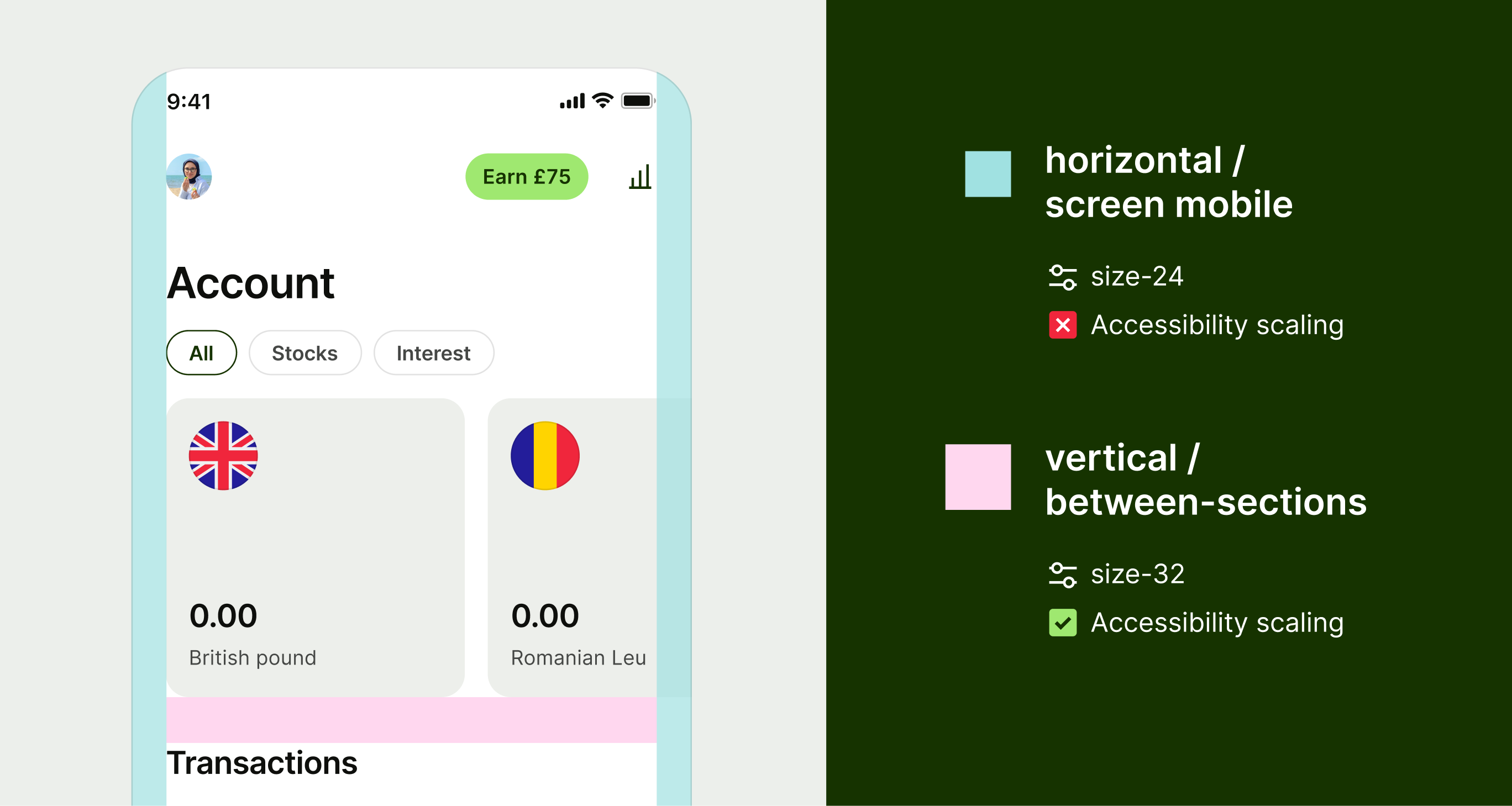
Defining when to scale
We defined scaling rules based on where it would have the most impact on perceived proximity and usability. All vertical spacing tokens scale to support clearer visual separation as text sizes increase.
Horizontal spacing only scales in specific cases, such as when elements scroll off the screen. This ensures consistency without creating layout issues in constrained spaces.
Scaling components
To create consistent, scalable experiences, we applied scaling tokens not just to spacing but also to typography, asset sizing, and internal component padding.
This gave us full control over how components adapted across different settings, allowing us to test and fine-tune both individual elements and the experience as a whole.

Cross-platform consistency
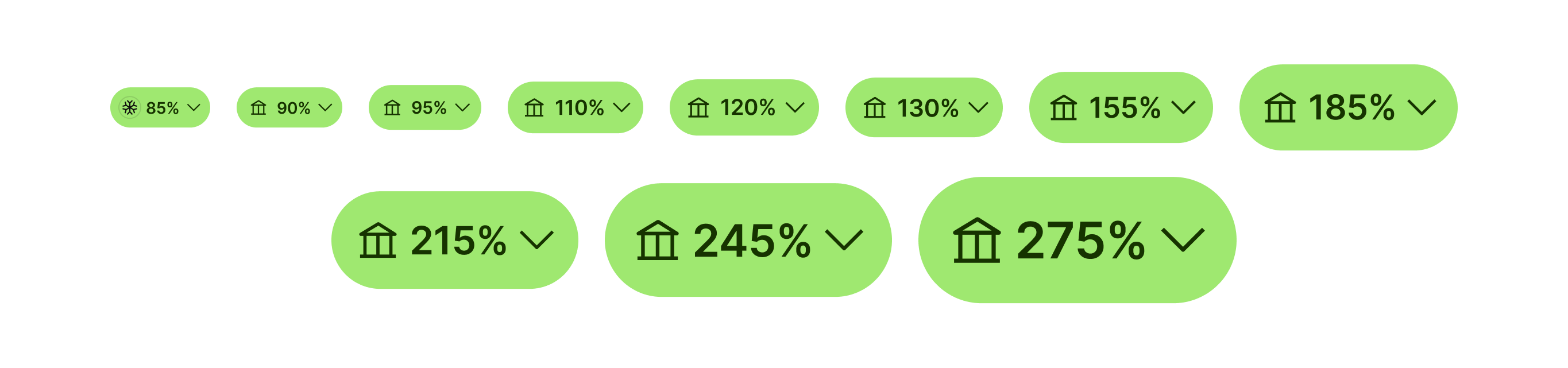
Wise supports native platforms that allow for dynamic scaling to improve accessibility. As part of this work, we aimed to ensure spacing scaled alongside text to maintain clear proximity between sections.
To achieve this, we aligned on a consistent approach across iOS, Android, and web. We kept things simple by implementing percentage-based scaling mapped to each platform’s native settings.
Semantics


Creating a usable set
The audit highlighted a few core spacing scenarios that appeared consistently across our product, such as padding, spacing between elements, and common layout structures.
These patterns helped us define a more focused and practical token set, tailored to how designers actually work and what the product truly needed.
Testing our styles
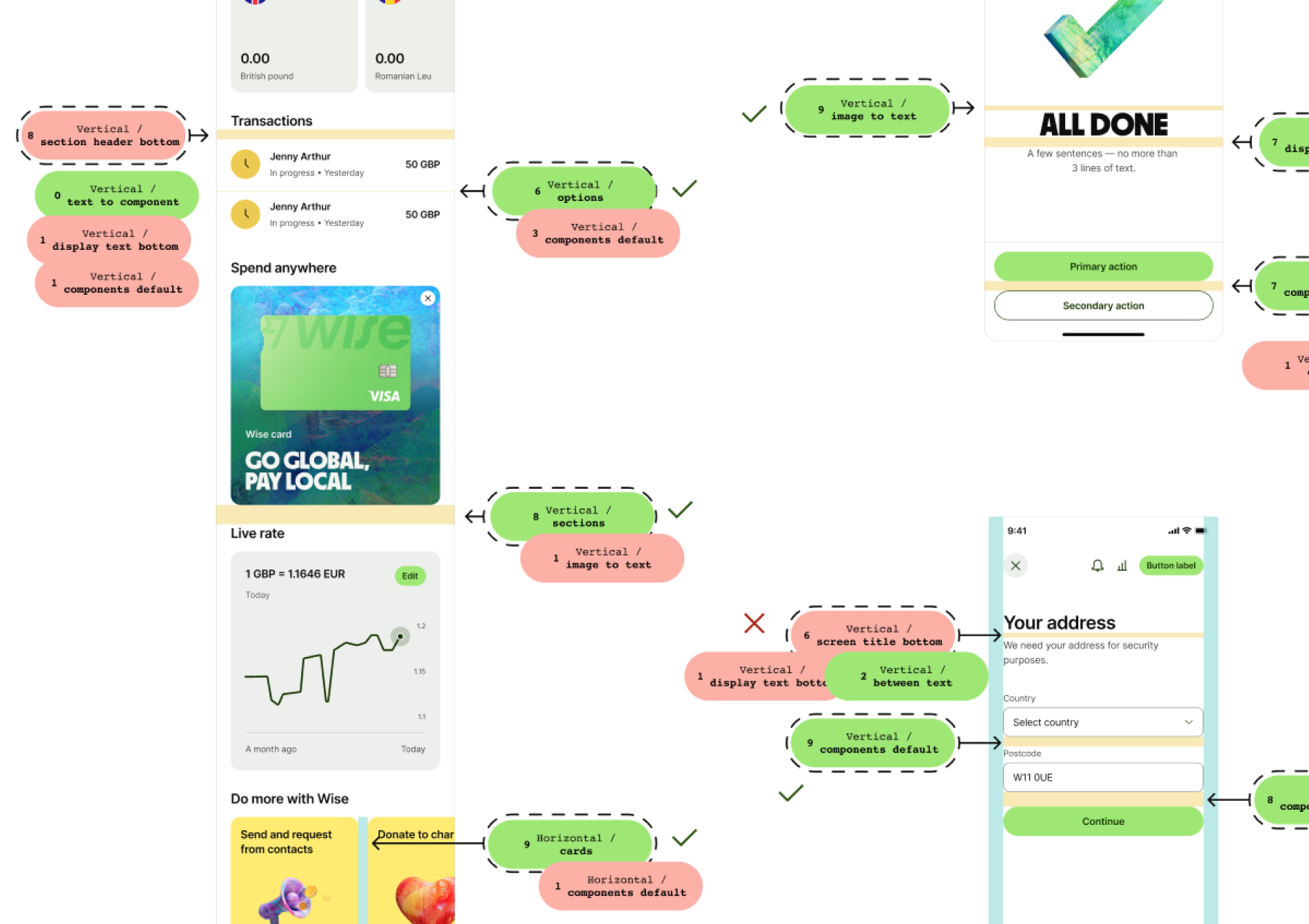
To validate our spacing system, I created a game called Name That Space, where participants matched spacing names to examples across different UIs.
This helped uncover patterns and made it clear which names were intuitive and which ones needed improvement.
Figma implementation

Scaling tokens
We started with a static foundational set using clear, scalable token names that gave us more control over the system.
From there, we created dynamic tokens using a percentage-based model. In Figma, we defined these as variables using modes, with 100% referencing the foundational value.
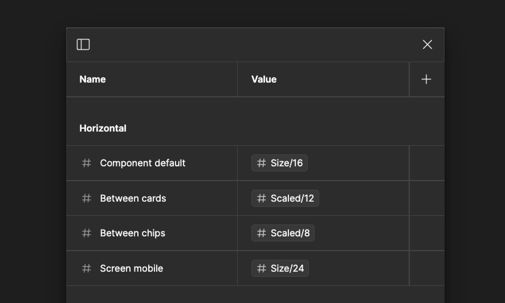
Shareable semantics
I created a shared public library in Figma for our designers, containing all of our validated horizontal and vertical semantic spacing values. These had been tested across different scenarios to ensure clarity and usability.
I also updated all of our templates to use these tokens by default, making it easier for teams to apply consistent spacing without needing to reference documentation.
The results

Clear semantic tokens
We introduced semantic spacing tokens tied to common product patterns, so designers and engineers no longer had to guess what to use or when.

Stronger foundations
We replaced t-shirt sizing with clear, scaleable values that reflect their actual size and usage.

Built for accessibility
Our new system supports dynamic scaling, improving proximity and legibility for all users.

Flexible with variables
We removed hardcoded spacing from components and used semantic variables to improve reusability and reduce reliance on documentation.